

[Comic Execution] 9/19 – ‘BALLISTIC’, ‘IT CAME!’, ‘THE STRAIN: THE FALL’
I’m really impressed with myself. Wrote all these reviews in one day! I’m a good comic book reviewer. *re-reads column* OH GOD IT’S ALL WRONG BURN IT ALL FFFFFFUUUUUUUU-
 THE STRAIN: THE FALL #3

Writer: David Lapham
Artist: Mike Huddleston
Colors: Dan Jackson
Publisher: Dark Horse Comics
Price: $4
A comic book about the end of the world via vampires, based on a book of the same. Sure, the books were written by Guillermo Del Toro and Chuck Hogan, but I’ve seen so many comic book adaptations of novels fail, my cynicism can’t help but feel a little bit justified. Issues one and two of the series were just good enough to avoid execution, much like the main characters of the series. But let’s see if they, and THE STRAIN, can survive the third test.
The story kicks off with a really wonderful and terrifying sequence that thankfully answers at least one question and, more excitingly, sets up a nice bit of suspense that lingers through most the rest of the issue. Then it jumps to our protagonists continuing to investigate the roots of the vampire epidemic in the city’s bowels, which has some clever dialogue but fails to have any real impact due to the unintentionally silly visuals. They return to their HQ where we get bits of character development and a bit of foreshadowing but then it jumps again to a new character, one that was introduced on the cover. It’s an okay introduction but doesn’t feel much different from the way most of the protagonists have been unveiled. Then, we get a flashback. It’s a cool flashback and makes up at least a little bit for the very choppy story up until that point. It resolves wonderfully then ends with a tease from the present storyline, one that doesn’t seem to set up so much as reinforce how bleak the situation keeps getting. Overall, the story is well paced and manages to pack a lot of information into a fairly smooth narrative but it doesn’t change the fact that there’s no real payoffs or obvious conflicts here. It’s clearly a problem with a comic book adapting a very dense, multi-threaded novel. Lapham’s doing his best but I feel like it’s just not working in this format.
The art is pretty much the same thing. The book kicks off with a really chilling set of panels that delves wonderfully into the vampires’ lair, leveraging a grim, bloody palette and thick, drastic dark lines. It’s very foreboding, visually. But the art stumbles in the next sequences where a wacky bum reveals the vampires moving under the city via a train. The scene of them vampires clinging to the train is one that, in my mind, looks terrifying. But the art can’t convey it that well and they end up looking so silly that it’s laughable instead. Things pick up again visually as the newest vampire fighter encounters his first pack. The panels are punchy and there’s a strong sense of energy as he finally turns to fight. The flashback sequence that follows is lush and striking, giving Amsterdam a lurid veneer that gets dark quickly. The antagonist that shows up is wonderfully eerie in his introductory panel, drawn in shadows with only his aristocratic top hat, cane and coat standing out. When he’s revealed as a blood sucker, the artist details his transformation with gruesome detail, fleshing out his pale, writhing form with gleeful nastiness. But the final panel, where we see a throng of vamps breaking into a shop and again, it’s made clear that the artist just can’t handle such an epic visual.
What all of this ends up telling me is that, at $4 a book, THE STRAIN: THE FALL just isn’t cutting it. The story keeps getting increasingly complex but not in a way that enhances the main narrative. Rather, it keeps diverging and diluting the most important parts of the storyline, killing the essential suspense needed to keep readers in invested. As the epidemic spreads and the book demands broader, bigger imagery, it becomes glaringly clear that the artist just can’t handle anything beyond narrow, personal stuff, which he does wonderfully. As a result, I don’t expect this series to get better, given how little actual development has happened until now. If the series changes artists and Lapham gets more leeway to sharpen the story, it might be worth keeping up with. But, for the sake of this column, I’m getting my silver implements and putting an end to this sucker. Sorry, Del Toro.
BALLISTIC #2

Writer: Adam Egypt Mortimer
Artist: Darick Robertson
Colorist: Diego Rodriguez
Publisher: Black Mask Studio
Price: $3.50
There really is, I’ve discovered, no way to describe this comic to the uninitiated. Trust me, I’ve tried. You could call it a sci-fi comedy but that totally overlooks the whole crime drama framework lying beneath it all. And just calling it sci-fi doesn’t do justice; it’s a whole different kind of science fiction that your average sci-fi fan might be startled by. Comparing it to ‘Transmetropolitan’, artist Darick Robertson’s work with Warren Ellis to which this bears a remarkable resemblance but even that’s a lie; ‘Transmet’ was a politically-driven, socially-conscious drama where ‘Ballistic’ never goes so far as to make politics a driving theme.
The second issue actually makes this WORSE. Where the previous issue was “desperate guy gets in deep with criminal organization, robs a bank, things get bad’, this issue goes all over the place. It picks up directly after the last issue with our protagonist on the run. He escapes the law, tries to get his gun fixed, gets betrayed, goes to prison, breaks out, involuntarily teams up with some woman, meets up with a criminal overlord, everything goes south, he escapes but things just get worse from there. The plot is so fast-paced, it almost feels like there’s too much going on. The writer is obviously trying to flesh out his world while telling this crime story but it could use a little reigning in. But it’s hard to complain when there’s so many cool things happening in each scene; the living gun has some weird ass dreams, as does his owner. The main character’s new ally (kind of) has got some superhuman stuff going on but even she’s a bit surprised by how things go bad in the end. It’s a breathless story that manages to be tolerable on ingenuity alone, instead of a plot that seems to go nowhere pretty fast.
If the last issue made you rethink what was possible in a comic, you’d better strap in for this one. The second and third pages themselves are a massive smorgasbord of panels detailing the present state of the setting, punching right into a mid-air chase scene. It’s frankly amazing how much detail Robertson conveys even in a densely packed set of panels like this. It jumps to a dark, grungy interior setting whose gloominess Robertson conveys deftly. Just when you think it’s all quiet, a full page smash of a weird dream sequence cuts in abruptly, startling you with one of the weirdest visuals I’ve ever witnessed in a comic. A few panels later and there’s some grotesque, unsettling biological stuff happening, involving a full grown body being grown spontaneously, all obscene warm, fleshy colors getting under your skin. It’s not long before we get another full page piece, this time a 4th-wall-breaking info page about a criminal overlord, posing as a page from a magazine about high profile criminals. It’s a clever way to engage the reader in the character’s details and allows Robertson to really flex his character design muscles. By the climax, we see a gruesome hand-severing followed by an impressively evil looking car ready to smash the protagonist into roadkill.
I also want to specifically praise the color and letters team on this book. I cannot say enough good things about Rodriguez’s colors. They bloom when needed, contract with a paranoid claustrophobia when foreshadowing, and every page is a rainbow of hues. Robertson’s found a match with the energized, elaborate work here combining with his work to create something one of a kind. And, thankfully, CRANK! is up to the task of making the letters stand out amid all this. Sharp sound FX that aren’t too goofy and don’t get in the way still color in the action and the weird dialogue of the talking gun has a cool reddish, alien effect to it. The big splash page dream sequence is especially notable, as CRANK! really unleashes a torrent of cool fonts that, I wonder, seem like the kind of stuff a sentient gun would come up with. Follow that with another dream where the internal narration is done in an unusual style of white text on black panels and it’s obvious CRANK! is serious about making an impression, and he has. I wish all comics had a support team this distinctive.
Overall, the one quibble I have with this book (the pacing is a bit too frenetic) is slight compared to how great it is as a whole. And Black Mask Comics gets huge props for presenting a full sized comic uninterrupted by ads at a reasonable price. Oh, and did I mention the AWESOME backmatter where writer Mortimer elaborates on the sci-fi details of his comic? It’s a fantastic addition to an already quality book. Seriously, pick this series up if you like sci-fi or weird comics or Cronenberg or anything like that. Support new publishers. Get BALLISTIC.
 IT CAME! #2

Writer: Dan Boultwood
Artist: Dan Boultwood
Publisher: Titan Comics
Price: $4
Titan Comics. What an awesome publisher. They have a pretty wide spread of books available right now and what’s impressive is that not a single one feels like a cash-in. There’s no “adaptation of a classic novel” or “movie tie-in” in the lot. They’re doing a couple of comic book adaptations of video games and those might be a possible source of easy money but those aren’t the books they’re advertising. You wouldn’t even know there was a ‘DmC’ or ‘Lost Planet’ comic out there. The original stuff they do have is wildly weird. Their anthology comic is a powerhouse of fun, energetic creators who are clearly just making comics.
And that’s exactly where IT CAME! comes from. The story doesn’t really evolve much beyond what was in the first issue from the second issue. Our protagonists, the snide Dr. Brett and his lady companion Doris, are investigating the appearance of an automaton from space in a small country town in England during the 50’s. As we reintroduced to the characters, the military are just arriving in response to Brett’s summons. The military characters are given just the right amount of goofiness, though compared to the main characters, they’re fairly nuanced. Naturally, they don’t last long and in the ensuing chaos, Brett and Doris stumble onto the robot’s spacecraft. The comic’s a bit short on plot but revealing what’s inside would certainly be spoiler territory but let’s say it’s both hilariously cliche and perfectly in line with what’s come before. As a gentle but smart riff on classic sci-fi horror, the second issue hits just the right notes, even if those notes are on a calliope made of waffles.
The art’s the real draw for this series and it doesn’t fail in the least. It’s all done in black and white, which is a bit of a shame, but I can absolutely appreciate why but I’ll discuss that later. It’s the linework that deserves accolades; perfectly clean, versatile, expressive, energetic, I could go on. There’s no sign of fatigue or ambivalence in any of the panels, even the expositive filler. And when it goes big, it’s a delight. There’s a moment where we get a wonderful sense of scale in terms of the robot’s size vs people and, despite a lack of color, it feels very solid and projects a nice depth. The interior of the ship holds even more surprises, impressive in scale. Despite the grandeur and action, it all retains a distinctively cartoonish cast the disarms some of the biting satire.
What really makes IT CAME! a great comic book, beyond all that, is that you get a whopping 26 PAGES of comic! There’s only two pages of adverts, and they’re both confined to the last two pages. Some of the those pages of comic are wonderful little “fake” ads that not only poke fun at the stuff you see in your comics but also mock the weird social mores of the Britain in which the story takes place. So issue two continues the delightfully fresh silliness and visual slapstick of the first one without losing a beat. Good stuff.
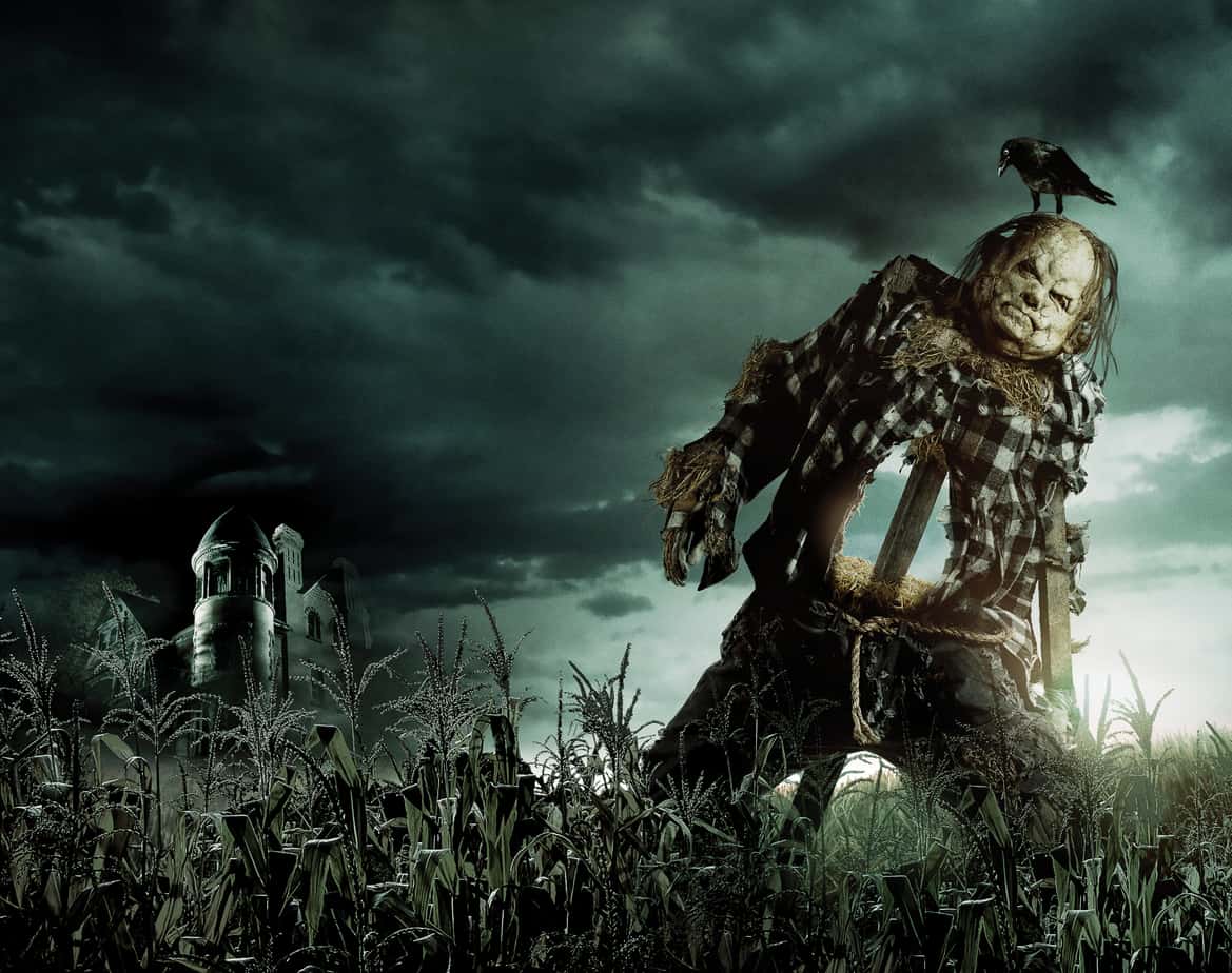
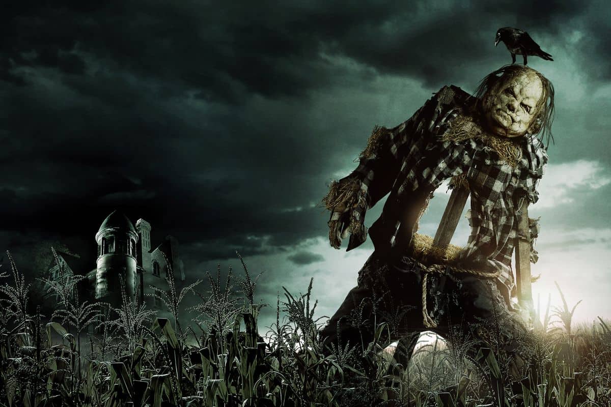
‘SCARY STORIES TO TELL IN THE DARK’ Comes Home on Blu-Ray in Time for Your Halloween Hangover
SCARY STORIES TO TELL IN THE DARK Will Arrive in Time For Halloween (on Digital) and on 4K Blu-Ray,
‘SCARY STORIES TO TELL IN THE DARK’ Review
It’s hard to believe that Alvin Schwartz’s collection of short stories came out the same
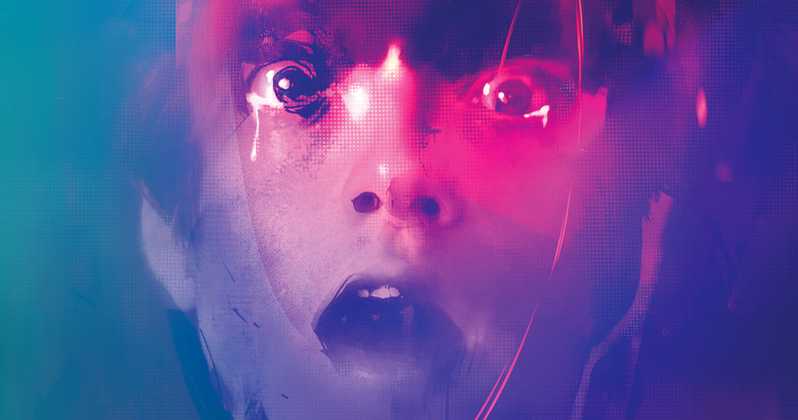
‘DANIEL ISN’T REAL’, But This Teaser Trailer Is
The team that brought my favorite film of 2018, Mandy, is back with Adam Egypt Mortimer’s Da