

[Comic Execution] 7/25 – ‘TOMORROWLAND’, ‘LAZARUS’, ‘THE ROCKETEER & THE SPIRIT’
Nice to see you, my loyal and not-so-loyal readers. Thanks for joining me yet again (or for the first time) as I ferociously strafe the carnage-laden battlefield that is the comic book industry, searching for an unguarded target of strategic value to unload my critical bombs upon. LOOK OUT BELOW!
 TOMORROWLAND #1
Writer: Paul Jenkins
Artist: Alti Firmansyah
Colorist: Beny Maulana
Publisher: Titan Comics
Price: $4
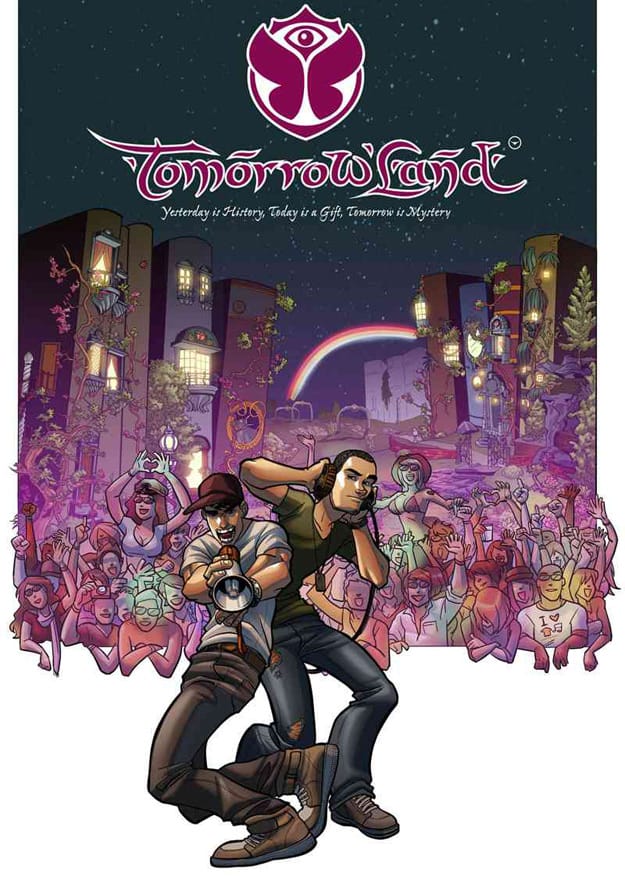
Sometimes, when you see a comic book cover on the shelf, you’re so struck by its unlikely strangeness that curiosity drives you to read it. TOMORROWLAND is that kind of book. The top of the cover is punctuated by a very cool symbol holding many meanings, some of which I felt would be interesting. The title is a unique stylized front with a strong Hindi or Arabic influence but clearly spells out the book’s title, with a similarly Eastern stylized phrase running beneath it. This title and accompanying symbol are colored in a bold, candy pink that matches the actual artwork presented beneath it. This unorthodox presentation was part of the reason I was drawn to the book. It’s also a Titan Comics property, which means it’s been imported from the UK to our shores exclusively by this independent publisher. Additionally, to the right of the title, hung at the top and small enough to be nearly dismiss-able, is another logo of a three-pointed iconized bird surrounded by a circle. “What?” I asked?
I didn’t really get an answer, at least not a satisfactory one, despite TOMMORROWLAND being a hefty and uninterrupted 28 pages of story. That’s not to say that I didn’t get SOME revelations but there are more questions in the first issue than answers. The big conceit of the story is this; there are forces of creativity and forces of entropy, and they’re at war over a magical dimension called Tomorrowland. Two brothers who are also DJs have somehow become the focal point of this conflict, thanks to their natural gift of channel creative energy into their music.
This story, as it’s told in the course of the comic, is not nearly as annoying as it sounds. There’s some neat use of dream states at the beginning, followed by some appropriately vague exposition dropped by mystical beings who pretty plainly foreshadow the wild climax of the first book. Unfortunately for said outsiders, the whole story takes place in the context of a music festival in the middle of the woods (presumably in Europe somewhere) so they’re taken as costumed revelers by the protagonists. This might seem laughably absurd to the uninitatiated but anyone who’s ever researched events like Burning Man or the like can attest to how bizarre festival performances can become. There’s also the convenient excuse that the festival itself seems to revolve around just such trippy nonsense so, yeah, it’s given a solid enough level of plausibility.
Once the conflict does get off the ground, though, things get interesting. Creatures of legend seem to do battle with imaginable (not a misspelling) monsters above the heads of the attendees and they respond in kind, seemingly oblivious to their peril. The brothers, though, having been subtly tipped off to the oncoming weirdness, barely manage to hold it together by somehow “pump[ing] up the volume” and subsequently driving away the forces of negativity. It’s a wild show and the brothers are elated that they helped end the struggle but, as it turns out, no one’s wise to what they saw at all. And that’s when Einstein, Shakespeare, Mozart and a Pharoah show up.
It’s an interesting story that takes a familiar premise (imagination is real and only a Chosen One, or two in this case, can do something. A thing. Whatever) and sets in in the unfamiliar world of music festivals, as well as making our protagonists an unlikely duo of headphone rocking, baseball cap sideways sporting, chinstrap beard growing, scarf in the middle of spring wearing bros. Not, like, “brother” bros. Because, yes, they’re brothers. But, like, “bros.” Yet there’s a lot of color and quirkiness to it all that veers just south of mediocrity into the territory of strangely fun.
And the art is exactly in the same place. It’s immediately an art style you’ll have to resign to either hating or loving. Madeuira is clearly and influence but there’s even more of the loose, comical level of exaggeration; big eyes are abound, proportions fluctuate marginally, powerful emotions are conveyed through unrealistic facial expressions, etc. It’s that weird mix of diluted anime and stylized cartoon that the equally loved/despised Humberto Ramos works in… It’s not offensive but it is a bit distracting. It’s both helped and hindered by a massively energetic coloring effort that ranges from pleasantly versatile to brain-hurting intensity. Especially offensive are the explosive bursts of magical energy and musical notes that arcs and bounce through the panels of the big showdown, rendered in teeth-grinding neons. It’s clearly the artist and colorists attempts to spruce up regular ol’ panels for a scene that does demand a sense of otherworldly power. But this is not the way to do it.
One of the other very interesting facets of the art is the weird immature maturity of it all. This is a rave, after all, so naturally there are several panels of generously endowed girls wielding bare midriffs and perfect cleavage. I’d even call some of the panels bald-faced exploitation, though the protagonists never quite join the artist in his male-gaze-ing. Then, in an interesting twist, there’s a modestly dressed elf! And she’s actually got non-fantastical anatomy! BUT THAT’S NOT ALL! Right smack in the middle of the big fight, a totally ripped Lorenzo Lamas centaur gets several panels of wide open, bare-chested glory, talking down to a fedora-wearing partier. So, the art is… weird.
So what do I think of all this? I’m… interested. This sort of light-hearted urban fantasy stuff isn’t typically my cup of tea, especially when it all seems so weirdly childish. Yet I’m drawn to how unequivocally unique it is. It’s hard to find comics that actually surprise me. Wow, that sounded jaded. Yet, here I am, wanting to read another issue because WTF. There’s also the fact that it’s a big book that fully justifies its hefty price tag, unlike some titles I won’t mention. Do I recommend it? I’d say pick it up, flip through it, and see if you can handle the goofy visuals. If you can, put down some money and get prepared for a fantastic voyage (I didn’t even mention the cartoonishly effete villain who may or may not be Aleister Crowley)! But if you’re a bit more “serious” about your comics, steer clear.
(Post-Script: Hey, it turns out TOMORROWLAND is an actual music festival in Belgium organized by two brothers! And this comic is basically a big PR move for the festival. The two main characters are actual DJs that play the festival regularly and created the festival theme: “Tomorrow Changed Today”. Sooo… yeah, not nearly as nonsensical as I thought it was and quite a bit disappointing.)
LAZARUS #2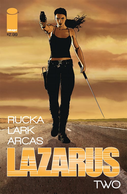
Writer: Greg Rucka
Artist: Michael Lark
Colorist: Santi Arcas
Publisher: Image
Price: $3
This review is going to be spoiler free but it’s also not going to make a lot of sense unless you’ve either read my previous review of LAZARUS #1 or read that issue. And, even if you have read that issue, you should also read my review of it because I’m going to talk about how my impression of this has (or hasn’t) changed since then.
Okay, so, are we up to speed? Good. Let’s get moving. I’ve decided that Greg Rucka thinks comic books should be like violent, dark soap operas. The guy really writes characters and plot like someone on a daytime network TV show would. It’s not necessarily an insult; a lot of people like heavy exposition, melodramatic dialogue and beat-by-beat turns of narrative. Personally, I get bored with this kind of stuff. It’s probably my ADHD or something. And that’s not to say that I wasn’t taken with a few of Rucka’s ideas in the course of this book. But it just wasn’t enough to propel me into the zone of caring.
First, he’s still failing to make the protagonist, Forever, a compelling personality. It seems, in fact, that the key to her personality is her suppression of one. She’s obviously not been given, by her Family, any chance to develop into a “real” person in the sense of having her own opinions or perspectives, but I still find it hard to sympathize with someone stuck in the middle of a sticky situation simply because they don’t know better. If it seemed like she secretly had her own initiatives and motives, I’d be more involved. And, in all fairness, it’s implied in the last page that she might just be moving in her own direction other than that of what those around her are pushing towards. But it’s also not entirely made clear, so I’m left cold by her lack of presence.
Which leaves me relying on her supporting cast to provide color. But Rucka only seems capable of painting in basic palettes: ice cold librarian scientist woman, complete with black rimmed glasses and bun; sadistic, condescending, spoiled, arrogant man child brother being manipulated by sexy, amoral, also spoiled “sister;” the rational, mature, well-mannered brother; and the most offensive of them all, the flagrantly illusive old man whose honeyed words and weary posture clearly belie an ulterior and probably sinister motive. I guess it’s implied that, because they’re incredibly wealthy, these sort of mannerisms are expected. Maybe so, but that doesn’t leave me any less uninterested in the next cliche line of dialogue they sputter next “Five children, and only ONE of them is worth a damn.” I’m pretty sure I saw this story before; it was called REPO! and it was way more interesting as a goth rock musical than a dystopian comic book.
I could talk about the art, but I feel like that would be pointless. How’s the art? It’s perfect. Too perfect. All the of the character’s feel like they were drawn from models. Hell, EVERYTHING feels like it was drawn from models. The story could be better told in photographs, honestly. At least then the colors would be a little less muted. Never have I seen so many variations on gray and brown. There’s one notable scene where the brat boy knocks a plate of dishes out of a maid’s arms and we get a frozen shot of the whole tray flying past him. But the very static nature of the panel is precisely the problem with the art; there’s zero motion. Everything’s just a photograph.
And that’s essentially my biggest problem with LAZARUS; it’s a TV show. It’s a comic book that DESPERATELY wants to be a really gritty, Walking Dead/Jericho-type action/suspense/drama type TV show. And, while I wouldn’t outright condemn such ambitions, that doesn’t change the fact that, as a comic book, this TV show sucks. Sorry, LAZARUS, but you’ve just been… EXECUTED.
 THE ROCKETEER & THE SPIRIT #1

Writer: Mark Waid
Artist: Paul Smith
Colorist: Jordie Bellaire
Publisher: IDW/DC Comics
Price: $4
Yes, both of these characters were in movies. No, those movies were not great. The comics upon which those movies were (very loosely) based, however, are considered classics of the sequential era and, really, were the foundations for what we consider “comic books.” Not quite pulp, but something more. So when I saw that there was going to be a crossover between these two iconic, Golden-Age classics, I was intrigued. I was even more intrigued when I was that Mark Waid, he of Daredevil fame, was writing. And now you get to find out whether it’s worth your time, either as a fan of the respective characters or as someone like me, just entering their worlds.
The means by which Mark Waid intersects the worlds of THE SPIRIT & THE ROCKETEER is of little consequence. The burgeoning TV industry is being fought over publicly in The Spirit’s home of Central City and a rebellious politician trying to stand for his ideals is found dead, coincidentally by The Rocketeer’s love interest. So the Spirit heads to California to investigate alongside Commissioner Dolan, the Gordon to The Spirit’s Batman. Not so coincidentally, they arrive at the same small airfield where The Rocketeer works and, thanks to the Spirit’s suspicious “costume” as well as a misunderstanding, they end up locking horns in a thrilling aerial melee. It’s a fun little caper that cruises along at a pleasing hum while gathering speed for the inevitable showdown. The respective gals in our heroes’ lives are introduced with a disarming charm that Waid lends to the protagonists as well. He handles both worlds convincingly and while there’s nothing surprising here (there’s definitely some tongue-in-cheek bits), the amount of energy and enthusiasm packed into the character interactions and dialogue is thoroughly inviting.
But the art! The art is magnificent. I’ve never immersed myself fully in the pulp era, so the old-school action of this book sucked me right in. Yet I can’t help feeling that there’s so much more going on with the visuals. It’s incredibly refreshing to see a page transition from a lively set of dialogue packed with detail (well defined background characters as well as objects like vintage rotary phones and desk lamps) to a big panel of a bi-plane passing through a night sky, immaculately illustrated. There’s a simple-yet-deep approach here, where everything’s just slightly stylized enough to make everything look more than real.
There’s one set of panels that are worth the price of entry alone; as The Spirit and his companions cruise towards a meeting with The Rocketeer’s girlfriend, we see their small car, headlights glowing, as it cruises down a backwoods road at night, the moonlight throwing shadows out from the trees and power lines. Three beats of dialogue, then a one-two knockout punch: The Spirit at the wheel behind a blast of headlamp glancing into his circular rear-view mirror then BAM, a circular panel representing the mirror as the Rocketeer blasts towards them, his fantastic helmet looming close.
From this point on, words fail me. There’s so many fun, creative images, like a wide panel split by a jagged break w/ the Rocketeer’s eye on one side, The Spirit’s on the other. Then a one-panel jump to the two of them about to collide, eye level and nearly face to face. But even as the intense struggle explodes, there’s a wonderful comedy of errors happening below, leading to a mutual end to the combat as the whole story is uncovered.
Look, just go buy the damn comic already. Out of the three I read this week, this is the one I’m absolutely going to continue to pick up. I’m not one for nostalgia or retro-isms so take my word for it when I say that this is more than a cash-in; it’s comic book gold.
Chris Melkus
Born and raised in the suburbs of Saint Louis, Missouri. Grew up on Ray Bradbury, Silver Surfer and Super Metroid. First introduced to horror when, instead of picking out a Super Nintendo game to rent from the local video shop, I wandered into the horror movie aisles. The cover of A Nightmare On Elm Street is forever imprinted on my brain, even though I didn't see the movie until I was much older. The first "scary" movie I ever saw was A Fire In The Sky. The abduction flashback gave me nightmares for months. I didn't develop a passion for horror films until I was old enough to drink and a friend introduced me to both craft beer and giallo films. From that point on, I was hooked. My favorite horror movies, to name a few, are DEMONS, FOUR FLIES ON GRAY VELVET, FROM BEYOND, BEYOND THE BLACK RAINBOW, etc. More at: http://about.me/cmelkus
‘REGRESSION’ Comic Review
REGRESSION #1 Writer: Cullen Bunn Artist: Danny Luckert Colorist: Marie Enger Publisher: Image Comi
‘UNDERWINTER’ Comic Review
UNDERWINTER #1 Writer & Artist: Ray Fawkes Publisher: Image Comics Price: $4 CLICK HERE FOR PREV