

[Comic Execution] 7/18 – ‘THE STRAIN: THE FALL’, ‘DINOSAURS ATTACK!’, ‘RED SONJA’
Welcome back, fellow sentinels of the sequential sublime, to Comic Execution, where I look at the big new releases of the week and either eviscerate them or shelter them tenderly beneath my black wings of hard earned love. Comics, man. You know how that saying goes; “It’s those you’re closest to that you feel strongest about.” Ain’t nothing gets me going like a magnificent story told through a medium as potentially robust as this one. Just don’t ask me for $4 of my precious dee-pees (it’s short for dead presidents, you greenhorn) and shovel me another tedious retelling of why nobody loves you. Spoiler; it’s because you’re boring.
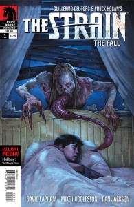 THE STRAIN: THE FALL #1
Writer: David Lapham
Artist: Mike Huddleston
Colorist: Dan Jackson
Publisher: Dark Horse Comics
Price: $4
Let’s get this out of the way before anything else; I didn’t actually finish the previous chapter of THE STRAIN’s comic adaptation. I got to the penultimate issue then dropped the series when Image Comics began barraging me with really good new books at cheaper prices than this one. Not that I didn’t like it; if that was the case, you’d be hard pressed to get me even one book in with that per-issue price. But the story was exactly the kind of vampire yarn I enjoy the most; jam packed with fiendish, repulsive bloodsuckers, brutality, and some really wonderful period-set flashbacks that provided ample color to break up the bleak urban atmosphere of the central plot.
It’s also hugely helped by a propulsive narrative that wisely splits its time between several characters, most of them interesting enough to keep me invested in their encounters with Del Toro & Hogan’s mutant Strigoi. Between that and their own reinvention of the classic monster, THE STRAIN deserves some praise, despite a typically bland “protagonist” that, while not hogging the spotlight constantly, is lent more importance than he deserves. So it’s with high hopes I approach this new series that chronicles the events that occur AFTER this sanguine infection saturates NYC.
We rejoin the ragtag crew of survivors from the original series: Professor Setrakian, elderly Jewish vampire hunter; Vasiliy Fet, tough Ukrainian pest exterminator; Latino epidemiologist Nora Martinez; and generic NYC white guy doctor Eph Goodweather who, out of this diverse and genuinely interesting cast, is the protagonist. Naturally. He’s also, of course, on bad terms with his ex-wife. Ex-living ex-wife. Yeah, it’s that kind of a drama. Fortunately, his cliche-ridden turmoil is quickly buried under far more interesting subplotting involving an ancient guide to battling the Strigoi as well as a vampire traitor out to stop what events are being set in motion by the big bad known only as The Master. Lapham (Stray Bullets) is the perfect writer for this series; his punchy dialogue and sharp pacing keeps exposition from getting wearying and divvies out the suspense & action with disciplined grace. When Goodweather’s turned ex shows up to infect their son, any other writer would’ve clumsily exposed the malicious convenience of her presence but Lapham’s packed pages (an ambush happening nearby provides some additional carnage) give you zero room to reflect on how absurdly ironic the encounter should seem.
Really, my only complaints about this book is the art. Huddleston is a pro but he’s economical to a fault; panels seething with murky suspense burst into intense horror but then a very rough, static, stiff scene gets dropped right smack into the mix, bringing the action to a screeching halt as you wonder why the editor didn’t politely point out how sorely lacking certain visuals are. Except I’m not really wondering that; this book is actually quite thick compared to the current standard and I imagine Dark Horse is keen on keeping the issues coming. Still, it’s hard to overlook the sharp drops in quality for a title that should really rely on heavy atmosphere. Part of that can be blamed partially on Dan Jackson as well. The colors here are admirably solid and finely tuned but there’s almost zero atmosphere except, strangely, for the first six pages of historical flashbacks. Grittiness and intensity in the modern setting are conveyed mostly with shadows and broad splashes of single tones. It serves the action well and occasionally his creative use of shocking reds combined with Huddleston’s bold, thick black lines really hits hard; page 14 has a superb one-two shocker I would almost recommend buying this for all by itself. But that’s really the only bright spot in a mostly bland visual presentation.
Overall, I will absolutely recommend this to anyone who enjoys vampires and/or survival horror, in addition of course to those who liked the previous run. Everyone else should approach with caution; if you really love a good story that bites, you should have no problem overlooking a somewhat mild artistic style in favor of a truly gripping yarn. And if you like this, you should really check out the movie Stake Land if you haven’t already. And, should you really want to go the whole nine yards, check out Del Toro’s little-known vampire thriller Cronos to get a look at what his personal vision of the bloodsuckers looks like on the big screen
DINOSAURS ATTACK! #1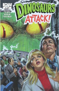
Writer: Gary Gerani
Artist: Herb Trimpe & Earl Norem (cover & interior paintings)
Colorist: George Freeman
Publisher: IDW
Price: $4
I was a pretty big fan of Mars Attacks! so picking this up came naturally. Despite my initial impressions up seeing it on the shelf, it’s not actually a spoof of that old-school revival but is borne from a similar IP born nearly a decade after the Mars Attacks! cards premiered, both from Topps. Like Mars Attacks!, this book is a tongue-in-cheek homage to the classic creature features of the ’50s with the same satirical tone you’d expect for just such a blatantly campy title. Yet there’s also a fairly vicious streak of horror here reminiscent of the Eerie and EC Comics era that nicely contrasts the more procedural sci-fi plot dominating most of the book.
That plot might be the only thing to complain about here yet, surprisingly, there’s enough mystery and spectacle to it that it’s hard not to want to know more. I might have to acknowledge here that I’m a sucker for gonzo sci-fi BS and I was actually really taken with the pseudoscientific explanation they lobbed out there for how it all goes down. There’s some hints of something being downright malevolent at work and Gerani deserves props for unwrapping the inevitable catastrophe with grim efficiency; not a panel goes by when you’re not gleefully invited to sneer at how blind all these lovable chuckleheads are to their own hubris. It doesn’t hurt in the least that all the art absolutely breathes out sublimely cheesiness, pages ripe with psychedelic pinks, purples and yellows. Page 15 in particular feeds my hunger for old-school sci-fi “hi-tech” machinery, embossed fonts on said computers screaming with retro-futurism. When the book hits page 21, I was absolutely sold. I can’t give anything away but it’s a full page of hypnotic, eerie, glorious weirdness followed up by even more radically luscious colors and intense panel work. Then there’s the last sequence, a painted incident where the first dinosaur shows up, its energized manifestation catching a hapless joyrider in its radiation field. It’s GLORIOUS.
I really can’t recommend this book enough to anyone who likes retro sci-fi, old school comics, MST3K-style cheese. Hell, anyone should be able to enjoy this, except for people with no reverence for the way comics used to be; absurdly fun. I also want to give HUGE thanks to IDW for presenting this in a premium format with lots of pages and NO ADVERTISEMENTS. None in the back, middle or front. You even get some pages of awesome bonus cards of the original era showing the “Dinosaurs” attacking hapless civilians in bone-crunching DINOSCOPE©. If you call yourself a horror fan and you don’t buy this book, you just don’t get it, man.
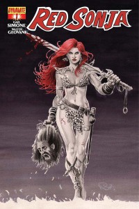 RED SONJA #1
Writer: Gail Simone
Artist: Walter Geovani
Colorist: Adriano Lucas
Publisher: Dynamite
Price: $4
I literally know NOTHING about Red Sonja. Well, okay, I know she’s a comely barbarian with red hair who slings a mean sword and pretty much established the armor bikini as a thing (unfortunately). I’m also aware that she’s part of the Conanverse. That’s it. I know nothing else. So I’m going into this with no preconceptions, whether that be a good thing or bad.
Given my reaction to the material, I think it’s a good thing really. Red is a character I’m surprised to find I like. I’m a cynic when it comes to busty badass babes as they’re usually flawed with some kind of insecurity that only some douchebag can handle or something of the sort. But it seems that the Conanverse doesn’t deal in that sort of overstuffed melodrama; Red is just a fun, intense, battle-weary warrior who, for some reason, insists on dressing entirely inappropriately for battle. But then, I keep reminding myself, this is Conanverse. Pulp comics at their finest. If you’re looking for something that makes sense, you’re in the wrong place. So I overlook the absurd outfit and focus on the action, the dialogue, the characters, the story and the art, even if part of me wonders whether there’s really anything empowering about this comic.
But it’s Gail Simone so OF COURSE it’s wonderful. It kicks off with a short, succinct introduction to the character’s involvement in the main thrust of the book; a king who once gave Red a significant measure of mercy is now preparing to face an unstoppable army as his own people suffer from a plague and she ends up at his side to face down this horrifying foe. The tone is both grim but light-hearted; it deals in conventional heroisms while subverting genre conventions when necessary. Simone, as usual, masterfully balances a propulsive narrative with enjoyable quirks and pulp goodness. One of my favorites is a bit where two young female archers who’ve come to request Red’s help refer to her as “she of the excellent cleavage” which is a pun.
Gail Simone, you are a gift to comics.
It takes something like that to disarm a book like this for me. By openly acknowledging how comical Red Sonja is as a character and skewering her buxom legend, she’s jabbing her elbow in the side of anyone who’s trying to take this seriously. “It’s all a bit silly isn’t it” she asks, inviting you on a quest that, while somewhat gritty, is clearly just a romp with a few sprinkles of clever writing. And fortunately, she’s paired with a top-tier illustrator who never lets a panel get away without filling in a generous amount of detail, every face clearly emoting. There’s a montage sequence that’s handled with just the right amount of grittiness without getting weighed down. The colors are luscious and never fail to enhance a scene, supporting the lines and really filling in the epic visuals with rich golds and misty coolness.
So, it sounds perfect, right? Unfortunately, it’s not quite. You see, Dynamite seems determined to absolutely screw their readership and, subsequently, their creative team. This is a four dollar book. It has 32 pages.TEN of those pages are ADS. 2 of them are RIGHT IN THE MIDDLE, interrupting Simone’s brisk pacing unnecessarily. This is not a 32 page comic. It’s a 22 pager. Let’s compare this to THE STRAIN; it’s 22 pages of comic as well and 5 pages of ads. All in the back of the book. For the same price. Now, obviously you’re saying “but Chris, clearly the art for RED SONJA is superior and therefore justifies the increased amount of ads by offsetting the cost of a superior artist.”
No. That’s not how comics work, kids. You do not commit the grievous sin of slapping a two page ad in the middle of a great book because you’re worried your title won’t pull in enough readers to pay back the cost of the art. If you DO get a big enough readership then great, you’ve just cut a profit. If you don’t make that number, you’ve just punished the readers who DID buy the comic, expecting a quality product and getting only 2/3rds of what they picked off the shelf. If that’s not the kind of cynicism that still mars the comic industry… This is why brick & mortar is dead necessary; I flipped through it on the shelf and discovered the hefty bulk was misleading. If I’d ordered it online where it’s described as “32 pages” on the Dynamite website, I’d feel downright ripped off when I got to the rather abrupt ending, like a stoplight arriving fifty feet sooner than you’d planned for braking. If they wanted to insure they could afford such an expensive artist, I’d suggest maybe trying a bit more advertising, since I’d literally not seen a thing about the series until it appeared on the shelf. If Simone’s name hadn’t been on it, I wouldn’t have touched it. Or maybe just drop the page count, you know? Skip the ads entirely and opt for a cheaper run. Savvy readers will pick it up anyway, see the lack of padding and have their faith restored.
Regardless, it’s hard to hold Dynamite’s cynicism against what is really quite a good book for the pulp comics crowd, or really, anyone into sword swinging fantasy of the wildest kind. Or, you know, horndogs who just want some barbarian cheesecake to go with their medieval adventure. I’m not judging. Really, I’m not.
Chris Melkus
Born and raised in the suburbs of Saint Louis, Missouri. Grew up on Ray Bradbury, Silver Surfer and Super Metroid. First introduced to horror when, instead of picking out a Super Nintendo game to rent from the local video shop, I wandered into the horror movie aisles. The cover of A Nightmare On Elm Street is forever imprinted on my brain, even though I didn't see the movie until I was much older. The first "scary" movie I ever saw was A Fire In The Sky. The abduction flashback gave me nightmares for months. I didn't develop a passion for horror films until I was old enough to drink and a friend introduced me to both craft beer and giallo films. From that point on, I was hooked. My favorite horror movies, to name a few, are DEMONS, FOUR FLIES ON GRAY VELVET, FROM BEYOND, BEYOND THE BLACK RAINBOW, etc. More at: http://about.me/cmelkus
‘SCARY STORIES TO TELL IN THE DARK’ Comes Home on Blu-Ray in Time for Your Halloween Hangover
SCARY STORIES TO TELL IN THE DARK Will Arrive in Time For Halloween (on Digital) and on 4K Blu-Ray,
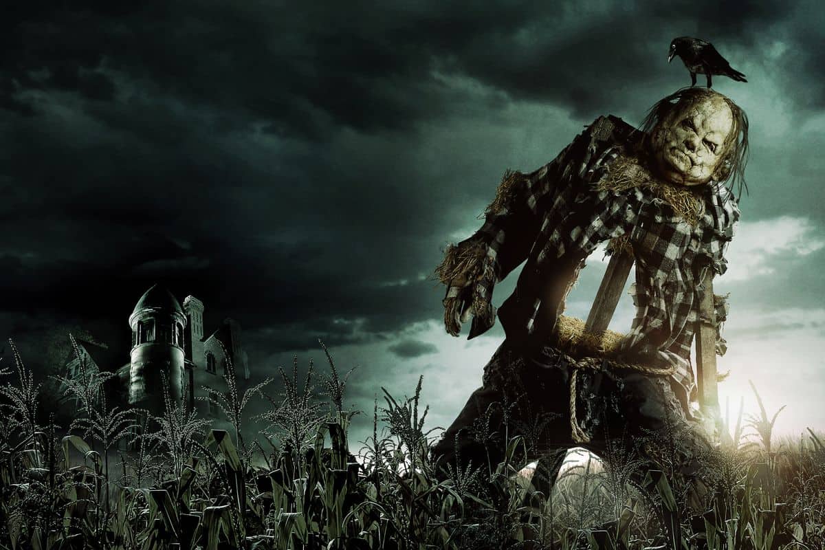
‘SCARY STORIES TO TELL IN THE DARK’ Review
It’s hard to believe that Alvin Schwartz’s collection of short stories came out the same
[FANTASIA 2018] ‘TIGERS ARE NOT AFRAID’ Review
It’s hard to pin down exactly what genre Tigers Are Not Afraid falls under. It’s kids living and