

[Comic Execution] 3/16 – ‘GHOST’, ‘MINIMUM WAGE’, ‘THE MERCENARY SEA’
This week saw the first really beautiful weather Saint Louis has had since November. You should assume that the delay in this week’s column is due to me being outside and savoring the sunshine.
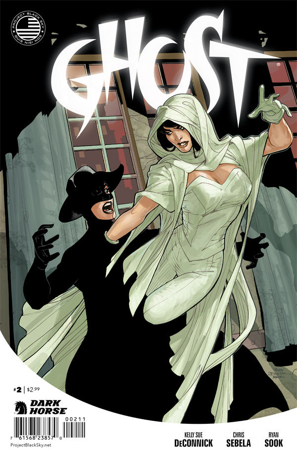 GHOST #2

Writer: Kelly Sue DeConnick & Christopher Sebela
Artist: Ryan Sook, Drew Johnson and Andy Owens
Colors: Dave McCaig
Publisher: Dark Horse Comics
Price: $3 (Digital)
So it turns out GHOST is the latest in a series of Dark Horse relaunches all tying into what is apparently going to be a coherent pulp hero universe. Coined “Project Dark Sky,” there’s no real narrative for the event other than some half-assed ARG hinting at psychic powers and alien invasions. It apparently has seven core titles, some of which I’ve only just glimpsed passing over on the rack on new comics day. That’s ambitious. But the whole gig is kind of pointless to me, because they’re clearly trying to recreate the resounding success that Valiant has had with their relaunch and that’s just not going to happen twice. First off, they’re missing some key elements; Valiant brought on board two names who were hot up-and-comers: Duane Swierczynski and Joshua Dysart, both manning the imprints flagship titles. Not coincidentally, Swierczynski is writing one of the major Project Dark Sky titles as well. And the earliest appearance of a PDS character was the ‘Brain Boy’ debut, a comic that bears more than a passing resemblance to Joshua Dysart’s ‘Harbinger.’ The parallels are numerous and obvious if you’re looking for them.
But I’m not here to review Dark Horse’s ambitious if unimaginative marketing tactics (and, in their defense, the few titles I’ve read have been high quality). No, I’m here to talk about Kelly Sue DeConnick and Chris Sebela’s GHOST. The first issue of the series was pretty cool but felt like it was missing something in terms of the balance between the horrific premise and the cool, over the top action scenes. This is definitely addressed in the opening scene, which echoes some of my favorite horror movies, deftly pirouetting along the line between grisly and comedic. Whether the latter is on purpose, I can’t say for sure and I’m hoping that’s a credit to the paired writers.
With that suspenseful scene on pause, we’re dutifully returned to the Ghost, Elisa, and her new demonic informant for a bit of long-winded drama that reminds me more than a bit of Supernatural if it was written by Joss Whedon. Which is a damn fine thing, even if I’m not as interested in the conflict as I am in where it leads, which is telling of how well the writers pace the exposition. It does eventually lead to a very cool scene in an underground club full of demons; the background chatter alone is rife with some brilliant stuff. There’s a well placed reminder that Elisa isn’t really a good person all around, which gets hammered home as she enthusiastically takes on the entire place with only her new friend to help.
While this is all going on, there’s a subplot that reveals that all is not as it seems. Despite juggling several subplots already, Sebela and DeConnick smoothly unveil their meticulously layered narrative with expert ease. At times the incessant snark of the demon character grates on the nerves and perhaps that’s intentional but it doesn’t make for any more pleasant of a read, given that he’s not funny enough to bear the load of the dialogue. Fortunately, the writers have the sense of provide physical comedy as well, again reminding us that Elisa’s surprisingly human for someone who’s not entirely human. By the time the final twist rolls around, the suspense is building again with both threads of the story, ending on a double-whammy of a cliffhanger.
All this is put on page by Ryan Sook, Drew Johnson, inker Andy Owens and colorist Dave McCaig. That’s a lot of people. The lineart duties are split down the middle between Ryan and Drew but to Drew’s credit, I didn’t notice the switch at all, at least not in terms of consistency and stability, as all the environments and characters are pleasing to look at in their detail and accuracy. Andy Owens is quite the anchor for the entirety of the 23-page span, displaying a remarkable patience and eye for detail, rendering things as insignificant as fabric wrinkles with concrete solidity. For example, the very last panel of the book is a great moment that relies so much on visual depth and definition of contrast, yet it feels organic and perfectly rendered. It also feels like a nod towards classic giallo, as does the “wallpaper” scene earlier on. McCaig’s colors, on the other hand, root the atmosphere in a modern noir aesthetic, full of gray washes and muted tones that occasionally give way to interesting textures, such as a grid of windows or Elisa’s white costume. There’s also some very nice, restrained but appreciable layout dynamics, especially during the club sequence, but I’d like to see some more of this, as the rest of the book is just static block panels.
I’d also like to take a moment to point out the weak link in this book: the lettering. It’s barely present and when it is, the fonts feel completely stock and there’s just so much missed opportunity on every page. It actually takes a pretty significantly poor performance for me to take note of “bad” lettering but this is one of those cases. It’s an action horror comic; where’s my ostentatious “schlurps” and “splorks”?
That’s really the only complaint I have with a book that is very good otherwise. And it’s a fair price as well, at only $3 on Dark Horse’s comics app. But that’s a bit of a nag there too. Why can’t I buy Dark Horse books on Comixology? I mean, the Dark Horse app behaves almost EXACTLY like the Comixology. Why force me to download a whole different app and get a whole new account just to read your comics? But really, I get why they’re doing it, but I’m not happy about it, especially since their app doesn’t play nicely with my cheaper tablet, versus Comixology’s. But that’s on me; I should’ve bought a hard copy like a real comic book reader should. Which I recommend you do as well.
THE MERCENARY SEA #2

Writer: Kel Symons
Artist: Mathew Reynolds
Publisher: Image Comics
Price: $3 (Digital)
At my local comic book shop, the subject of THE MERCENARY SEA came up and someone tried to dismiss it as “Firefly on a boat,” which immediately incurred by wrath. Not just because I loathe such simplistic dismissals by principal but because it’s just flat-out untrue. There’s two very different mindsets behind those two properties, despite their numerous but superficial similarities. ‘Firefly’ was, as with most of Whedon’s TV shows, an amalgamation of tropes collected from westerns and sci-fi, carefully curated and modified for maximum dramatic impact. THE MERCENARY SEA, on the other hand, faithfully imports the foundations of pulp adventure comics, letting the human drama play out organically. Basically, ‘Firefly’ was a mainstream TV show, complete with the inherent limitations that come with that medium, while THE MERCENARY SEA is a pulp adventure comic that exemplifies the genre. Don’t get me wrong, ‘Firefly’ was great for what it was, but I’ll take a comic book like this one over a TV show (any TV show… well, except ‘Boardwalk Empire’) any day.
Part of the appeal of THE MERCENARY SEA is in its settings; WWII-era Pacific theatre and all the intrigue that comes with that. As befits any proper pulp comic, we were left on a cliffhanger ending with the last issue and we pick up right in the middle of it as things go south, quite naturally. There’s a lone one-liner fired off before the real shooting starts and, even for this dog-averse writer, it’s a pretty amusing quip. Fortunately, the thrill of the fight is uninterrupted by any further cheesiness, and there’s a really cool bit where someone throws a kukri blade which at first seemed just appallingly unrealistic but, lo and behold, it absolutely is a thing and fits the character. At one point the black crewmember mans the turret gun. The visual gag of a big black man wielding a big gun is actually not nearly as obvious as it would seem to be. Or rather, it wasn’t to me; I didn’t pick up on it until a second read of the battle. And then there’s the gray-haired Wulf, who surprisingly saves the lives of the would-be attackers. It’s one thing to write a fun action scene but another to pack it with rich character detail.
Now, in defense of the ‘Firefly’ comparisons, the Captain’s merc-with-a-heart-of-gold schtick does bear an almost deja vu-inducing resemblance to that of Malcom Reynolds but, as I said before, it isn’t necessarily the character development that’s the draw here. For example, the Captain and crew quickly become embroiled in matters of espionage and the details of their new mission are intertwined with the ongoing Japanese invasion of China at the time. It’s immediately apparent there’s something else going on all together and there’s some pretty bold foreshadowing; for the Captain and his crew, it’s not a matter of if they’ll be betrayed but how. Are they really working for Allied forces are is the boat’s new employer playing on the Captain’s sympathies? Of all the questions still up in the air, there’s one that Kel answers with refreshing honesty; the ship’s spunky female mechanic (there’s one ‘Firefly’ parallel) has a relationship with the Captain that’s far steamier than previous implied, thoroughly subverting the aforementioned ‘Firefly’ parallel.
Ping, the Chinese hostess from earlier makes a return and there’s a bit of drama between her and the mechanic that feels a bit weird in the sense that Jack has to be aware that Ping is provoking the mechanic yet he does nothing. Is it because he’s a jerk or because he feels like it’s not his place to defend either one of them? I’m not sure and I’m interested in seeing if this conflict plays out and how. Which, fortunately, it looks like it will, since Ping is also more than just a pretty face, though that’s not really much of a surprise. Then again, THE MERCENARY SEA isn’t generally surprising in its plot convolutions, not yet at least. Kel Symons keeps the convolutions to a minimum, thankfully focusing on the action and intrigue, maintaining the core of what pulp is all about.
Mathew Reynolds keeps the visuals as arresting as they need to be to draw the audience into THE MERCENARY SEA’s relatively straight-forward tale. There’s a wonderful moment of visual suspense during the opening clash: one horizontal panel, full on, of a Mauser with the hammer being pulled back. The panel just prior is a dense one but there’s a clear visual cue of the Mauser being pointed, from the foreground, at Captain Jack’s dog. In the panel of the gun by itself, the cocking of the hammer is perfectly described by a small but potent “ka-chik.” This set up isn’t unique but here’s why it works so well here; Reynolds’ perpetual use of outlines and shadows comes into play big time with this scene, with the gun’s silhouette carved into a rusty-red background. Normally, a “dog in peril” moment is pretty annoying just by merit of existing but the visual suspense of the moment sells it so well, I barely noticed. Barely.
There are a lot of moments like these packed into this book and many times they’re the result of artist Mathew Reynolds and letterer Pat Brosseau collaborating. Page ten features a wonderful one-two beat of Captain Jack yelling “fire” in a bright red, black-outlined font with a popped word balloon barely containing it, all in the foreground of both its own AND the next, larger panel, which features the firing of the cannon, verbalized by a gigantic “FOOM” booming in the background, filling the panel, the very word itself fractured by the force of the action. This is what I mean when I talk about THE MERCENARY SEA being pulp at its best. There is so much visual richness in this issue, it seems pointless to try and process all of it in this review. Just take my word for it when I say that this one of the best looking comics I’ve read in a long time.
I really love this series so far. As I’ve said before, it fits in so well with my other favorite ongoing Image titles, like ‘Five Ghosts’ and ‘The Massive’ among others and there’s so much to enjoy in each issue. I am a little wary of the writing falling into overused cliche but at the same time, I know Kel Symons is probably doing the best job he can to both evoke the best of pulp comics while at the same time divesting it of all the problematic and tedious elements of the genre. They’ve done a great job so far and here’s hoping the next issue will maintain this standard of quality.
 MINIMUM WAGE #3

Writer: Bob Fingerman
Artist: Bob Fingerman
Publisher: Image Comics
Price: $3 (Digital)
I had a lengthy discussion with my local comic book shop owner, a magnanimous gentleman whose merits I cannot praise enough, about the ramifications of the e-mail I received from MINIMUM WAGE author/artist Bob Fingerman regarding my review of the second issue of his comic. I came to him with the same concerns I expressed to Bob, which was that his personal response seemed to indicate the worrying possibility that my column actually had some sort of impact on comic book sales. In not so many words, he told me that was not the case and that I should write my column the way I wanted to and not to be concerned with its theoretical impact on the livelihoods of the creators of the comics I negatively reviewed. Some of you might be wondering why I would be unhappy if my column was influential enough to affect sales. My primary motivation for this column is actually drawing readers to Destroy The Brain. Don’t get me wrong, I love comics and I love writing about them and I love the act of criticism. But I’m also not looking to become a “critic.”
But I’m worried that might be happening anyway. Maybe starting a comics criticism column wasn’t really the best idea, in that regard.
The new issue of MINIMUM WAGE returns to the holding pattern of one Rob Hoffman, recent divorcee living with his mother and looking for love. He’s got a girl, but things aren’t perfect and Rob’s the kind of guy who holds on to imperfection. He’s consulting with his friend Matt, when the issue starts, about the troubles with his new girl and it’s more and more apparent that Rob is a bit self-sabotaging. Though, in his defense, everyone is, in one way or another, but through Bob’s pseudoautobiographical lens, Rob’s obsession with failure is overwhelmingly omnipresent. Somehow, this makes him seem more likable, and I’m not sure why. Better not think about THAT too hard. It doesn’t help that Rob’s car-free lifestyle hits me in all the feels.
The whole first act feels like a well-formed first planted directly in the solar plexus of my generation; the living with the parents, the absence of a car to get around in, the struggling for a legitimate career, the search for a meaningful relationship, all happening at an age that just doesn’t seem appropriate. But the blow itself only lands after Rob is rejected and he utters one of the funniest yet poignantly sad lines in the series so far: “I’m still wearing a condom.” Well, he doesn’t “utter” so much as think it, but yeah, it’s a moment I laughed at in spite of myself. He consoles himself with a friend but, as his friend points out, Rob seems unable to do anything but bring himself down.
It takes a particularly surreal turn of events to shift the mood from bleakly morose but Fingerman sells it by throwing Rob into the role of temporary puppeteer on a wacky local-access variety show where he meets a childhood crush whom he ultimately has sex with. Up to a point, it’s some of the funniest stuff so far in the series and a welcome contrast to the angst that had been dominating the tale so far. But Rob’s story is a real one and when he finds out an ugly truth about his childhood crush, he panics. In one of the saddest moments in the whole book, we’re treated to a confession from someone who might be in a worse place than Rob. Thankfully, he realizes this and offers much needed comfort. It’s a welcome positive note to end the story on, after so much romantic catastrophe that, to Fingerman’s credit, seems more amusingly unfortunate than pathetic.
And Bob Fingerman’s skills are put to the test with this issue, portraying the interior of a taxi, a studio stage, fake Klingons and a puppet gallery. As usual, his distinctively cartoonish renders these scenes respectably, as well as imbuing even minor characters like Kimmy with raw authenticity. The moodier scenes are also touched with a surprising amount of artistic emotion, the overgrown flora of one building seeming to almost swallow up the door. Unlike the previous issue, where I felt Bob might have coasted on a couple of pages, this issue is vibrant and perpetually building up or tearing down something.
And behold, we don’t have just 20 pages of comic, we have 22 plus two pinups that were so visually interesting that I welcomed their addition. I’m pleased to say that the concerns I had with the last issue were laid to rest here. MINIMUM WAGE is a series I endorse with trepidations put to bed.
‘REGRESSION’ Comic Review
REGRESSION #1 Writer: Cullen Bunn Artist: Danny Luckert Colorist: Marie Enger Publisher: Image Comi
‘UNDERWINTER’ Comic Review
UNDERWINTER #1 Writer & Artist: Ray Fawkes Publisher: Image Comics Price: $4 CLICK HERE FOR PREV
Comic Review: WEIRD DETECTIVE
Chris Melkus gets weird with Dark Horse Comics' Weird Detective #1!