

[Comic Execution] 11/15 – SILENT HILL DOWNPOUR, SPRING-HEELED JACK, WYTCHES
So this week I ended up grabbing physical copies of the comics I usually review for the website. It occurred to me, while at the shop, that the money I was spending digitally to get my comics would be better spent at the comic book shop I love so much. But then, when I got home, I remembered: oh yeah, I have to actually put these comics somewhere. I considered having a contest to give them away when I’m done reviewing them but that would seem like bribing readers and that’s not something I condone. Plus, I’m not sure I’d give away the comics I actually enjoyed. I just don’t quite know what to do with the failures and I can’t predict what’s going to be a failure reliably enough to avoid them. So, sadly, I’ll be returning to digital issues next week, against the wishes of my conscience. Unless someone else can suggest a suitable remedy?
WYTCHES #2

Writer: Scott Snyder
Artist: Jock
Colorist: Matt Hollingsworth
Publisher: Image Comics
Price: $3 (Digital)
My roommate, a comic book geek with tastes that vary appreciably from mine, is also reading Wytches, but not entirely for the same reasons as me. Well, not in the same proportions, at least; he’s coming into Snyder’s work from the Batman angle, whereas I know Snyder from his horror comics. While I’m not necessarily saying our impressions will be drastically different, I’m definitely interested in what he thinks of the slower, more personal narrative of Wytches versus what he’s familiar with. The irony is that he might appreciate it better than I, having distance from the utter menace of Severed, which pitted two helpless delinquents on the run against a truly foul evil. In Wytches, there’s at least the father watching over his daughter & wife, so the sense of danger is slightly diluted, not to mention it’s modern day, with all the safety that accords.
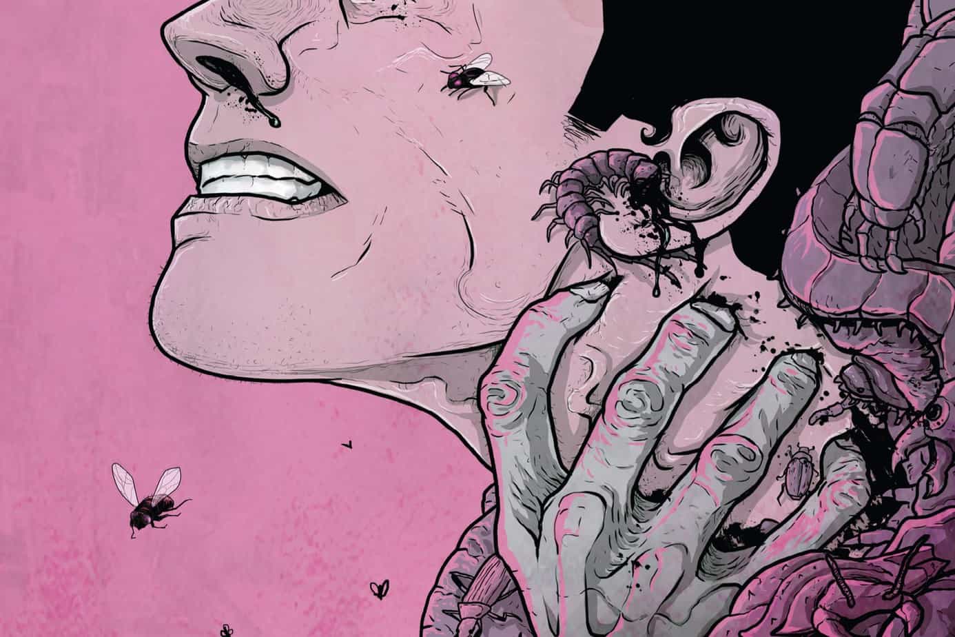
To some extent, Snyder both acknowledges and negates that in the latest issue. But before he returns the reader to the ongoing narrative, he inserts a meta-narrative that takes place inside the novel of Charlie Rook. As I suspected from the previous issue, there’s far more to Charlie’s writing than appears, though you wouldn’t know it all from the page it occupies here. Snyder is laying pipe, for sure, but it’s not particularly compelling pipe at the moment but thankfully it gets out the way quickly to make way for an explanation as to what happened after last issue’s cliffhanger. And there’s where Snyder does a bit of dodging; Charlie’s daughter Sailor has been bitten and developed a mysterious lump that a specialist is unable to diagnose. With this anomalous thing, Snyder has put a roadblock up, if vaguely, for rational explanations of Sailor’s problems. We don’t get a specific timeframe but the lump’s appearance soon after the attack in her bedroom is medically difficult; even the specialist’s explanation of an autoimmune reaction is flimsy.
As expected, Sailor gets in more trouble but what’s notable with this issue is that her parents are being pulled tenuously (and not so) into her nightmare. Her mother experiences a flashback of a memory that may or may not be distorted by trauma into a surreal nightmare but, more importantly, her father is assaulted by a familiar intruder. Yet neither of these defy rational explanation, making it clear that Snyder’s narrative hasn’t yet descended into the truly supernatural. This is a pretty well-traveled conceit that Snyder isn’t fooling anyone with; it’s used simply to justify the parents’ frankly stupid inaction regarding the danger surrounding their new home. Charlie’s latest encounter will either make or break this cliche, depending on how the next issue picks up the thread. To his credit, Snyder absolutely knows how to make cliffhangers both digestible and provocative, even if this issue was a bit heavy-handed.
Jock’s art is as expressive as can be with this issue, managing realism and emotional strength with both delicate and heavy lines. The issues that I had with Matt Hollingsworth’s odd textures and washes of abstract colors isn’t prominent, acting more to augment the mood than establish it. The panel layouts have enough intrigue to keep things from getting stale but don’t experiment too much, relying on the aforementioned textures to do the heavy lifting. It is a bit of a shame that Snyder and Jock don’t play around a bit more with layouts in order to break down the solidity of Sailor’s nightmare reality. Letterer Clem Robins doesn’t quite put in the same energy as Jock and Hollingsworth; most of the sound FX are the exact same font and don’t seem to differentiate much in color either, not noticeably, regardless of whether the noise is a creaking floorboard or a head being cracked. However, it’s entirely possible that Clem was saving the more intense lettering for the one big moment in the comic, except that it, again, appears to be the same font and color, simply enhanced by a jagged outline.
Wytches is only $3 and it’s 25 pages of quality comic. That’s a deal no matter how you cut it. Sure, there’s some rough edges to it but it improved considerably with this issue and I expect it will continue to do so. It’s also one of the few genuinely interesting horror comics on the shelf right now; Nailbiter is fantastic but a blatant play for the current serial killer horror trend and beyond that there isn’t much else notable. This includes the famed Robert Kirkman’s Outcast, also a dishearteningly obvious grab for the possession horror trend. Not that you should read Wytches because there’s no other options but because Snyder is trying to stand out and succeeding, which is always worthy of attention.
SILENT HILL DOWNPOUR: ANNE’S STORY #3

Writer: Tom Waltz
Artist: Tristan “T-Rex” Jones
Colorist: Michael Spicer
Publisher: IDW Publishing
Price: $4 (Digital)
At this point in my very short career of reviewing comics, I’m reaching a middle ground on licensed comics. I used to despise them pretty well indiscriminately and I wasn’t much fond of reboots either, seeing them rarely as anything other than a cheap tactic to draw attention. Valiant and Gold Key proved me wrong on the reboots (though they’re still annoying on the whole) and lately IDW has been putting out some really great adaptations, like the Return to Slumberland and Mars Attacks! that sort of come out of the blue but really work. Silent Hill Downpour shouldn’t work at all, as it’s based on a game that just didn’t do that well, commercially or critically, and is tied in pretty strongly with the story that game tells.
Though now that I’m Googling it, it turns out Tom Waltz, writer of Silent Hill Downpour, is also one of the writers of the video game as well! Suddenly it all makes sense; Anne’s Story was likely already a part of the overall tale of Downpour and that’s why it fits so well without the larger context. Waltz already knows all the beats the story is going to go through, he’s not just trying to weave Anne into the fabric of the Downpour story. That’s why each of these issues has such tightly wound twists and turns, why the flashbacks work well; this was all planned from the start, unlike other survival horror video game comic book adaptations I can think of (looking at you, The Evil Within). Waltz it’s pulling apart Anne in a precise, clockwork way that doesn’t seem unfair; you know the terrible decisions she’s made and you have to empathize a little as Waltz unfairly subverts your assumptions at each turn. That’s not to say that the whole story is unpredictable but he colors the revelations in shades of gray, not an easy task in a horror comic that requires melodrama. Unfortunately, he also feels obliged to introduce a couple of unnecessary characters that are simply nods to the game; the letter carrier in particular seems like a pointless diversion.
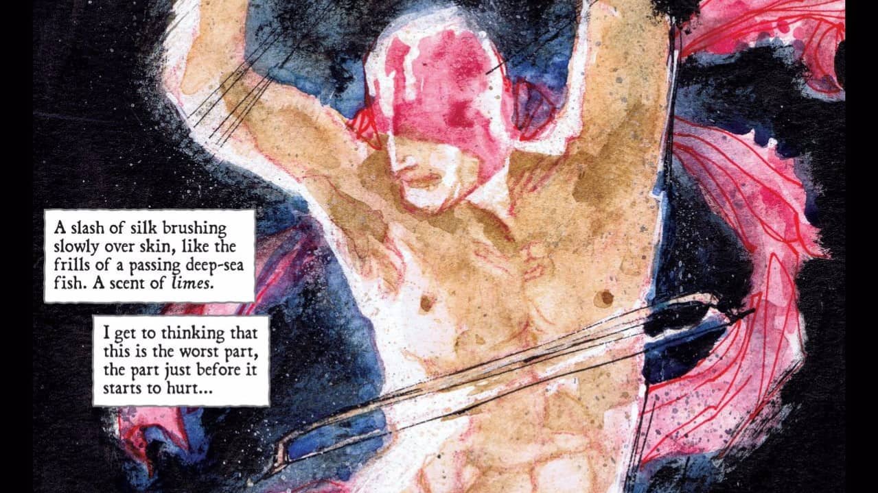
As usual, the art by Tristan Jones is beautifully gloomy and expressive and he continues to manifest some genuinely creepy monsters; one that appears in his issue has such a unique introduction, I wonder if it shows up in the game because man, I’d love to see it in action. The panel layouts are solid but have a nice rhythm, but with only one flashback sequence, there isn’t as much experimentation, which I miss. It also feels like colorist Michael Spicer might have gotten a little out of hand on this issue, as several pages are so dark as to be frustratingly vague (rather than just eerily suggestive) but this could also be covering up some of Jones’ potential sloppiness. Regardless, don’t read this comic in the dark, not because you’ll be scared by it (you might) but because the details are difficult to pick out even in suitable reading light. Outside that, this is still a tight ship, with letterer Neil Uyetake keeping the gory stuff suitably squishy, never failing to give his lettering the appropriate placement, textures and colors.
Silent Hill Downpour: Anne’s Story represents the opposite of the spectrum from Wytches: this comic is a visual tour de force but it’s still an adaptation of a video game and is stuck with some of the problems any adaptation is going to have, where Wytches is fresh and unencumbered. But as I pointed out earlier, Tom Waltz is no hack and the way he writes Anne’s descent into hell (or whatever Silent Hill is) is difficult to put down and that’s worthy of praise. Thanks to the past three issues of this comic, there’s going to be a high bar set for the video game when I finally play it, I can say that for sure.
 SPRING-HEELED JACK #1

Writer: Tony Deans
Artist: Martha Laverick
Publisher: Alterna Comics
Price: $2 (Digital)
I’m a Jack The Ripper fan. When I was a youngster, I read “Yours Truly, Jack The Ripper” by Robert Bloch and that pretty much kicked off my fascination with the historical character. Obviously, “From Hell” was a big deal for me as well, both as a comic and a movie. Yet, despite his perennial popularity, Jack The Ripper owed a debt to his predecessor, an urban legend called Spring-Heeled Jack. Unlike his flesh-and-blood brother, Spring-Heeled Jack was commonly accepted to be a supernatural monster, with leaping and slashing claws dominating descriptions of him, to the point that several well-known newspaper illustrations depicted him with wings. There’s already a high-profile comic about Spring-Heeled Jack, one whose name is only a hyphen away from being identical to this one, but it would appear to be more of a pulp adventure/horror hybrid, while this one is more procedural/horror.
The writer, a total newcomer named Tony Dean, writes this issue with a briskness that is pleasing but doesn’t bother to color outside the lines at all. His Jack is effete and elegant, a well-to-do monster that, depending on your perspective, is either scarier or less so for his charisma. His victims are given just enough depth to make their deaths somewhat meaningful but the investigators he’s ripped from history are such a cliche it’s hard to care about their involvement in the case. Dean would’ve been better off creating a more interesting, dynamic fictional character than the Sherlock/Watson dynamic of Arthur Conan Doyle and Joseph Bell. Thankfully, the focus is on Spring-Heeled Jack and the comic ends with a reminder of how terrifying he should be, if he wasn’t busy being so unhilariously curteous.
Artist Martha Laverick handles lines and colors and does so competently. There’s a charming simplicity to her style, one that has a mild manga-style to it but not distractingly so. But that style doesn’t necessarily serve this story well; the setting of Victorian England doesn’t come to life so much as lifelessly occupy the backgrounds, consisting mostly of walls with vaguely brick-shaped splotches on them. The characters are more interesting visually but that only highlights how tedious the world around them is. Her coloring is much better though, particularly during the opening sequence, her use of candlelight and contrast popping right of the page. But the daytime scenes shouldn’t be rendered in the same broad contrasts of color, yet most of the panels are washed in a vague pinkish-purple. It’s one thing to saturate panels in warm or cool colors to heighten drama but the procedural, daytime scenes should be grounded and realistic to some degree. Page layouts are solid and there’s just enough tweaks thrown in to fend off the monotony of square panel after another. Letterer Joshua Cozine doesn’t get much to do but he does a fine job, placing and augmenting sound effects with a precise touch.
One of the most puzzling things about this comic is how PG-13 it is. As an indie comic about a horrifying Victorian monster, you’d think Dean and Laverick would embrace the violent nature of Jack’s crimes but the one death in the book happens off panel. Is it supposed to be more frightening by implication? Except it’s strongly implied that Jack simply eviscerates his victims with his claws, nothing particularly unsettling about that really. Is it possible Spring-Heeled Jack is written for younger readers? Focusing on historical characters as protagonists might not be the best way to go about this. This is a $2 comic on Comixology and, for that price, there’s just enough quality here to recommend it, but should the next issue lose its precarious footing, I’ll cut it loose without a second thought.
‘REGRESSION’ Comic Review
REGRESSION #1 Writer: Cullen Bunn Artist: Danny Luckert Colorist: Marie Enger Publisher: Image Comi
‘UNDERWINTER’ Comic Review
UNDERWINTER #1 Writer & Artist: Ray Fawkes Publisher: Image Comics Price: $4 CLICK HERE FOR PREV
Comic Review: THE GODDAMNED
THE GODDAMNED #1 Writer: Jason Aaron Artist: rm Guéra Colorist: Giulia Brusco Publisher: Im