

[Comic Execution] 8/29 – WAYWARD, KUNG FU LIMITED, AND THEN EMILY WAS GONE
Last August here in Saint Louis is a very distinctive time of year. We’re right on the cusp of September and as the rest of the continent starts to cool down, the summer doldrums morph into powerful storms and heavy rain. This happens in spring as well but that season is no fun because tornadoes show up and everyone has to flee for the nearest basement. No, the last week of August is much stranger; the temperatures are still high but as muggy days dissolve into balmy nights, the sky cracks open and oceans spill forth. I sound poetic about this because these changes herald the absolute most wonderful time of year, as many of our residents will testify; early autumn. September is a wonderful month for me, as it’s my birthday, and that is followed up by October, both the best month of the year, containing the best day of the year. So as the clouds finally begin choking out the sun and the lighting and thunder battles in the sky every night, I feel the thrill of anticipation.
And as the torrents of warm rain soak the dark streets, I’ll instantly recall one of my favorite scenes in all of cinema history; the rain-drenched beginning of SUSPIRIA. Not to mention all the other great thrillers that took place on a dark and stormy night. Yes, now that summer is draining away, my spirits are beginning to rise. I can practically smell the latex masks already…
WAYWARD #1

Writer: Jim Zub
Artist: Steve Cummings
Colorist: John Rauch
Publisher: Image Comics
Price: $3 (Digital)
I was immediately a bit wary about this comic when I approached it from the Comixology marketplace, despite being an Image title. The plot summary reads, right off the bat; “BUFFY THE VAMPIRE SLAYER FOR A NEW GENERATION!” I’m not sure who wrote that copy but it’s pretty lazy and treats potential readers like morons. But Jim Zub’s name helped offset that initial offense, as his medieval fantasy parody SKULLKICKERS is one of Image’s most underrated hits. I’ve never heard of the artist and, after some research, it looks like he’s done a bit of work for a lot of publishers, so he’s definitely a pro, if one with not much visibility. So I really didn’t have much idea of what kind of quality to expect with WAYWARD.
The comparison to BUFFY isn’t entirely misplaced but it’s also not appropriate. Yes, the main character is an attractive yet slightly weird young girl who is suddenly caught up in the world of the supernatural. But this isn’t really the draw of the series. Instead, it’s the setting of Tokyo that provides the biggest thrill, because rather than sticking to generic, Anglo-European supernatural myths, Zub incorporates classic Japanese folklore instead and, of course, there’s the cultural dynamic as well. Unfortunately, like Buffy, protagonist Rori Lane has more than a bit of Mary Sue about her; Irish father, Japanese mother is the immediately red flag. Then there’s the fact that she’s in high school but speaks fluent Japanese is a bit hard to swallow, even if she was apparently “immersed” in both cultures. And, of course, she’s perfect looking and has impeccable fashion sense. When she suddenly develops a supernatural sixth sense that prevents her from getting lost, I balked disdainfully.
When we meet her mother, it becomes painfully clear that artist Steven Cummings isn’t at all interested in realism, because she looks like she should still be in high school herself! I mean, sure, Japanese women are notorious for being ageless but unless she had this girl in her late teens, there’s no way her mom wouldn’t have at least SOME wrinkles. There’s a subtle hint that her Irish father may have gotten physically abusive with her, which is wonderful because daddy issues. How could a girl who’s been through such recent trauma be so paradoxically extroverted? I’m not asking for her to be angsty but so far I’m not sold on this character at all, especially since the first six pages are slathered in captions that tedious exposit her life story. Somebody definitely forgot to “show, don’t tell.”
When Rori’s cornered by a bunch of street toughs, she tries to intimidate them, which is incredibly myopic given her appearance, so she must be utterly unselfconscious, despite managing to look preposterously fashionable. Then the other protagonist shows up and everything gets turned upside down. Ayane is some kind of cat spirit (a kitsune?) who appears as an attractive girl who also looks high school age and wears fashionable clothes! What a coincidence. Anyway, the when the thugs encounter her, they ditch their human disguises because… well, anyway, there’s a fight, Rori’s aforementioned sixth sense manifests again, the good guys escape, Ayane and Rori make fast friends and that’s it.
I’ve already jumped the gun on the art, griping about Steven Cummings’ and possibly Jim Zub’s decision to portray Rori’s mother as a young adult, rather than the middle-aged person she should be. Outside his characters, Cumming’s art is actually incredible; backgrounds overflow with details and authenticity, lines are machine-like in their precision, POVs are consistently engaging, layouts are energetic, monsters are very cool looking, there’s some mild gore that’s really well done, but his characters…
Steven Cummings’ draws girls (and, in Rori’s mother’s case, women) in a way that I don’t like. They’re not overtly sexualized yet there’s a creepy kind of perfection to their looks. All of the background characters appear realistic and detailed but Rori, Ayane and Rori’s mother look completely flawless. Idealized. Airbrushed. I mean, sure, Ayane’s a supernatural being so I guess you can get by with that as an excuse, and Rori’s the main character so naturally we don’t want her to be a perfect looking human being, but when I saw Rori’s mother, that was where I drew the line. There would’ve been nothing wrong with giving her some age, putting some weight on her body, anything that could define her as a real human. Nope. She looks like a supermodel, just like Rori, just like Ayane. And if that’s going to be a (very annoying) thing, I’m not going to put up with it.
Special note; what’s with the lettering? There’s only ONE instance of lettering of any kind for the ENTIRE first half of the book. They finally show up when the fight happens, and it’s solid stuff from there on out, but what the heck is up with the complete silence of the first 12 pages? It’s Tokyo, for crying out loud! Is this supposed to reflect the change that comes over the city at night? Is it on purpose? I can’t tell honestly, and that’s not a good sign.
In the afterword, writer Jim Zub promises that WAYWARD will have “bigger puzzle pieces slowly fitting together to make something unexpected.” But at the moment, WAYWARD is shallow, packed with schmaltzy characters going through the motions of a predictable story, suffering from an excessively glossy art style. But here’s the big problem; earlier, I said that WAYWARD shouldn’t be compared to BUFFY, and here’s why: where BUFFY’s secondary characters actually buoyed the show and kept the relatability of the stories, WAYWARD’s secondary characters are just as flat and generic as Rori herself. And with Zub’s promise that things will move “slowly,” I’m not going to bother waiting for a second issue on this series. WAYWARD, I’m afraid, is getting the axe.
AND THEN EMILY WAS GONE #2

Writer: John Lees
Artist: Iain Laurie
Colorist: Megan Wilson
Publisher: Comix Tribe
Price: $2 (Digital)
So very glad to see this comic exploding onto the scene like it properly should. The thing that’s great about AND THEN EMILY WAS GONE is that it’s a fresh, unusual approach to comic book horror. As an opposite example, take Robert Kirkman’s OUTCAST, the first post-THE WALKING DEAD horror comic he’s attempted. With the recent peak saturation of possession horror, it’s a bit hard not to look at the identically-themed OUTCAST with some cynicism, particularly since it retains so much of the dramatic, rather than horrific, core which THE WALKING DEAD was so well known for. But attempting to draw parallels to anything current with ATEWG is difficult; it’s heavily rooted in Stephen King but draws more from his earlier, more surreal works than his modern, concept-heavy efforts like THE CELL or UNDER THE DOME. At one point, AND THEN EMILY WAS GONE writer mentioned fellow Brit filmmaker Ben Wheatley (KILL LIST, A FIELD IN ENGLAND) as an influence and it clicked; his comic reads precisely like Ben Wheatley adapting a Stephen King novel into film. WHICH NEEDS TO HAPPEN.
John Lees’ writing for this issue gives equal real estate to the three narrative threads, following pseudo-hitman Vin, protagonists Fiona and Greg, and the mystery of Emily’s father’s new hobby. As the balancing act goes, it’s a bit ironic that the scenes that involve the “core” story are the least interesting. Vin’s a terrible man but Lees is demented enough to offer us a vision of the even more horrifying people who employ him, and he succeeds by working with the reader’s imagination, rather than against it. By putting Vin’s boss out of sight but not out of reach and making his presence a thing soiled with blood, Lees proves he understands that it’s what you don’t see that really frightens. Fiona and Greg’s story further develops the lurking menace behind the quaint facade of Merksay, but is more conventional about it; when the characters’ backs are turned, old women mumble demented threats and local tavern patrons issue ominous declarations. The best part of Fiona and Greg’s tale is actually the scene where Fiona waves at her father; there’s something haunting and darkly melancholic about it that I can’t quite place. Elsewhere, Lees contradicts his earlier attitude of keeping the horror in the dark by showing us exactly WHAT was in the box from #1. It’s a shocker only in the sense that it doesn’t make much sense, but that’s actually part of why it works; what’s inside is only frightening in what it implies, but while that does muffle what could’ve been a startling twist, Lees deftly unveils an even more chilling detail immediately after, and THAT is what makes the scene truly grotesque.
The art from Iain Laurie gets to really shine this issue. Of particular note is the receptionist scene. The way Iain renders the computer, the pneumatic tube and the message cylinder so plucks a chord so perfectly unsettling, it’s like some kind of mutant that’s pretending to resemble technology just long enough to devour someone from the inside. The whole scene evokes the retro-grunge of Terry Gilliam’s BRAZIL yet also has the queasy pseudo-biology of Cronenberg’s VIDEODROME. The poignant and gloomy moment between Fiona and her father is heightened by his deceptively detailed depiction of their home in Merksay, viewed from the outsider, where heavy clouds, distant hills and crooked plank fences impose somber dreariness on what should be a hopeful scene. The layouts manage to be varied enough to give each page a distinct narrative role without cramping the art even a little. Megan Wilson’s colors are even more dominant in this issue, reinforcing the griminess and moodiness of Iain’s lines with heavy contrasts, deep shadows, subtle palettes of dust-coated blues and purples, all refined down when necessary but often heightening the tension and foreboding with their weighty presence.
AND THEN EMILY WAS GONE is a genuinely frightening comic. It’s also ridiculously cheap, at only $2 an issue, and it has a wonderful bonus feature on the last page: Merksay Stories, which recount urban legends from the disturbing island, usually centering on the legend of Bonnie Shaw. They do feel derivative of the infamous creepypasta memes but couched in the comic’s lore and accompanied by Iain’s art, it’s a simple yet effective way to elevate the creepiness of the book. While the story is taking its time getting where its going and sometimes does so in cliche manner, it’s also mired in some serious nightmare fuel. Read it if you like being scared.
 KUNG FU LIMITED #1

Writer: Nick Flatt
Artist: Andrew Herman
Publisher: Bang Bang Comics
Price: $2 (Digital)
It was a slow week for comics and as I scoured Comixology’s digital releases, I stumbled upon this comic from relatively new publisher BANG BANG Comics. The cover attracted by eye, ironically enough, not because of the gratuitous ass-shot but because I immediately recognized it as a clever homage to the cover of the classic Eighties album ‘Get Lucky’ by Loverboy, with the signature red leather pants inverted to a red leather jacket over tight jeans. And, well, nunchuks. So, yeah, color me intrigued.
The story follows three martial arts expert operating a private security agency. Not particularly well, it would seem, as their de facto leader keeps turning down much needed payment. The two men of the group are pegged as oblivious morons while the girl of the group constantly puts up with their man child behavior. Sadly, most of the jokes aren’t funny enough to make this seem like anything besides an impossibly parasitic relationship. There’s a pot dealer of the legal variety who hires them and this provides the main arc of the issue, and things get a bit funnier with the introduction of that character, but some of the jokes fall flat, particularly the non stop stoner jargon that loses its charm almost instantly. That said, the line about ninja stars is a shining example of how well Nick Flatt & Andrew Herman’s comedy can work, when it does. There’s a big build-up to a joke that isn’t nearly as unexpected as they wanted it to be but is pretty hilarious anyway, mainly because of the quirky dialogue. Their misadventures with pot brownies? Not so funny.
The artwork, by Andrew Herman, is rough but has potential. The backgrounds are simple but effective at conveying just enough information about the scene without distracting from the action. The characters are all well defined and have a suitable range of expressions, though close-ups and some actions scenes are clearly a bit out of Herman’s range, as his lines get a little sloppy, sometimes distractingly so. It’s good to see that both the male and female characters are drawn with equal amounts of sex appeal. The action scenes aren’t particularly inventive and feel more like Herman trying to impress, because a lot of the poses are flat. The colors are effective and versatile, to Herman’s credit.
This book is a pretty shaky affair. The story isn’t a huge draw and while the comedy is at times absolutely brilliant, it’s not consistent enough to justify art that is equally as unreliable. And while it’s pretty cheap at $2, it also doesn’t really satisfy, especially at only 21 pages. Sadly, in an already flooded comic book market, something like this should be dirt cheap. In fact, I can name several free to read webcomics that are significantly better than this so there’s really no justification for the price.
‘REGRESSION’ Comic Review
REGRESSION #1 Writer: Cullen Bunn Artist: Danny Luckert Colorist: Marie Enger Publisher: Image Comi
‘UNDERWINTER’ Comic Review
UNDERWINTER #1 Writer & Artist: Ray Fawkes Publisher: Image Comics Price: $4 CLICK HERE FOR PREV
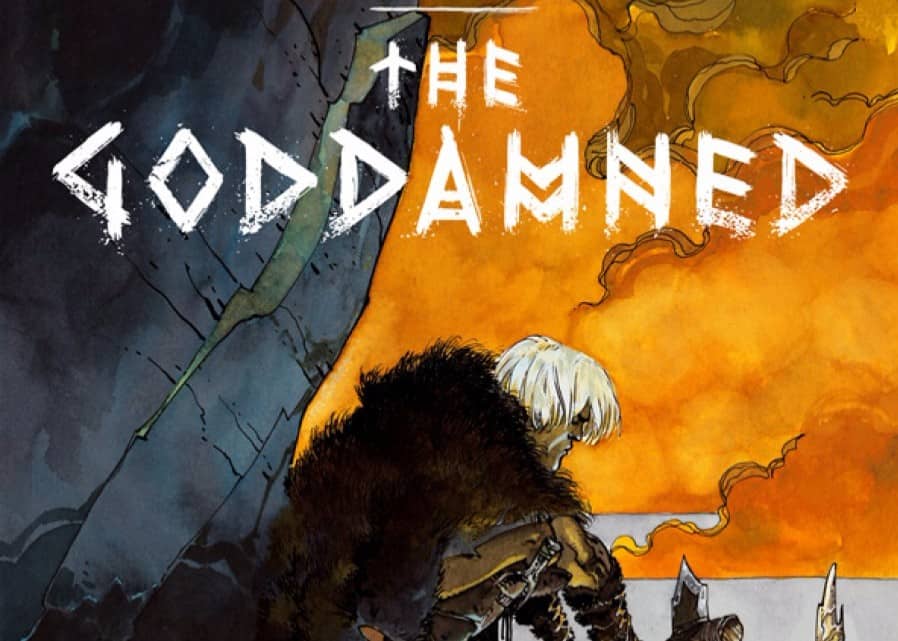
Comic Review: THE GODDAMNED
THE GODDAMNED #1 Writer: Jason Aaron Artist: rm Guéra Colorist: Giulia Brusco Publisher: Im