

[Comic Execution] 8/23 – HELLRAISER: BESTIARY, LITTLE NEMO: RETURN TO SLUMBERLAND, JUSTICE INC
Last week was moving week. It’s been a little hectic. It’s cool though, because if my plans go through the way I want them to, you’ll have more COMIC EXECUTION than you can handle in about a month. Here’s a hint: FIRE & STONE.
Regardless, this week’s column is extra long to make up for last week’s absence. It’s probably not much consolation for you but hey, at least I acknowledge my failures by overcompensating?
HELRAISER: BESTIARY #1

Writer: Ben Meares, Mark Miller, Victor LaValle
Artist: Conor Nolan, Colin Lorimer, Carlos Magno
Colorist: Tamra Bonvillain, Michael Garland
Publisher: BOOM! Studios
Price: $4 (Digital)
This comic was kind of doomed from the start. You see, when I see the word “bestiary” my immediate association is with roleplaying games, whose massive catalogs of monsters are usually called “bestiaries” so, naturally, I was hoping against hope that HELLRAISER: BESTIARY would actually be just such a compilation of the evil things which populate Clive Barker’s Hellraiser mythos. Alas, it is not. But it is an anthology-style comic set in that same world, so all is not lost.
There’s three tales, two from Ben Meares & Mark Miller, the latter of whom is responsible for the excellent NEXT TESTAMENT, also adapted from Clive Barker’s work, while the “center” story is penned by Victor LaValle, acclaimed horror novelist.
The first tale is Pinhead-centric and sees the infamous Cenobite becoming unusually reclusive after an undetailed excursion to the realm of mortals. Inside Pinhead’s lair, he is ramping up his executions of human mortals obsessively while outside, his Cenobite followers congregate and, eventually, tear each other apart. It’s interesting to see Pinhead actually impacted by something, so much to the point that his behavior becomes erratic and it’s equally as intriguing to witness beings as seemingly inhuman as the Cenobium doing something as mundane as fighting amongst each other re: Pinhead’s absence. What exactly is Pinhead’s game? Honestly, the way this comic is written, I’m not entirely sure. If my assumption is correct, then we get to witness Pinhead trying his best to wring as much pain and misery from his victims as possible in a pretty creative way as a vicarious form of vengeance for whatever befell him on Earth, but without any real understanding of Pinhead’s psychology or what preceded these events, I can’t be totally sure. As a result, this story comes off less frightening and more comedic. Which, admittedly, might be the intent. But it certainly isn’t a satisfying story.
The central tale, from LaValle, is far more illustrative, focusing on a series of disturbing events within a family shelter in Queens, and a particular Puzzlebox that triggers these events. It’s a gruesome tale, one that is as much about the diabolical corruption infesting the human mind as anything else. LaValle’s characters are appallingly real, ripped from the same confused, unhappy cloth as Clive Barker’s creations. One of the things that many don’t much care for about Barker is that he doesn’t write heroes or even protagonists; everyone’s a potential antagonist and nobody is going to save anyone. LaValle emulates this admirably, with main characters Sandy and Danny being fucked up in a pretty understandable way, meeting horror with horror. The rest of the characters come off a bit one note, but the mystery surrounding the “shelter” and its administration lends them an intriguing depth. What’s more interesting is the mysterious stranger who shows up and unleashes an otherworldly horror, one I don’t think has been seen in the world of HELLRAISER before. There’s a delightfully macabre moment where a young girl witnesses most of the worst of what happens and basically is charmed by the whole thing. LaValle might not have much room to tell a story and his tale is as open-ended as the previous one, but the inclusion of genuinely interesting characters elevates it to something I find myself invested in.
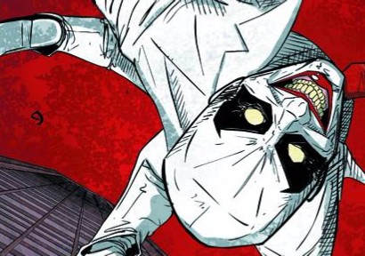
The third tale is short and, in the sense of the Hellraiser canon, possibly the most transgressive; Pinhead is trapped by a group of arcane magic-wielding badasses with a most unusual purpose in successfully capturing the Cenobite. I don’t want to spoil anything but what Miller and Meares have set up with this story is potentially awesome. It doesn’t hurt that the aforementioned badasses are actual badasses, wielding assault rifles loaded with bullets that have runes CARVED INTO EACH ONE. That’s a lot of bullet carving. There’s also a lovely bit of humor from Pinhead that is so well timed it’s hard not to laugh.
There are three different artists on board, one for each story, and they’ve got very different things going on. Conor Nolan’s opening is pretty weak. His style is impressionistic and very light on detail, which is a major bummer because I would’ve loved to witness the Cenobite homeworld in all its hellish glory. When he does go whole hog with detail, it gets messy, and not in a good way. Plus, his character expressions are stiff, though that might be intentional, and this is supported by the fact that the one emotional note we see is an utterly bone-chilling smile. But it doesn’t excuse entire panels that are just geometrical shapes. Overall I wasn’t impressed with Nolan’s work and it’s also telling that he did the colors for his story as well.
Colin Lorimer’s renderings for LaValle is, as usual, top-notch stuff. His panel layouts have a diversity that infuses the narrative with a needed rhythm and his POVs are equally distinctive. When the actual horror stuff goes down, Lorimer gleefully proves that less is more, effectively contrasting Nolan’s buckets of gore with two savage fatalities whose payoff is more than earned. The colors, from Tamra Bonvillain, are mostly subdued and moody, which works mostly because of detailed they are, but when they spring to crimson life, it’s pretty glorious.
Carlos Magno illustrates the last story of the issue, bringing an ultra-gritty flair to the proceedings. His lines are bold and expressive and every panel has a big, in-your-face feeling to it. His layouts accentuate his cinematic visuals but occasionally break up the sameness at key points. Character designs are both intriguing and detailed, feeling heavily Mad Max/The Warriors inspired, and his depiction of Pinhead is actually the coolest I’ve ever seen. The colors, courtesy COMIC EXECUTION regular Michael Garland, are absolutely fantastic: he coats the pages in dirty yellows and reds, miring Magno’s lines with hot, oppressive tones, mixing in subtle purple and blue hues to accent the fiery brightness. Between Garland and Magno’s work, you can almost smell the sweat and cordite.
The biggest problem with this series is the first story, which honestly feels not just out of place but sloppily made as well. It’s ten pages of subpar comic, which leaves a mere 14 pages of comic worth paying money for. But this is also an expensive comic at $4 per issue, so it’s hard to excuse such a significant chunk of disappointment, especially frontloaded. But I am really sold on the last story of the issue, which continues in HELLRAISER: BESTIARY #2, so I’m going to wait until that issue comes out before I make any hasty decisions.
LITTLE NEMO: RETURN TO SLUMBERLAND #1

Writer: Eric Shanowar
Artist: Gabriel Rodriguez
Colorist: Nelson Daniel
Publisher: IDW Publishing
Price: $4 (Digital)
I’ve always been a pretty big LITTLE NEMO fan. Not because of the comics, of course, but because of the video game and, to a smaller extent, the 1989 movie. Yes, that’s right, the video game had a bigger influence on me than the movie did. To be fair, it was actually one of the very first video games I ever played, alongside GYRUS and GYROMITE (and the usual suspects, of course). I was a little bummed when I saw the movie because, unlike the game, it didn’t feature Nemo getting cool powers from animals, but it was still weird enough to charm my already jaded sensibilities. I didn’t find out it was based on a comic strip until nearly a decade later. I still haven’t seen anything more than a few strips but I can absolutely see why it’s influential. And I can also see why an attempt to update it would be controversial, even with two critically acclaimed creators at the helm.
The writer, one Eric Shanowar, is known for his bestselling comic adaptation of THE WIZARD OF OZ, one that pretty much launched the career of artist Skottie Young. It’s appropriate that Eric is handling this, given his superb work on the former. Shanowar kicks off the story with a prologue of sorts, establishing humorously the bizarre whimsy that is Slumberland while poking fun at bureaucracy. When the new Nemo is introduced, Shanowar uses him to slyly acknowledge and subvert the expectations of readers familiar with the Nemo of past; he’s present as totally unwilling participant at first, which actually gives the initial run of “dreams” a more slapstick style of comedy. That’s something that’s surprising, in that Shanowar embraces the comic strip narrative of the original series, where there’s no obvious plot arc, at least not at first. But as Nemo gradually experiences more of Slumberland, he becomes more interested in it, and the dynamic of the dreams changes. In this way, Shanowar cleverly riffs on the idea of lucid dreaming as the gateway into Slumberland. All of this happens beneath a colorful series of weird yet whimsical misadventures. Like Nemo, by the end of the first issue, Shanowar has his readers thoroughly intrigued by the possibilities that lie within Slumberland.
I’ve seen Gabe Rodriguez’s art for the smash hit LOCKE & KEY and, honestly, wasn’t particularly impressed. But I also didn’t realize LOCKE & KEY was an intentional mash-up of horror, fantasy and drama, rather than just straight horror, so that’s probably why I was turned away. Gabe’s art for LITTLE NEMO seems to be quite a bit different to me, particularly his character designs, which feel heavily rooted in the style of LITTLE NEMO creator Winsor McCay, rather than the distinctively exaggerated style he’s known for. It’s actually quite the feat because, near as I can tell, not a note of Rodriguez’s draftsmanship falters as a result of his chameleonic transformation. If anything, he approaches the role with the kind of energetic enthusiasm I wish every artist approached their source material with. Page 11 alone is stunning to behold at first glance but further attempts to pare it down to digestible components is futile; the visual path of the narrative swerves drunkenly and weaves into itself, surfing atop a wave of lush, insanely detailed yet tightly controlled art. Rodriguez effortlessly evokes the naive charm of McCay alongside his absurd beauty while simultaneously packing in the kind of detail and action we expect from modern comics without compromising either. That’s a huge deal. Similarly, colorist Nelson Daniel lays down panel after panel of often bold, typically impeccable colors that are as effervescent and punctual as Rodriguez’s lines. But there’s also a lot of minutia in his work that deserves close scrutiny; textures hum in the backgrounds, flavoring the occasional scene with more layers of art.
The thing about this debut of LITTLE NEMO that deserves a lot of praise is an element of the narrative and art combined that I witness rarely. Starting in the first page, the panel layouts are big and perfectly proportioned but totally unremarkable, even during the prologue that takes place in Slumberland and into Nemo’s first encounter with Slumberland in the form of the officious emissary Popcorn (who is, notably, an adult). It’s not until Nemo encounters the younger Bon-Bon and reluctantly agrees to visit Slumberland that, suddenly, the panels lose their rigidity, transforming into a downward slide. From that point on, the only stability in each page is the ultimate panel in which Nemo awakens in his bed. The important thing to note is that it’s not until Nemo first agrees to enter Slumberland that the panel dynamics change.
There are other ways that Shanowar and Rodriguez visually convey the transformation of Nemo from begrudging skeptic to dream enthusiast. The first trip he takes into Slumberland, he’s conveyed there via bed, over which he has no control. The second time, though, it’s his curiosity that gets the better of him, though it’s again his bed that he has no control over that transports him. By the third night, he expresses vague disappointment that his sleep will be untroubled by Slumberland but this time his vehicle to the land of dreams isn’t triggered by a Slumberland herald or a button but just manifests unexpectedly. This evolution reflects his gradual shift in attitude towards Slumberland. I point this out because it’s not immediately obvious and, as a result, the wacky ways that Nemo ends up in Slumberland seem absurd, yet even that is on purpose. These are dreams, after all.
Obviously, LITTLE NEMO: RETURN TO SLUMBERLAND might not be for you. You might think that kid’s stuff is for kids and you only read “adult” comics. If that’s the case, I’m sorry to have wasted your time. Your sad, brief, cruel, incredibly limited time. But if you’re, you know, a decent human being, you NEED to go get this comic. It’s stupid good. Get it, read it, then reread it. The first read will be the fun one, the second one will be there one that leaves you amazed.
 JUSTICE, INC #1

Writer: Michael Uslan
Artist: Giovanni Timpano
Colorist: Marco Lesko
Publisher: Dynamite Entertainment
Price: $4 (Digital)
MORE PULP COMICS! Is there such a thing as too much pulp comics? There is. I am witness to this, and it is called JUSTICE INC. Despite the obvious danger in doing so, Dynamite Entertainment has brought together three “classic” pulp heroes in one comic. Now, pulp hero team-ups are nothing new for Dynamite but this is is the first time-crossing triple threat that I’m aware of. Sadly, only one of the heroes present has any star power and that’s The Shadow. His cohorts, Doc Savage and The Avenger, are barely known in the comic world at large, even by someone as nerdy as me. But hey, maybe they have a really cool villain to balance it out…
The writing is handled by one Michael Uslan, a lesser known Hollywood executive producer who, according to IMDB, is executive producer for 99% of every BATMAN movie ever made, including animated films. How have I not heard of this guy? If his writing for JUSTICE INC is any indicator, he needs to be escorted away from the set of any movie, regardless of how much cash he’s throwing at the studio. The beginning of Justice Inc immediately gets into hokey nonsense regarding the “God” particle and time travel, spending way too much time talking about that pseudoscience and not enough time moving the plot along. It’s a bit more interesting when the story goes back to the genesis of Doc Savage’s time travel idea, putting HG Wells, Albert Einstein and Enrico Fermi together in the same place, which is actually pretty fun while it lasts, but it still spends too much time on pointless scientific exposition. Fortunately, this moves to some corporate intrigue elsewhere, but the dialogue is still absurdly corny, even for pulp comics.
Halfway through the comic, something finally happens; an airliner is sucked through Doc Savage’s accidental time warp, forcing him to try to save them. They all end up in 1939, which is coincidentally the same era as The Shadow’s heyday. As you can tell, the plot is pretty flimsy. One of the pilots comments that they’re “running out of fuel.” HOW? It only gets more preposterous from that point on. Some villain is introduced, as well as a mysterious, invisible interloper, but they’re only present long enough to make themselves known, and then the comic ends. It feels like it takes hours to get through, and not in a good way.
The art, by Giovanni Timpano, is quite the opposite; consistently thrilling and packed with details, yet tightly controlled. Timpano shifts from locale to locale with no visible dissonance and capably renders all the environments without missing a single element. His characters are expressive and distinctive, and designed with both realism and a distinctive flair. HIs layouts are complex but intuitively readable and there a lot of moments where he experiments with his panels, incorporating them into the visual narrative, such as page 16, where Doc Savage’s experiment succeeds in transforming the page into energized rays. Colorist Marco Lesko does his best to keep up with these lines and supports them quite well but there isn’t anything remarkable. The lettering is underwhelming, totally dwarfed by Timpano’s action.
I’m giving JUSTICE INC another issue to reassemble itself after a pretty rough start. To be fair, uniting three disparate characters and their worlds is no easy feat but what we have here feels so sloppy and discordant, it feels like we would’ve been better served by snippets of flashbacks, rather than the tedious exposition that dominates this issue. Still, Timpano’s art promises much to look forward to if this thing actually gets off the ground, and given that The Avenger still hasn’t been introduced, I can see that happening. Still. at only 21 pages for $4 bucks, it’s going to have to really deliver. We’ll see.
[Inked In Blood] New And Upcoming Comics For August 19th, 2015
IN SHOPS THIS WEEK: WELCOME BACK #1 Writer: Christopher Sebela Artist: Jonathan Brandon Sawyer Co
[Inked In Blood] New And Upcoming Comics For July 8th, 2015
IN SHOPS THIS WEEK: NEGATIVE SPACE #1 Writer: Ryan K. Lindsay Artist: Owen Gieni Publisher: Da
[Inked In Blood] New And Upcoming Comics For March 13th, 2015
IN SHOPS THIS WEEK: HELLBREAK #1 Writer: Cullen Bunn Artist: Brian Churilla Publisher: Oni Press