

[Comic Execution] 6/6 – ‘NAILBITER’, ‘BIG TROUBLE IN LITTLE CHINA’, ‘BURN THE ORPHANAGE’
TONIGHT. MIDNIGHT.
‘HP LOVECRAFT’S FROM BEYOND’ AT THE HI-POINTE THEATRE. LATE NITE GRINDHOUSE.
I can’t even tell you how stoked I am for this. One reason you’ve got to see this movie is for a very geek reason; the title credit is done in one of the coolest design schemes I’ve ever seen. You just don’t know how cool it looks until you see it on screen. The other great thing about the movie is that it’s progressive for its genre, with a female protagonist who not only makes other horror movie heroines seem like idiots by comparison but is also not an ice queen either. I really can’t say enough about how much I love this flick. If you’re here in Saint Louis, go see it tonight or tomorrow night! If you’re not, why not join us at home and watch it on Crackle or Hulu? I guarantee, it’s a damn good time and pretty much required viewing for horror fans of all kinds.
 NAILBITER #2

Writer: Joshua Williamson
Artist: Mike Henderson
Colorist: Adam Guzowski
Publisher: Image Comics
Price: $3
I’m glad to see this comic getting the traction it deserves. It’s been highlighted just about everywhere comics are talked about, which is actually kind of a shame because Williamson’s writing is about the same here, which seems to say to me that its explosive popularity has more to do with the recent fixation pop culture has with serial killers, but that’s also not factoring in the more eye-grabbing artwork. Not that I didn’t love Miroslav’s art on ‘Ghosted’ but it was more subtle and restrained than what Henderson does here. They both have their merits, but one is just more flamboyant than the other. And, sadly, flamboyant moves more comics.
I’m a bit way of how Williamson is handling his titular character, introducing him right away as a generally unlikable jerk. This isn’t surprising, since most the characters in this book are dramatically flawed in sometimes not so obvious ways, but Nailbiter is just right out a smug arse. I say this worries me because generally that sort of arc is very predictable; his personality belies a redemptive character that emerges as the story progresses, something I really don’t much care for; I like unrepentant assholes, personally, because frankly I haven’t yet met a jerk who “redeemed” themselves down the line. Jerks are jerks for a reason. We’ll see how the character evolves but I hope it’s not as predictably as I fear. There’s a fire, which is a nice elemental inversion of the rain that drench the town in the issue prior, and this segues into a well-timed, delicious plot twist, pushing the tale deeper into murky depths. Sadly, this is followed up by a pretty boring conversation between the two protagonists that serves mostly to color the history of the town with almost no obvious connection to the plot. If Williamson is indeed going to tie all these details up into one neat bundle, I’ll eat my foot. Twice. The last page gives the readers a nice hint as to how the next issue is going to go down and it’s promising.
Henderson’s art is really incredible this issue. His ability to convey a sense of place and firmly ground his characters in those locales is incredible, working with a lot of dynamic depth in each panel. Just randomly opening a page (7), I see in panel five that Henderson drew a row of coat hooks beyond the front door of Nailbiter’s home, and they look PERFECT. Like, who DOES that? The scene after the fire is deep with ash-blanketed atmosphere but still bustling with detail, and one of the panels presents a cast 8 characters deep, all quite distinct and full-fleshed. But my favorite, absolute favorite part of this issue is the death scene halfway through the book. Without giving too much away, it really marks the first time anyone in comics has successfully imitated the first-person camera work of the horror masters, evoking Dario Argento and John Carpenter in the best way. It’s a huge thing and worth the price of entry alone. I really hope we see another death scene like this in the series.
At only $3, the second issue of NAILBITER wins again, even if I’m a bit wary of the way Williamson is crafting his story. I should also mention that this is only 20 page comic, which honestly is a little disappointing but with art this stupendously good, I’m actually quite satisfied. Here’s hoping the next issue is a little weirder and that Nailbiter himself gets to be the delightfully cruel, unlovable bastard I want him to be.
BURN THE ORPHANAGE: REIGN OF TERROR #2

Writer: Daniel Freedman & Sina Grace
Artist: Sina Grace
Publisher: Image Comics
Price: $3
I’m definitely still pretty curious as to what the story was with the previous issue of BURN THE ORPHANAGE: REIGN OF TERROR. Specifically, whose decisions was it to wedge a completely unrelated back-issue of a different comic while compressing an important #1 to only 20 pages, then tacking on an extra fifty cents to the price? I probably wouldn’t have judged it quite so harshly if not for that extra cost that didn’t seem particularly justified, given how the quality of the comic had lowered since the last arc. Has that quality changed since that issue?
The writing feels more energetic than the last issue, bouncing back and forth between multiple character conflicts then running headlong into a serious battle which segues into an interesting twist. While all this follows protagonist Rock, there’s an intriguing scene that details the antagonist character further as well as an even twistier end page revelation. It’s all very well coordinated and, thankfully, this issue also sees grimness of the books current scenario much more accentuated, with a peripheral character death played comedically but still effectively elevating tension. Sly nods at anachronistic hacker BS in action films are part of the comic’s delicate balancing act of drama and tongue-in-cheek parody. I was a bit offput by the weird attempts at hipness by introducing drug use though. Regardless of the few shaky scenes, this issue is far more satisfying than than the previous one.
Sina’s art appears to have solidified with this issue as well. Linework feels more coherent overall and colors contain more refinement, but the real excitement is the detailed background work and panel dynamics. Page six is a perfect capsule of how Sina’s art works; two characters in the foreground remain static for all four panels with a pleasingly gritty background as a character in front of it provides the dynamics. A panel on the next page packs 12(!) characters in its borders and Grace manages it with surreptitious visual tricks. Page 8 has a clever block of compressed images conveying flurries of blows very effectively, cut off with the punctuation of a yelling mouth. I won’t go much further into the art because it would give away some of the plot but Grace maintains this level of energy throughout.
Like the previous issue of BURN THE ORPHANAGE, this one shares space with another story, and while I like this story a bit more than the previous one, it’s still unwelcome. Fortunately though, this book is only $3 and is much improved from the previous. This new BURN THE ORPHANAGE arc survives to the next round.
 BIG TROUBLE IN LITTLE CHINA #1

Writer: Eric Powell
Artist: Brian Churilla
Colorist: Michael Garland
Publisher: BOOM! Studios
Price: $4 (Digital)
I’m a big John Carpenter fan, as should be any person reading this website on a regular basis. ‘Big Trouble in Little China’ is one of his truly cult films, as out of place in his filmography as anything else but also thoroughly deserves its cult status. It’s hard for me to name a film that’s as fun to watch, which is saying something for a guy whose prior flicks were almost entirely thrillers, though it does share the same surreal, absurd comedy of ‘Dark Star.’ The film itself ends on a notorious cliffhanger and it looks like BOOM! Studios is determined to clear that up with the help of noted pulp comics revivalist Eric Power of ‘The Goon’ whose comic shares the self-aware humor of ‘Big Trouble in Little China.’ Carpenter himself is also credited, naturally incurring my curiosity regarding how much of an involvement that means. Artist Brian Churilla has popped up once before in my readings via ‘We Kill Monsters,’ another title that shares themes with ‘The Goon,’ though Brian is best known for his cover art on sci-fi thriller BlackAcre. Let’s see if their collaboration with Carpenter can stand up to the expectations placed on it.
As expected, Powell keeps the tongue firmly in cheek throughout the book, subverting expectations left and right to humorous effect. Jack Burton is written with the kind of aggressive silliness that this book really needed and Powell delivers confidently. It’s genuinely hard not to hear Russell’s voice when reading Jack’s dialogue in this book. Powell diverts the main narrative away for a few pages to delve into a hilarious part of Jack’s history and while it’s a bit of a disruptive diversion, it also serves to establish how regular this kind of weirdness is in Jack’s life. Whether for good or bad, the core tale is an extension of what happened on the movie, plugging in another bad guy in the place of Lo Pan, a pretty nondescript one at that who lacks that villain’s distinctiveness, sadly. Fortunately, Powell is smart than that, as this new antagonist is merely a catalyst for what sounds like a pretty awesome supernatural quest Jack has to take on. So yeah, it’s Powell doing his best to homage and extend the original film and he does a damn good job.
Brian Churilla has a lot on his plate with BIG TROUBLE IN LITTLE CHINA and he does his best to carry it. His lines are expressive and fresh, with just a dose of cartoonishness to them, reinforcing the light-hearted tone of the book, though the way he draws the demon at first is surprisingly ferocious, which delightfully sticks throughout, augmenting the chuckle-worthy juxtaposition. Sadly, though, Churilla appears to be averse to backgrounds in general, opting to set his action in mostly non-descript blanks, sometimes peppering them with necessary details and small crowds but never holding those in place. This definitely gives the book a cheap feel, like it was rushed to print. It’s not like this is a thing that cripples the book but it becomes even more glaringly obvious given how much work Michael Garland put into the excited, vibrant colors as well as Ed Dukeshire’s appropriately oversized work on lettering.
This is a $4 book, the top of the price spectrum, and it nearly delivers on that promise. Churilla needs to step it up a notch, though. Or maybe BOOM! needs to look into hiring a background artist. I hope the art improves in the next few issues because it’s hard to justify a premium price on a title whose art is only half there, especially when cheaper titles like ‘Nailbiter’ and ‘Burn The Orphanage’ manage to deliver on all fronts.
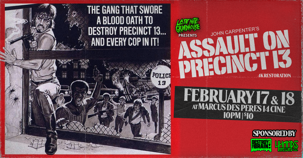
Late Nite Grindhouse Presents ‘ASSAULT ON PRECINCT 13’ at Marcus Des Peres 14 Cine on February 17 & 18
Late Nite Grindhouse in St. Louis continues our 13th year in 2023 with a classic in exploitation, lo
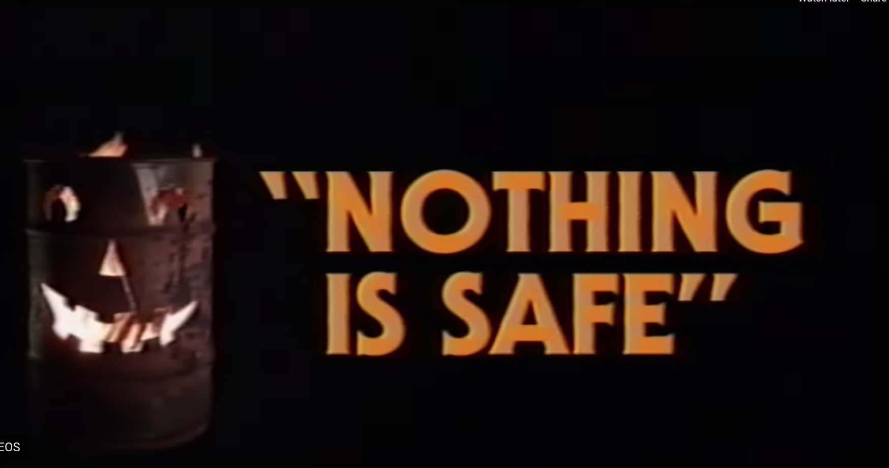
John Carpenter-Esque Score + Rap: Get Hyped on Clipping’s “Nothing Is Safe”
I’m sure you and I know that people often compare a lot of synth scores as “Carpenter-Es
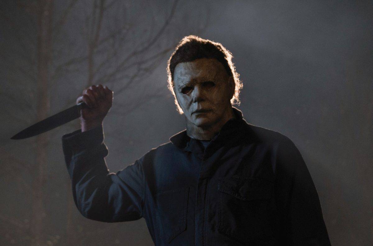
‘HALLOWEEN’ (2018) Review
John Carpenter’s Halloween from 1978 is one of my favorite films. Not just one of my favorite