

[Comic Execution] 2/7 – ‘TUROK’, ‘MINIMUM WAGE’, ‘THE ILLEGITIMATES’
And we’re back to normal. Well, not entirely normal. I’ve really started picking up on the digital format now and it’s going to have a bit of an impact on the column. You’ll probably see fewer executions, since one of my primary gripes for a lot previous series was paying insane sums of money for comics with too many ads in them. Digital means no ads, and sometimes it means cheaper prices, too. But I’ll always notify you if I’m reading something digitally, so you can take that into consideration. Do I recommend you go digital? Not at all. I still buy all of my personal books in physical form (though not in Vertigo’s case) every week. But for these comics, you should definitely consider it.
 MINIMUM WAGE #2

Writer & Artist: Bob Fingerman
Publisher: Image Comics
Price: $3.50
When I look at the cover of MINIMUM WAGE, it’s interesting to note that, beneath the title is the phrase “By Bob Fingerman.” Of course, it’s not unusual at all for a creator to display their name next to the title of their work, but it’s the “by” part that’s notable. Compare this to the presentation of Jeff Lemire’s name on his ‘Trillium’ covers or Matt Kindt’s on ‘Super Spy’: there is no “by” at all. The previous issue of MINIMUM WAGE also added a slight concession to ownership; rather than simply having Bob Fingerman’s name above the title, it was “Bob Fingerman’s” MINIMUM WAGE. Additionally, the cover of the collected first volume of MINIMUM WAGE, cleverly titled MAXIMUM MINIMUM WAGE, has the “by” despite the original covers bearing the “Bob Fingerman’s” format, though several issues drop his name from the cover entirely.
What does it all mean? Probably nothing. But what it does add to the books is a stronger sense of personability, of responsibility. There’s an issue of the original run of MINIMUM WAGE where Fingerman talks about how he wants to escape the slums of “comics” for fine art, and while that particular scene paints that moment as a weak one for him, it’s still obvious that Fingerman struggles with the commercialized trappings of the medium, and the idea that each issue needs to have his name in the same format on every cover is part of that loathsome rigamarole.
And yes, the last two paragraphs were a not-so-subtle reminder that I’m not getting paid to write this column and that means I get to write WHATEVER THE HELL I wish to write about. And now, having procrastinated no further than two and a half paragraphs, I shall commence with the review proper. Fingerman’s dialogue is as true as ever, his characters spouting lines that could only be heard in NYC around the turn of the millenium. The pacing is mostly smooth with a single smudge that, while intentionally illustrating a friend’s awful sense of humor, fails to justify a full page of… well, nothing, basically. Fingerman also makes the awkwardness of real sex seem both amusing and wincingly familiar. A late-comer character adds a very nice element of intrigue to the story but rather than feeling like a last-minute save, there’s that organic storytelling that Fingerman is so good at.
His art gets a work out in this issue as we see more of his NYC neighborhood as well as some nudity. There’s some much appreciate touches of mood to bring the settings to life and while his exaggerated cartoony style seems a bit goofier when illustrating the naked body, especially since he can’t show anything explicitly, it feels more like he’s just trying to illustrate the events rather than turn anybody on. There’s a couple of pages where it feels like he’s coasting, one where the panels are just dark and another where all four panels look almost identical except for one character’s expressions and gestures. These are brief gulps of air for an artist drawing a hefty sized book with a lot of story and a lot of stuff in it so I consider them blips on the radar but they are there.
The second issue of MINIMUM WAGE doesn’t see any kind of drop in writing or art quality, no jump in price but there is one problem; the first issue was 24 pages, this one is only 20. This is a problem because I’m looking at the latest issues of ‘Drumhellar’ and ‘Pretty Deadly’ which are both 24 pages but are the same $3.50 price point. For even further comparison, the recently launched Marvel title ‘Ms. Marvel’ is 20 pages for fifty cents less, though it’s also loaded with an onslaught of ads too, but for Marvel to charge LESS per page of actual comic than an Image title seems worrying. This is not something I want to see continue with Image and this is also not the only time it’s happened: this happened just recently with the second issue of ‘Dead Body Road’ though that was still just a $3 book.
What I’m concerned with is that Image is launching high profile titles with heavier 1st issues as a way to entice readers into a series, then chopping off the extra meat to draw the series out and make more money. That’s not cool. If you want to make a 8-issue mini last 10 issues, don’t be deceptive about it; set the page count at 20 on the first issue so we know what we’re dealing with. This is like when a store puts up a “sale” on a product, except the sale is for 10 cents off a $5 item. Yeah, technically, it’s a sale and if you’re paying attention, you’re not “technically” getting ripped off. But it’s still slimy. And you’re better than that, Image.
We’ll see what the next issue brings. Consider this a stay of execution because of the good will Image has earned, in the hopes that the next issue will have more content or a lower price.
TUROK #1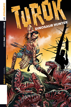

Writer: Greg Pak
Artist: Mirko Colak
Colors: Lauren Affe Dinisio
Publisher: Golden Key Comics
Price: $4
I know TUROK has a longer history than what I’m familiar with, which is to say the comics existed before the video game did. But I did play the first video game when it came out, as well as ‘Turok 2’ so I’d like to think I’m at least a little versed in the world of TUROK. Apparently I’m not. Turns out this is like having seen a bunch of movies based on Philip K Dick novels and claiming you know Philip K Dick’s works. I do feel a bit ashamed now, but I have seen the errors of my ways with this relaunch of the TUROK comics.
Greg Pak, he of ‘World War Hulk’ and ‘Robot Stories’ fame, is the author of this reboot. Pak is the kind of storyteller who can craft a simple story, tell it directly, and still manage to produce something that’s worth rereading. His script for TUROK #1 is no exception. TUROK’s origins as the black sheep foster child of a tribe of natives isn’t particularly compelling at first, giving him a pretty tired excuse for his lone wolf lifestyle, but Pak deviously disrupts that cliche by hinting at a second layer to his sad tale, one with menace and darkness. The bullies that mess with him definitely feel far less forgivable, especially with how little actual personality they have. Sure, they’re jerks, but they also feel like jerks manufactured to make Turok seem more sympathetic. Similarly, the tribe chief is the stereotypical old, white-haired, stern voice of authority.
It all seems a bit too convenient, serving really only to underline how different Turok is. It makes a certain amount of sense that he doesn’t bother flesh out these characters too deeply, given what happens at the book’s climax, but if Pak expects us to sympathize with their plight from here on out, I’ll be hard pressed. But I think he’s got other ideas because this issue is just a short set-up to the gut punch of a twist that drops 3/4ths in. Not only do we get a NEW set of far more menacing antagonists, but Turok’s own level of edginess goes up a notch. I’m pretty impressed by how Pak is laying down this new world while still moving the plot swiftly. There’s also some interesting ideas too, with Turok’s introspective moments hinting at his own surprisingly mature self-awareness as well as the allegorical nature of the antagonists.
Mirko Colak does a quality job of fleshing out Turok’s world, every character packed with detail and every scene fully realized. There’s a nice variety of emotional expression in his faces and the action has a concrete, simple flow that helps maximize its impact. Colak makes drawing both humans and creatures look easy, but the art goes beyond that. There’s a powerfully impressionistic feel to more than a few of the scenes that I’m pretty impressed by, such as the reflection in the water of a face and the firelit totems leering over Turok. The backgrounds can feel a bit samey at times but given that most comics wouldn’t even bother with them, it’s just a quirk and not an offense. Lauren Affe’s work on the colors is absolutely next level stuff. Seriously. She imbues every page with mood, even the static backgrounds smothered in texture. That impressionistic feel I mentioned earlier is almost entirely her doing. And with Marshall Dillon’s vibrant, adventurous lettering dotting the pages with bursts of energy, this issue is a visual buffet to gorge on.
While Pak could definitely have used some breathing room to make us care just a bit more about the secondary characters in this issue, it’s also commendable that he’s got the bowl rolling so quickly and with such thrilling efficiency. I love the art and I’m rarely at that point on a first issue so there’s that. This is a great reboot for Turok and I’m genuinely excited for more, even at $4 an issue. Is the physical comic book packed with irritating ads that would diminish the books value? I can’t say, as I read this on my tablet. But, as a tablet experience, it was wonderfully ad free.
 THE ILLEGITIMATES #3

Writer: Marc Andreyko
Artist: Kevin Sharpe
Colors: Pete Pantazis
Publisher: IDW
Price: $4
So THE ILLEGITIMATES was creating by a guy named Taran Killam. He’s one of the current SNL cast members but he’s also just recently had a role in ‘12 Years A Slave’ and ‘The Heat’ and is slated to appear in the upcoming… nope. Can’t do it. Not happening. You’ll have to look it up yourself. I suggest you don’t, though. Anyway, so he’s a comedian? I’m not familiar with his SNL work and I haven’t seen any of his movie stuff but it’s interesting to note that the longest running TV show he was on was… Nick Cannon’s Wild ‘N Out?
That’s cool. Something about that makes me think that some of the best parts of THE ILLEGITIMATES are his fault. The absurdly excessive gore, the off-kilter character flaws, the tongue-in-cheek tone that’s not quite parody but nearly there. This is nothing like the stuff I’d expect from an original IDW property, especially one with no-names behind it. They’re taking risks here, and I like it.
The writing is still a bit dry though. There’s more than a few attempts at clever dialogue but it never quite connects as well as it’d like but it also serves to demonstrate how dysfunctional the protagonists are. The pacing’s just a bit hurried but the storyline is quite simple so it’s not challenging and, as I said last time, it’s refreshing to read an action comic that doesn’t bloat the material. The plot is, as I said, simple but has just enough tricks in it to stay interesting, even if it’s just slightly predictable. That said, there are smaller quirks that elevate the material to something more stimulating than it first would seem.
The art is a mixed bag. Kevin Sharpe has a lot of energy but not as much control as I’d like. There are a lot of really big, fun panels and he manages the action scenes with aplomb but there is some disorienting moments early in the issue; character hairstyles change between panels inexplicably and the panel logic of each scene seems to be a bit wobbly. Sharpe’s laziness pops up twice again later on, rendering several characters a bit mutant-looking but his illustrations of exploding heads is awesome, as is his rendering of Pierce’s special weapon. I’m also pretty grateful that there’s as much beefcake as their is cheesecake in this issue; rarely do action comics have such an equal opportunity appeal. Inker Livesay and colorist Pantazis take the lines a lot further than they start off at, infusing them with glossy textures and dynamic outlines. I feel like Sharpe could be trying a little harder but he’s also dealing with a pretty intense visual narrative so it’s hard to fault him.
I still like THE ILLEGITIMATES, despite myself. I genuinely think it’s got everything to do with how bold the series has been so far. It’s also because it knows its dumb and does just enough to keep it from being offensively so. And, in the digital format, there’s no ads, which means that the $4 price tag is probably only justifiable outside the ad-riddled print format. So, with the caveat that you avoid the print version of the comic, I’ll definitely recommend this series to anyone craving some cheesy, fun, clever spy action that’s not insulting.
‘REGRESSION’ Comic Review
REGRESSION #1 Writer: Cullen Bunn Artist: Danny Luckert Colorist: Marie Enger Publisher: Image Comi
‘UNDERWINTER’ Comic Review
UNDERWINTER #1 Writer & Artist: Ray Fawkes Publisher: Image Comics Price: $4 CLICK HERE FOR PREV
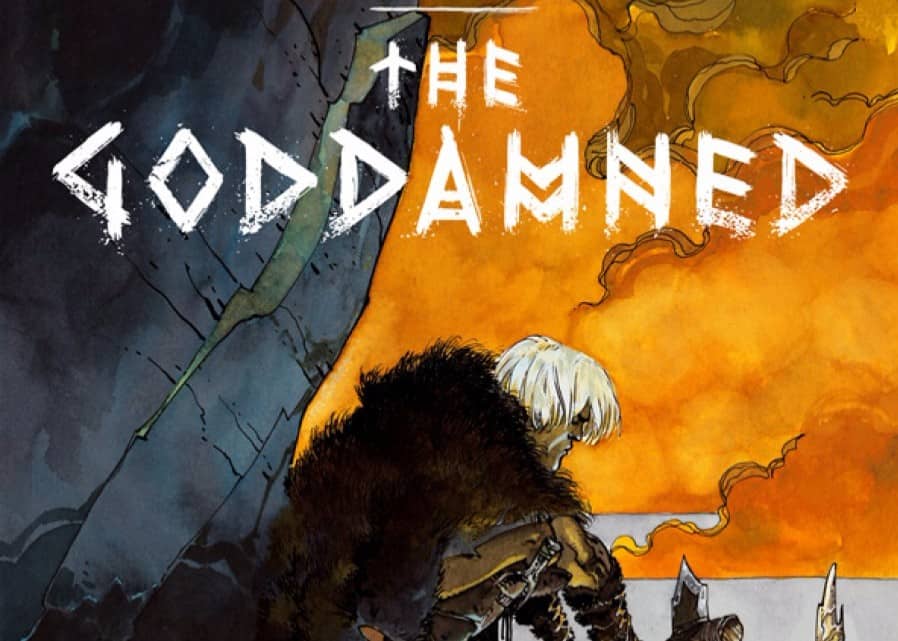
Comic Review: THE GODDAMNED
THE GODDAMNED #1 Writer: Jason Aaron Artist: rm Guéra Colorist: Giulia Brusco Publisher: Im