

[Comic Execution] 10/24 – GONERS, JUSTICE INC, PREDATOR
ONE WEEK. SEVEN DAYS.
My plans for the next seven days are, if I must say, pretty epic. First off, I’m going to be doing a special column for Destroy The Brain, in which I finally watch and review Halloween III and Halloween H20, neither of which I’ve seen, making me a pretty poor horror movie fan. Along with those reviews, I’ll be talking about a pumpkin beer that I’m looking forward to big time as well. But then, at the end of the week, myself and a friend are going down to Saint Genevieve in southern Missouri for a brewery tour and to take in the very old and beautiful city at a time of year when the veil between past and present is thinnest. I even have have a costume all picked out: I’m going to be an executioner.
Get it?
PREDATOR: FIRE & STONE #1

Writer: Joshua Williamson
Artist: Christopher Mooneyham
Colorist: Dan Brown
Publisher: Dark Horse Comics
Price: $3.50 (Print)
This is the one we’ve been waiting for, folks. Joshua Williamson, known around here for the stellar Nailbiter as well as Ghosted, both fantastic horror comics, is writing the newest iteration of the long-lived Predator comic franchise and with him comes acclaimed artist Christopher Mooneyham, best known for superb pulp adventure comic Five Ghosts. The promise of these high caliber talents teaming up for, of all things, a Predator comic… Even jaded old me is pretty excited.
Chronologically speaking, Predator bridges Prometheus and AvP and, consequently, spoils a bit of the direction that AvP is going in, as it starts off with the significant absence of a particular character from AvP, sadly. The only protagonist we are left with is the utterly uninteresting “grizzled veteran” security chief from AvP, who’s in the process of confronting the last remnants of the aliens aboard “his” ship. He’s a very macho dude and it could be annoying but Williamson, as usual, owns the silliness, having Galgo utter lines like “I’m too pretty to die in the middle of nowhere” or “You survive and the next round is on me.” And Williamson cleverly subverts this by making Galgo look like quite the tool at the climactic confrontation, not only failing to even challenge his enemy but totally misunderstanding the nature of the threat as a result of his blind cynicism. Williamson actually successfully channels the spirit of the first Predator movie by going full-blown action movie but also by knowing that the real protagonist of the movie was the titular alien but doesn’t rely on it to keep things interesting.
Christopher Mooneyham delivers his signature gritty but beautiful, old-school style but also shows off his incredible range; his drawings of space ships have a richness of detail yet a controlled economy. There’s his welcome use of speed accents too, adding big energy to panels where needed and his POVs are engaging as well. He knows when the go for dramatic minimalism, like the detailed silhouette bleeding into empty white space, expressing a foreboding breathlessness that’s perfectly timed. He also doesn’t pull his punches on the gore, gleefully exploding a foolish human daring to face down the Predator one-on-one, head flying off, mouth wide in shock, ribcage disintegrating ala Mars Attacks. It’s pulpy awesomeness. And his Predator!!! Colorist Dan Brown infuses every panel with suitably moody colors, fleshing out the ship’s interior with a wide variety of industrial-grade griminess but never sacrificing detail. There’s so much effort put into reminding us that this is a sci-fi comic and Brown helps immensely by coloring in the Predator’s heat vision, properly matching the visuals of a handheld tracker with a digital device, rendering the Predator’s cloak in that distinctive, light-bending manner we know and love from the movies, translating its shimmering effect on the page just right. And letterer Nate Piekos backs it all up with a constant stream of pulpy SFX, from the opening salvo of a cryo-machine deactivating in the darkness to the smaller touches, like the beep of the tracker locking onto a target or the plop plop of dripping blood. All three of these artists are in top gear, working in perfect sync.
Because I was so excited about this issue, I bought a print copy and made an interesting discovery; Dark Horse comics sells their print issues cheaper than their digital! All this time I’d been scorning them in these reviews for having such expensive books when this issue is fifty cents cheaper in print than it would be to get it digital. I’m not sure what the purpose of this is but I’m not really against it myself. And at $3.50, Predator: Fire And Stone #1 is a perfect example of why comics are worth spending money on.
JUSTICE INC #3

Writer: Michael Uslan
Artist: Giovanni Timpano
Colorist: Marco Lesko
Publisher: Dynamite Entertainment
Price: $4 (Digital)
And we’re finally at issue number three of this series. After the last issue, it definitely felt like there was a longer wait between then and now, even though it hasn’t been more than a month. This is probably also because the Grendel vs The Shadow, a thicker volume of equal quality, has come out twice since this series debuted and has a more appealing story. Justice Inc has the potential to be better though, with a more bombastic and detailed art style that, paired with a sleeker, meaner story, would be a knockout combo.
But writer Michael Uslan isn’t interested in that, which is weird. The entire issue focuses on the birth of The Avenger, aka the late millionaire industrialist Howard Hughes, who died in the previous issue rather spectacularly. It’s also got some weirdly intense drama between Doc Savage and The Shadow, so much to the point that it kind of seems homoerotic, particularly with their newly paternal roles in the rebirth of Hughes as the Avenger, which I’d be into if I felt it was purposeful and not the result of tone deaf writing. But what’s most disappointing is how Uslan reverts from the same problems that plagued the first issue, namely clunky exposition explaining The Avenger’s strange predicament as well as an even more awkward confrontation between the main antagonist and Lamont Cranston, The Shadow’s alter ego, in which absolutely no action happens and there’s just a long winded explanation of just WHAT exactly went down in the prior issue. I think Uslan doesn’t give his audience enough credit honestly, which makes sense, given his Hollywood affiliation. Does not a good comic book writer make, sadly.
And what’s even more a shame is that artist Giovanni Timpano continues to aggressively detonate panels with glorious, fearless art, crammed with dynamic POVs and big dynamic poses, all enhanced by exhaustive layout experimentation. Marco Lesko handily completes these illustrations with comprehensive, thoughtful colors that never fail to augment Timpano’s lines in every possibly way; the massive sprawling monk massacre page is splattered with an abundance of eye-catching crimson, laid out with precision. Unfortunately, there’s still no effort from letterer Simon Bowland, near as I can tell. There’s a big ol’ sucker punch in one scene but literally not SFX from Bowland at all. I don’t mean to sound rude but I hope he’s not getting paid much for this job.
Sadly, Uslan’s writing completely gets in the way of how good this series could be. The previous issue had enough action in it to distract from how sluggish Uslan’s scripts are but that isn’t the case here, and more importantly, so much more of the exposition in this issue feels utterly unnecessary. Again, as I said, it’s obvious now that Usland doesn’t really know how to write comics for a comic book reader and it doesn’t help that there’s zero lettering work on a comic that’s asked $4 for. This series got a second chance but it’s just moved too slow to avoid the edge of my blade. Goodnight, Justice Inc.
 GONERS #1

Writer: Jacob Sehman
Artist: Ariel Olivetti
Colorist: Gabriel Cassata
Publisher: Image Comics
Price: $3 (Digital)
Horror comics from Image are such a hit or miss affair in my eyes. Unlike their sci-fi or fantasy efforts, they usually fall into either novel twists on popular concepts (Ghosted) or in depth explorations of fresh ideas in horror (Revival). There’s no real middle ground where a traditional genre is mined for possibilities because, well, The Walking Dead. Even 30 Days Of Night couldn’t compete, even though it preceded The Walking Dead by a year (in the comic book world). Unlike those series, it isn’t immediately obvious what Goners is about besides the drama of children losing their parents traumatically. There’s monsters for sure, but what are they is entirely secondary to the story of the Latimer family.
This is made obvious by the prelude, establishing the tale as chronologically scattered, with flashbacks interrupting flashbacks. It’s immediately obvious that the story was written out first because there’s such an immediate lack of information that we’re suffering just for context. There’s so many questions but never any real answers, despite a full 23 pages of action. Writer Jacob Sehman doesn’t know how to balance exposition and action properly, opting to develop the family’s emotional bonds with sentimental flashbacks rather than fill in the readers on the ongoing narrative. Withholding information is standard but by being too stingy, Sehman creates a dissociation between the unfold events and their relevance to the characters involved. It doesn’t help that his detective characters are entirely flat and unmemorable.
Penciller Jorge Corona comes from that growing strata of artists from the Joe Mad/Ramos school of hyper-stylistic, exaggerated, manga-accented lines. I totally dig this style in the right place: Battle Chasers is awesome because of Joe Mad’s style and Ramos is actually well suited to the high flying antics of Spiderman but a grim, drama-heavy horror comic like this needs art that’s gritty, realistic and emotive. There are monsters in this comic but they’re not at all scary. They’re certainly weird looking but there’s one scene where a monster clamps its jaws bloodlessly over a cop’s ankle like a literal anklebiter. Despite scenes that require darkness, there basically no actual shadow in this comic, and instead darkness is just a blue filter, like a cheap B-movie. Letterer Steve Wands steps up the plate and takes a swing, and while he is mostly effective, it also doesn’t feel right that such a creepy book should be so comically lettered. I usually complain about there not being enough work done in the lettering department but here, I think it takes away from the spookiness.
As a horror comic, Goners is completely ineffective. Encumbered by a choppy, awkward narrative and inappropriately cartoonish art, it might pass as a comic for young teens who are really into horror but appealing to them requires a simpler, clearer storyline. I don’t know who Goners was aimed at but I don’t think it has an audience and can’t expect to trade long on its cliche “mythical monsters as real things” conceit, especially when comics as excellent as Hinterkind do it far better. Sorry, but this comic is a goner.
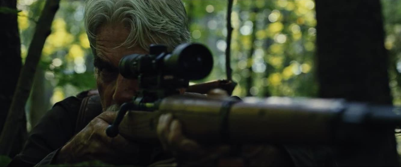
[FANTASIA 2018] ‘THE MAN WHO KILLED HITLER AND THEN THE BIGFOOT’ Review
The Man Who Killed Hitler and Then the Bigfoot — holy shit! Not since The Englishman Who Went
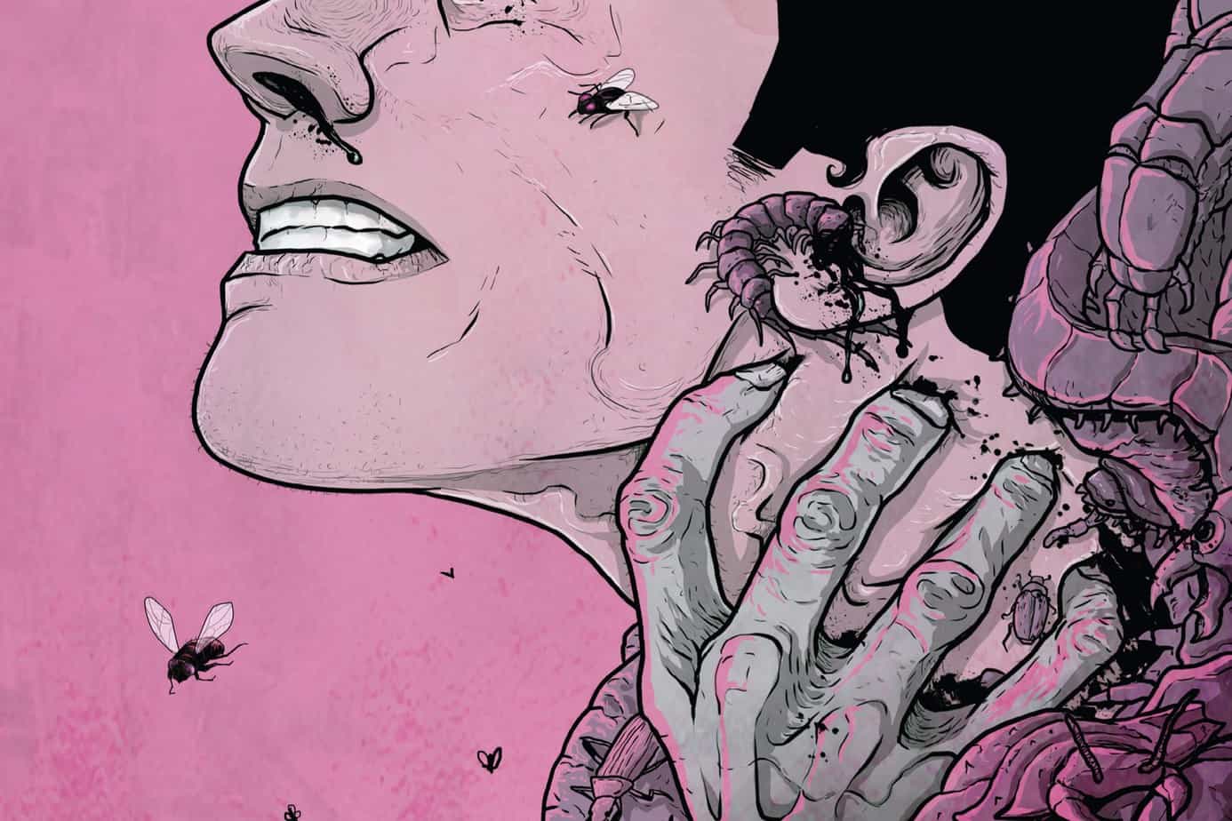
‘REGRESSION’ Comic Review
REGRESSION #1 Writer: Cullen Bunn Artist: Danny Luckert Colorist: Marie Enger Publisher: Image Comi
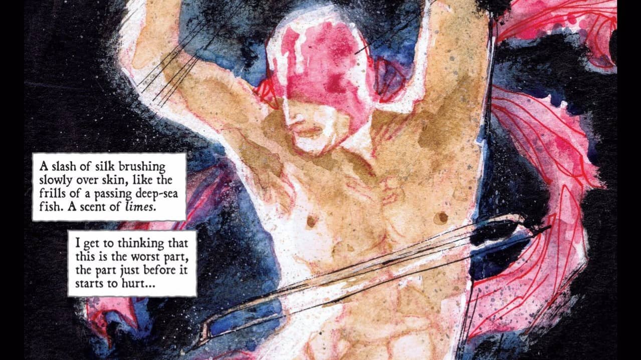
‘UNDERWINTER’ Comic Review
UNDERWINTER #1 Writer & Artist: Ray Fawkes Publisher: Image Comics Price: $4 CLICK HERE FOR PREV