

[Comic Execution] 10/10 – WYTCHES, AVP, SILENT HILL
Halloween looms ever closer, my fiends. Can you taste it? Smell it? Hear it?
Find quiet. Settle your thoughts. Be still.
Alone. Look out your window into the night.
It’s there. Just out of sight. It’s waiting for you to leave your car, or your home, or your job. It waits in the places between.
Halloween wants you.
Wants to be you.
You think you wear it, like a mask, but the truth? It’s you that’s being worn.
It draws near…
WYTCHES #1

Writer: Scott Snyder
Artist: Jock
Colorist: Matt Hollingsworth
Publisher: Image Comics
Price: $3 (Digital)
Me and writer Scott Snyder have a history. In 2011 I was introduced to his work via Severed, his debut at Image Comics. Up until that point, he’d been known mostly for working with DC/Vertigo, as a Batman writer or on a Stephen King-headed series, American Vampire, neither of which interested me. It was the gorgeous art of Atilla Futaki that drew me into Severed but Snyder’s writing kept me enthralled and I followed him to his Swamp Thing reboot, one of the few good things to come out of DC Comic’s New 52. But the next non-superhero title he introduced was at Vertigo, who is blacklisted from this column for their excessive advertisements and per-issue costs, the worst in the industry outside the Big Two. So now that Snyder has returned to a reasonable publisher like Image, let’s see what he’s up to.
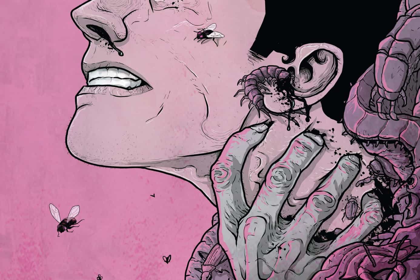
Wytches immediately establishes itself as a horror title with an absolutely chilling prologue that earns good faith from Snyder’s audience early on by presenting a genuinely twisted scene I won’t spoil the details of here. It does create a certain expectation for the reader from that point on, which Snyder plays against by switching narratives, focusing on the domestic rigamarole of an unusual family. We’re introduced to daughter, father and mother in quick succession and while Snyder does briefly tease us with a bit of strangeness, we’re mostly in character development mode, Snyder elaborating on the father’s career as an illustrator and dropping yet another ominous hint that not all is right with the daughter before cutting to an encounter at her school that triggers a flashback showing exactly what’s wrong with their daughter. As I said, Snyder has good pacing, not drawing out the character development too far and keeping the exposition beats well spaced. The flashback contrasts strongly with the idyllic scenes prior, and the tension ratchets up quickly before exploding with terrifying force. Wisely, Snyder doesn’t let the return to the present puncture the terror generated by the flashback, following it with surreal weirdness. From that point on, the story stops being domestic and pretty much becomes about the family’s struggle to deny the horror lurking outside their home but that appears to fail on the last page, it is implied. As usual, Snyder’s writing is mostly without fault here, though I hope the pages spent elaborating on the father’s job have a purpose. It’s also notable that, the way the parents discuss their daughter’s traumatic event, I’m not entirely convinced they weren’t responsible for what happened somehow.
I’ve read Jock’s art before a few times but I remember him best for the ultra-gritty noir tale Snapshot, which he excellently imbued with energy and dynamics. I didn’t think he would be a good fit necessarily for Wytches but I’m glad to be wrong. His lines still retain their distinctively expressiveness and are further enriched by a heaviness here not present in his other works. His character designs are appreciably realistic and what little we see of the antagonists is horrifying enough, though thankfully not much is seen. When he draws their victims being taken, it’s disturbing and Jock deserves accolades for making those scenes work. The lettering, by Clem Robins, is good stuff, solidly delivers where needed and gets the hell out of the way, properly conveying all varieties of sounds without hurting the realism of the comic, which is a challenge, considering how intensely violent some of those noises need to be. If there’s a weak link in the art here, it’s the colors by Matt Hollingsworth. He’s doing something interesting with Wytches: rather than simply color the pages, he’s layered textures over everything and colored those textures. Most of the time, these textures do a great job of amplifying Hollingsworth’s subtle hues, giving the gloomier sections more depth, but then some pages feel like they’d be greatly improved without the distraction of Hollingsworth’s splatters of odd colors and visual noise.
Wytches is 25 full pages of comic for only $3. Even with the love-it-or-hate-it coloring style that Matt Hollingsworth is doing with this issue, you can’t argue with a deal like that, especially with how genuinely scary the tale is. Snyder has gotten back to fine crafty, intricate horror storytelling and Jock is illustrating it with aplomb, unintimidated by the genre he hasn’t had much work with. I heartily recommend this horror fans and can’t wait to see what happens next, and hopefully Hollingsworth will have refined his coloring process further the next time around.
SILENT HILL: DOWNPOUR #2

Writer: Tom Waltz
Artist: Tristan “T-Rez” Jones
Colorist: Michael Spicer
Publisher: IDW Entertainment
Price: $4 (Digital)
Back to Silent Hill. But a comic book! A strange conceit, for sure. Not a new one, though; IDW’s comic book adaptations of Silent Hill date back to 2004, not long after the third game in the series was released. The problem of adapting Silent Hill into a comic is that so much of what made the games effective was how it toyed with the game’s reality, relying on your own paranoia to fuel the tension. A comic doesn’t have that luxury so Silent Hill Downpour has had to rely on superior writing to get by.
Tom Waltz continues Officer Anne Cunningham’s spiral down into the depths of her personal nightmare and thankfully he’s giving us a protagonist who’s more complex than the previous issue might have revealed. Despite her enraged pursuit, when Anne finally gets her hands on the man she’s been hunting, she spares the life of Murphy Pendleton, a flashback to better days reminding her that she’s a cop, not a killer. This is a pretty big turnaround for her, as the previous issue made her out to be pretty ruthless and amoral. If she is, indeed, a good person, at her core, why’s she so rotten? More flashbacks fill us in, and the mystery of the wheelchair finally pays off as we see Anne’s life fall apart, piece by piece. By tying her memories to the recurring wheelchair nightmare in Silent Hill itself, Waltz prevents exposition fatigue. But new memories bring forth new nightmares, of course, and Anne finds herself on the run again before running right smack into the center of the town. By this point, Anne’s gone from being a genuinely unpleasant character to someone we can’t help feel sorry for and Waltz resourcefully constructs a narrative that peels back what we think we know about Anne, entwining it with the horror of Silent Hill.
Tristan “T-Rex” Jones and Michael Spicer continue to bring to life the most horrifying vision of Silent Hill I could ever imagine seeing on the page. They tackle the iconic Silent Hill nurse and render it as freshly horrifying as it was the first time I saw it; they spare no details, making its amorphous scarred mass of a face look not like a mask, as it has in the past, but more like a visual anomaly. But really, the star of the show is the second monster that shows up. I won’t elaborate but you have to see this thing to believe it; it’s truly awful, something I hope I don’t have to look at again, and this is entirely because Jones and Spicer are art bastards that summon things that shouldn’t be. All of this stuff works because the flashbacks are calm, mundane, realistic portraits that let the reader look through a window into reality long enough to dread the inevitable return to Silent Hill. As I said last issue, colorist Michael Spicer deserves equal credit to artist T-Rex, because so much of the dread and menace is his fault entirely. This is one of the most atmospheric horror books I’ve ever read and the colors are to blame.
Silent Hill Downpour is 20 pages of comics for $4. Looking at what you get for Wytches and Alien vs Predator, there’s no comparison: Silent Hill Downpour should be cheaper, no question. But Anne’s story is also more interesting and compelling than what’s presented in AvP plus the art of Wytches doesn’t quite measure up to what’s in the pages of Silent Hill Downpour. If the next issue bumps up the page count a few, I think we can overlook the difference here. IDW has a fantastic team on their hands here and it’d be a shame to dismiss them right out because IDW is a bit greedy.
 ALIEN VS PREDATOR: FIRE AND STONE #1

Writer: Christopher Sebela
Artist: Ariel Olivetti
Publisher: Dark Horse Comics
Price: $4 (Digital)
I’m a Christopher Sebela fan. We’ve reviewed his stuff here before; we gave his Ghost comic (written with Kelly Sue Deconnick) a look earlier this year, with praise and commendations. His style is accessible but not condescending or sterile and he conveys character nuance without letting it get in the way of action. He gets around in the industry and there’s good reason, but one of the problems of the Fire & Stone series so far has been compromised pairings. Does this reboot of the historically mediocre AvP franchise break that pattern?
Sebela wastes no time getting to the meat of the AvP segment of Fire & Stone, sprinting through two pages of loose exposition that vaguely positions this series in the future, chronologically, relative to the Aliens & Prometheus titles. We get the impression that some seriously bad shit has gone down, more so than what we’ve seen so far, and characters we initially met in Fire & Stone have evolved (in some cases literally) dangerously. Unfortunately, this does mark the first time in the Fire & Stone crossover that missing out on a prior series will leave you in the dark but fortunately Sebela keeps the urgent present in focus, mainly by keeping the conflicts in the foreground and cutting to newer threats every once and a while. I can’t say too much about the details of the story, as that would spoil quite a bit, but there’s a villain in this book that Sebela infuses with a life beyond the page, allowing him to be both menacing yet strangely human in his curiosity and deceptiveness. The friction between the two protagonists could’ve been played up for drama’s sake but, wisely, Sebela’s anti-hero character bypasses this with an amoral pragmatism that you rarely see done well even though it ends up his downfall. The climactic confrontation ends with an unexpected bang and promises even more thrills, something Sebela is remarkably good at.
Dark Horse Comics go-to Ariel Olivetti illustrates Sebela’s script with a seemingly boundless level of devotion, every page spectacularly stuffed with badass monsters, gritty (yet detailed) industrialized interiors, distinctive character designs and dynamic action. There’s a bit of a manufactured feel to some of the interiors but they’re so well wrought that you’d have to look close to pick up on their computer generated origins. Did I mention how cool Olivetti makes his monsters look? His xenomorphs are fairly detailed even with a crowd of them in a panel and close-ups feel like they might be lifted straight from an Alien movie (I hope they’re not), such is the level of visceral detail. His Predators are equally delightful to behold, each one given special characteristics and visual flair, inviting close scrutiny and speculation; this one shows off its mandibles and has a damaged mask while another has a fully closed facemask. But the star of the show is the main villain, an “accelerated” lifeform resembling a cross of a human, a xeno and an Engineer. Olivetti goes nuts drawing him, layering beautiful, weird alien anatomy over a humanoid form, letting his humanity peek through. As he stalks the protagonists, there are so many panels that grandly display his bizarre physique, it becomes a character in itself, especially since he doesn’t really even know WHAT he is anymore and neither does the reader, though I do know one thing; Ariel Olivetti makes that extraterrestrial man-ass look gorgeous and it’s ALL OVER THE PLACE; no less than SIX panels put it right smack in the foreground, unavoidably the center of focus (well, to my eyes). Thanks to Olivetti’s grotesque and lush art, AvP succeeds at evoking the Giger-esque weirdness that Prometheus failed to. It helps that letterer Nate Piekos knocks it out of the park, adorning every single page with a smorgasbord of bold, dynamic SFX; from the blazing roar on page one through to the searing laser blast on the last, he diligently and intelligently accompanies every appropriate panel with his exciting lettering, coloring them to match perfectly. And the way he letters the Predators dialogue is spot-on, evoking their voices from the movies while matching the alphabet they use as well.
I should also add that Olivetti does the colors as well and he doesn’t give an inch here either, perfectly rendering his lines in refined, deep hues, splashing in bright reds and garish tones. His gore is very effective thanks to this.
Dark Horse has just scored their first home run with the Fire & Stone series here. While this issue does rely on readers having also read Aliens, it’s not a huge hurdle and one can easily figure out the full story based on context. Sebela and Olivetti are in top form here and this issue is generous at 22 top quality pages of comic, worth the $4 for anyone into science fiction, horror, or just great comics.
SNAP JUDGMENT – E3 2018
Instead of making a truncated and minimal post for the few trailers last week, I’ll tackle those n
‘REGRESSION’ Comic Review
REGRESSION #1 Writer: Cullen Bunn Artist: Danny Luckert Colorist: Marie Enger Publisher: Image Comi
‘UNDERWINTER’ Comic Review
UNDERWINTER #1 Writer & Artist: Ray Fawkes Publisher: Image Comics Price: $4 CLICK HERE FOR PREV