

[Comic Execution] 1/3 – ‘REVELATIONS’, ‘TWILIGHT ZONE’, ‘GRINDHOUSE’
It’s 2014! Have you made your resolutions for the new year? Well good for you!
You’re doomed to failure, naturally, but by all means, commence your futile efforts. I will savor your anagnorisis in the same way an ophiocordyceps unilateralis organism relishes the very exquisite climax in which its spores burst forth from the parasitic structure growing inside of and possessing the host ant.
My New Year’s Resolution for 2014? I’m SO glad you asked. I plan on executing more comics! Sure, I won’t make any friends with this resolution, but who needs friends when you’ve got the promise of countless tears shed in the name of my brutal and razor sharp critical analysises! Wait… is it analysi? Analysae? Now I’m just being anal.
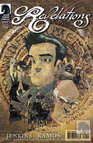 REVELATIONS #1

Writer: Paul Jenkins
Artist: Humberto Ramos
Colors: Leonardo Olea & Edgar Delgado
Publisher: BOOM! Studios
Price: $4
Picked this up blind, knowing that Humberto Ramos’ art would be a tough pill to swallow, even with the superbly capable Paul Jenkins on writing duties. The cover has a ‘Da Vinci Code’ thing going on, though laughably cartoonized by Ramos’ exaggerated style. I just have a hard time taking seriously anything he draws but I’ll have to accept that not everyone feels that way with this comic. Which, just how Dan Brown is this thing?
It’s VERY Dan Brown. It kicks off with a cardinal plunging to his theatrical death of impalement on one of THOSE fences. You know, the kind that impales people (‘Spellbound’, ‘Deathwish II’, ‘REPO! The Genetic Opera’, etc). There’s some mad bastard intent on making sure the cardinal is good and murdered but the cops show up just in time. This prelude sets up the protagonists’ introduction, a wise-cracking John Constantine Scotland Yard detective named Charlie recruited by an old friend in the Vatican to investigate said impalement. Jenkins’ writing is amusingly sharp and he gives the intensely cynical Charlie just enough likability to stay on the reader’s good side but it doesn’t make him any less of a cliche. Meanwhile, some subterfuge deepens the plot back in Vatican City but there’s nothing solid enough to sink teeth into, not to mention both characters involved are nonentities.
It’s not long before Charlie is applying his scalpel-like sarcasm to the crime scene and we pick up on the (unsurprising) interference Vatican has throw into the mix. Charlie meets the Cardinal from the previous scene, Toscianni, setting up the conflict to come between Charlie and Toscianni. But the rest of the book focuses on Charlie’s investigation, giving us just enough procedural meat to tantalize. Jenkins knows how to write a competent page turner and Charlie’s “quirkiness” never quite crosses the line into annoying. But there’s also nothing new at all going on in this issue. Murder mysteries set in the Vatican are a dime a dozen. Nothing is hinted at here that colors this story uniquely, so while I can’t condemn the writing, I also won’t pretend there’s anything worthwhile here.
The art by Humberto Ramos leaves me just as cold. His exaggerated, cartoony style doesn’t click at all with such a gritty tale, even if he competently renders every detail as needed. Even the ultra-refined coloring doesn’t help, sometimes actually overloading panels, especially the first sequence. It crosses the line from atmospheric to distracting and, paired with Ramos’ distorted character proportions, it’s just unpleasant to look at, and not in a good way.
This one’s a lost cause. I did find myself wanting to know what happened next as soon as the last page turned, but a little distance and I found that urge vanished, leaving me with a $4 comic I didn’t care enough for to justify buying again. At least it gets the dubious honor of being the first comic executed in 2014.
TWILIGHT ZONE #1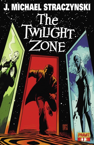
Writer: J Michael Straczynski
Artist: Guiu Vilanova
Colors: Vinicius Andrade
Publisher: Dynamite Comics
Price: $4
Oh boy. Yeah. Exactly. THE TWILIGHT ZONE. I mean… THE TWILIGHT ZONE.
Say it with me, one more time. THE TWILIGHT ZONE. Okay, so, now that we’ve established that, let’s move on. Apparently, Dynamite wants to make a comic out of the THE TWILIGHT ZONE. Honestly, I can’t even begin to explain what’s crazy about that. Let’s start with the fact that THE TWILIGHT ZONE, as a show, was a big inspiration behind some of the silver age horror comics that have come to define the medium itself. And hey, whaddya know, there was actually a TWILIGHT ZONE as far back as 1962 that seems to have survived in some form or another for nearly twenty years, almost hitting a hundred issues! The idea of reviving that comic and trying to imitate that success certainly seems like marketing genius but it also seems like creative suicide. How do you live up to that big of a name?
Well, for one, you don’t hire J. Michael Straczynski. I’ve reviewed his comics before with a grim outcome but I considered the possibility that I’d set my expectations too high, and so approached this with a more level attitude, even with a name like THE TWILIGHT ZONE. I was wrong. JMS naturally introduces the story with a Serling-esque narration, drifting in on a board meeting of bored, rich white men, the chairman of whom is obviously distracted. But by what? We learn he’s hired a private eye for some unexplained purpose as, meanwhile, the most successful member of the board is making a deal with the devil to shed his old identity in order to escape the impending discovery of his embezzlement scheme. Why anyone with his level of expertise would fail to recognize a con point right at him, I’m not sure. I’d say desperation made him stupid but that kind of mistake makes for a miserable failure of a con artist and is not the hallmark of a multi-billion dollar, long-game embezzler. If your main character is going to be a despicable human being, at least be consistent about it.
There’s two pages in which we witness his live falling apart as his identity slowly dissolves and, honestly, it’s surprisingly boring for such a cool concept. It serves both to exaggerate what a bastard this guy is but also to illustrate how he’s changing into someone else and what the impact of that is on his day to day. It’s neat but it didn’t do much for me. I guess we’re supposed to get some kind of schadenfreude out of seeing things go south for him but I never felt enough hate for the character to get that. As he’s whisked away for the last phase of the changes, things are evolving elsewhere, and we get a hint at what’s REALLY going down with the mysterious benefactor managing the whole affair, as well as witnessing the fall of the axe on the embezzler’s former employer.
Ala ‘Oldboy’, the main character wakes up in someone else’s home with an unfamiliar face in the mirror, though oddly it’s one that doesn’t look all that different from his previous. He celebrates his impossible escape for a while, only to discover that his previous identity has been stolen! At that point, I literally laughed. Could JMS have possibly written a more predictable cliffhanger to end the comic with? But here’s what I’m more interested in; without thinking very hard about it, I bet I’ve unraveled the “twist” that JMS has planned. You see, early in the issue, it’s established that the embezzler has been patiently waiting to take over the chair of the board for a while now, and has been getting increasingly impatient with said process. Then, later, he nonchalantly “explains” his boss’s malaise with a curt summary of the unexplained murder of the son of said boss. He’s obviously lying, covering up the fact that he murdered the son to prevent the company becoming his inheritance, which would also explain why he’s way more nervous about the “eraser” firm knowing so much about him when all he really did is just embezzle money, which we all know is punished with minimum-security imprisonment, boo-hoo. So yeah, expect to find out that this guy’s a murderer.
BUT THERE’S MORE! Really early in the story, an employee of the cafe that the embezzler frequents discovers a very old coin that he left them, but not at all on purpose. In fact, he had to have left it by accident, because *gasp* it belongs to the murdered son! Remember that PI I mentioned earlier that the boss hired? He shows up at the end of the comic, having somehow (he said sarcastically) tracked the embezzler despite the identity swap. Naturally, the PI has the coin, or will and here’s how that’s going to play out; somehow, the embezzler is going to blackmail his old identity, only to be arrested for the crime he committed under that identity by way of the private eye not only being able to prove that he is the original embezzler, but also a murderer. Oh, the irony! If only he’d remembered that HE MURDERED SOMEONE and realized that trying to win back his old identity is COMPLETELY IDIOTIC and definitely not the behavior of a proficient white-collar criminal.
Let’s also talk about how the only female characters are bland nonentities victimized by the embezzler and how the only person of color is a shop clerk. If the “eraser” firm had the miraculous ability to alter his handwriting and transform his dental features, why did they go half measure and leave him the same color? Maybe, being rich white dudes, they felt like that would be Too Much©. And the biggest irony of this is near the end of the book, when an angry black man condemns white-collar criminals, triggering a acid-tongued retort about how the law is for normal folk like him. It borders near on racism, actually.
Anyway, enough with slamming the writing. The art, thankfully, is very good. Vilanova has a supremely lush master of line and detail, not quite falling into the hideous drudgery of exacting realism while still rendering everything in a very immersive solidity. Faces are rich with detail and expression and the NYC backdrop, as cliche as it is, is worth exploring with each big panel. There’s actually a fun yet subtle amount of layout creativity, not enough to distract but definitely enough to push the visuals over the edge into above average. It helps that colorist Andrade has a cinematic grace and can establish mood without defying the realistic aesthetic of the linework.
But this is also a comic book called THE TWILIGHT ZONE and, with a title like that, I expect, nay, DEMAND far better than this. What we’ve gotten is a cheaply written knock off that expects us to forgive it on the merits of the art alone. Take that name off the front page and we’ll talk. But until then, I’m executing this in the hopes that Rod Serling will rest in peace.
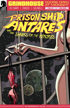 GRINDHOUSE #4
Writer: Alex De Campi
Artist: Simon Fraser
Colors: Gary Caldwell
Publisher: Dark Horse Comics
Price: $4
So you may have noticed something about the number the is next to the title of this comic. It’s a number that comes after 3. In fact, it’s THE number that comes after 3. Can you think of a reason why this is significant? Oh boy, let’s not think too hard now, we don’t want to strain the ol’ casaba. Answer: Comic Execution is supposed to END with issue three of a series. Having a 4 up there is a violation of all that is sacred and holy. Except we’re on a website called DESTROY THE BRAIN, which is responsible for hosting a program called ‘Late Nite Grind House.’ So when you make a comic with the word “grindhouse” in the title, it’s going to get special treatment.
The second half of the ‘Prison Ship Antares’ storyline wraps up here as the planned insurrection by the inmates explodes, set to a song from the classic opera ‘Carmen.’ Naturally, they mostly ditch their prison duds in favor of skin and underwear. The melee is amusing but the violence is oddly muted, I guess mainly because it’s just cloned nonentities whose skulls they’re bashing in. But there’s also a lack of viscerality, with a throat-slashing marked by a pithy dash of crimson rather than a gout of ripped flesh and gushing blood. An eyeball gets popped out of a skull but it just seems more cartoony than grim.
This first scene culminates in a showdown between the warden and the rebels, though the warden has the advantage of flamethrowers and a katana. The Asian character gets to dispense some martial arts vengeance while delivering an invective aimed at every non-Asian badass who ever tried to accessorize with a katana, which seems appropriate for the character but doesn’t hold much weight outside that context. The villain still gets away and, having had it once and for all with the prison, plots a course for the furnace that is Saturn then flees in an escape pod, leaving the prisoners to deal with the guards wielding the flamethrowers. Which we don’t see at all. One panel, fountains of fire are pouring down a hallway at the women, the next, they’ve captured the guards. The whole thing begins to break down when the guards just spill the beans re; the control room, revealing themselves to be spineless wusses without the presence of the ship’s warden. Not very well made clone guards, it seems.
As they try to wrangle the ship’s controls and seemingly fail to figure out a way to halt their impending doom, the warden has rigged up a surprisingly well-made bondage harness for her captive and makes a pretty malevolent threat before the woman who snuck on board slices her in half, rescuing her love but deciding against the possibility of helping her fellow prisoners. However, the lucky, deus ex machina save that prevents the whole ship from being destroyed is a pretty Hollywood way to end a grindhouse story. It’s all just a little too happy for what started off so disturbingly grotesque. That same thing happened in the previous arc.
The art in this issue seems to have dipped in quality as well. Most of the fight scenes completely lack backgrounds. A prison guard gets sliced open with a katana but yet again, all we see is a nondescript splash of blood. What happened to the body-melting gore from the previous issue? I wanted to see one of the prisoners grab a flamethrower and use it on the guards! Overall, there’s just no denying how low-quality and uninspired this issue looks.
I personally can’t recommend this comic beyond this issue. It’s certainly sure to appeal to readers who don’t have a deep familiarity with grindhouse films or are fond of B-movies in general or just generally want something violent and sexy. But for the purposes of being a “grindhouse” comic, it doesn’t meet my expectations. What puzzles me, though, is that the third issue genuinely had me excited. And in the letters section, writer De Campi admits to loving Takashi Miike and his splatter-filled ‘Ichi The Killer’, which is one of the most intense, weird, fucked up movies ever. So where’s that in these comics? Maybe it’ll show up in the next arc but with the disappointment that was the fourth issue, I’m not going to ask my readers to risk their pocket change on such an uneven title.
Comic Review: WEIRD DETECTIVE
Chris Melkus gets weird with Dark Horse Comics' Weird Detective #1!
Comic Review: REPLICA
REPLICA #1 Writer: Paul Jenkins Artist: Andy Clarke Colorist: Marcelo Maiolo Publisher: Afte
[Inked In Blood] New And Upcoming Comics For July 23rd, 2015
IN SHOPS THIS WEEK: WOLF #1 Writer: Ales Kot Artist: Matt Taylor Colorist: Lee Loughridge Publish