

[Comic Execution] 8/8 – MARS ATTACKS, BIG TROUBLE IN LITTLE CHINA, THE SHADOW
PULP COMICS!! God, I can’t believe I’m turning into that guy. The sad thing is that I am the proud owner of a trenchcoat that looks exactly like it came out of a detective novel. No, not a creepy Hot Topic black leather duster, I’m talking the real thing, as vintage as you can get without dropping a few grand. Definitely holding on to it in case trenchcoats come back in style. Or the apocalypse happens. Whichever comes first.
Also, I just noticed that, for the second time, I’m reviewing all #3 issues. I think it’s a good omen.
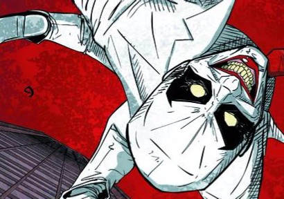
THE SHADOW: MIDNIGHT IN MOSCOW #3

Writer: Howard Chaykin
Artist: Howard Chaykin
Colorist: Jesus Aburto
Publisher: Dynamite Entertainment
Price: $4 (Digital)
I’m pretty excited about a new announcement involving The Shadow. Interestingly, this new title is going down at Dark Horse Comics, rather than at Dynamite, the current home of the pulp noir hero. But this is probably because Matt Wagner, indie pulp icon and creator of cult favorite ‘Grendel’, is writing and drawing it. That is, he’s writing and drawing ‘Grendel vs The Shadow’! Now, for those of you unfamiliar, ‘Grendel’ is a pulp comic from the Eighties that followed an aristocratic novelist, Hunter Rose, who moonlights as the titular masked assassin and comes to control NYC’s organized crime. The character’s appeal was quicksilver; essentially, if Batman had chosen a life of crime instead of fighting it. It helped massively that Wagner gave him an iconic look, instantly recognizable as rooted in crime noir pulp. He was so popular that, at one point, there was even a Batman/Grendel crossover! While Grendel has never quite regained his former glory, the resurgence of ‘The Shadow’ and other pulp icons, thanks to Dynamite’s efforts, has led to this. It’s not entirely surprising, as Wagner himself wrote one of the key series in The Shadow’s revival, but it’s still exciting.
At the same time, it’s hard not to wish Howard Chaykin was writing the series instead. His ‘The Shadow’ manages to focus on the story without sacrificing the intrigue that defines the noir aesthetic, even with an issue as light on action as this one. By highlighting the internal struggle that faces the “retired” Lamont Cranston, Chaykin offers an intriguing conflict within a character who, as most pulp heroes goes, doesn’t seem to have much to offer. It doesn’t last, of course, because it’s a pulp comic and action overrides character development. The narrative continues, as with previous issues, to jump back and forth between the menace in London and Lamont’s journey, but now those disparate threads finally meet… kind of. Again, Chaykin’s writing tries and succeeds at capturing the feel of the period even as he continues unwinding the plot slowly, using Cranston and Margo’s rapier wits to enliven the proceedings. There’s a thankfully brief exposition involving the main antagonist whose getting ever closer to the fulfillment of his sinister plans, reminding us necessarily that something IS at stake besides Lamont’s vacation. More action to keep the momentum, which resolves into a new plot twist. Not to spoil too much, but it turns out there’s quite a bit more at stake than initially hinted at as Chaykin cranks up the intrigue to 11.
But really, what you’ve come for is the art, and Chaykin does not disappoint. His renderings of the Queen Mary cruise ship is truly magnificent, inside and out. But Chaykin’s adept at so much more than settings; the first round of action has a fantastic spray of blood that crosses panels, giving the battle a visceral edge. One of the things I haven’t talked much about in previous reviews in this series is the clothing design. IT’S INCREDIBLE. Like, the textures Chaykin uses and the colors Jesus Aburto selects combine to create some serious visual deliciousness. This doesn’t apply nearly as much to the men’s wardrobes as much as it does the women’s but there’s some spectacular stuff on both sides. The paisley robe St. John is wearing on page six is probably one of the few robes I would ACTUALLY find excuse to wear outside my home. Street scenes bustling with bystanders are an eyefull of fun, inspired looks. Even FURNITURE looks like they’ve been given the treatment. There’s just so much to take in with the art in this series it’s overwhelming.
Every time I read a new issue of THE SHADOW: MIDNIGHT IN MOSCOW, it desperately makes me want a new pulp noir film or TV show set in the ‘40s. With the popularity of ‘True Detective’ and the impending end of my favorite TV show ever, ‘Boardwalk Empire,’ I feel like there’s a place for something like this on TV right now, especially with ‘Mad Men’ coming to an end as well, not to mention the success of similarly pulpy “Penny Dreadful.” Heck, imagine how many classic pulp characters you could cram into such a series! Ratings start slumping? Bring the Green Hornet in! In the meantime, you can just read this series instead ‘cuz it’s probably better than any TV show would be anyway.
BIG TROUBLE IN LITTLE CHINA #3

Writer: Eric Powell
Artist: Brian Churilla
Colorist: Michael Garland
Publisher: BOOM! Studios
Price: $4 (Digital)
It’s kind of interesting, reading comic book adaptations of two totally different cult classics at the same time, the one opposite BIG TROUBLE IN LITTLE CHINA being NIGHTBREED. Adapting a film to a comic is never a walk in the park (though I sympathize very little with masochistic and greedy writers who bring it on themselves) and I imagine adapting a cult film is even more so. Yet, so far, both of these books have proven to be significantly more enjoyable than any of the movie-to-comic adaptations I’ve read (I’m looking at YOU, ‘Robocop’). To some extent, this makes sense with BIG TROUBLE IN LITTLE CHINA because the movie was already rooted in a large way in pulp comics, which is why Eric Powell is such a perfect fit. NIGHTBREED, though, continues to surprise me. But that’s not what we’re here to talk about.
Eric Powell really was the best of all choices to write this series, and in this issue, his distinctive sense of humor really comes into play. It’s great that he’s introduced some characters besides Jack Burton who get to inject more silliness into the story, because Jack’s comedy can get a bit one-note. I loved the flashback story that evoked classic black and white horror flicks like WHITE ZOMBIE and THE CABINET OF DR CALIGARI, even if it wasn’t quite as funny as it could’ve been. But what’s really interesting about it is how Powell plays off the “evil” nature of Jack Burton’s hypnotic mistress by making Jack the victim, someone we’re not really sympathetic with, so that the witch’s inevitable demise comes off with a touch of irony.
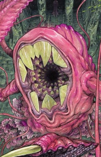
But really, it’s the confrontation with the Seven-Faced Widow that’s the main attraction and she does not disappoint. Without spoiling too much, her face off with Jack is both anti-climactic and brilliantly hilarious, evoking a bit of ‘Army of Darkness’ in one spot. That said, the length of the joke does distract a bit from what’s supposed to be an adventure-comedy hybrid, feeling like a bit of an extended break from the actual action. The last two pages of the comic are kind of a waste, honestly. Nobody should’ve been surprised by the twist and there’s nothing particularly funny about the dialogue either. If necessary, a single page would’ve done the job.
Brian Churilla’s art gets more enjoyable every issue and this one’s no exception. He continues to make the realm of the Twilight Road a fantastic setting packed with visual spectacle; the cages that fill the monolithic temple of the Seven-Faced Widow add an eerie yet exotic feel, and the statues of the Widow compound this. The monster that guards her lair is very cool looking, feeling like something that would actually exist in this dream world and not just an amalgam of stuff from nature. But Churillo isn’t just content with fleshing out the fantastic; his depiction of Mexico is vivid and fun too, details like the witch’s dress or the lamp in her fortune telling parlor really make it easy to get sucked in. One of my favorite panels depicts the witch’s face, eyes cut off, her long hair flowing down and becoming the shadows in the background of the next few scenes. Colorist Michael Garland continues to lavishly slather Churilla’s lines in fresh, vibrant, yet atmospheric tones. The way he manages to establish the alternate visual narrative of the Mexico story without taking away from the color of it by using dusty shades and warm hues is commendable. And letterer Ed Dukeshire scatters enthusiastic, pulpy dashes of action varying from minute but distinctive hissing noises to big, bold roars. I loved the “flush” in the background at one point. Brilliant.
Powell does do a bit of padding in this issue but even with that, it’s still 22 pages of some of the best pulp comics you can get your greasy mitts on right now. No fan of cult movies should miss this series and, really, anyone who loves fun, goofy and imaginative comics needs to be picking this up. I don’t heartily recommend comic book adaptations of movies but this one’s an exception, and it looks like that might be happening more often…
 MARS ATTACKS: FIRST BORN #3

Writer: Chris Ryall
Artist: Sam Kieth
Publisher: IDW Comics
Price: $4 (Digital)
The irony of me reviewing a Chris Ryall-penned MARS ATTACKS story is that I first encountered Ryall’s writing in his similarly alien-themed ‘Groom Lake’ back in 2009, mainly because I was a sucker for Ben Templesmith’s art at the time, thanks to ‘30 Days of Night.’ There’s some parallels between the two series and I’ll say that, if you enjoy MARS ATTACKS or MIB, you should definitely track down ‘Groom Lake’ and give it a go.
However, where ‘Groom Lake’ had a pretty robust sense of humor, MARS ATTACKS: FIRST BORN has proven to be a mostly grim tragicomedy. The misadventures of blind Clare and her adopted Martian child never veers too far from nightmarish terror, and this issue only manages only a snatch of mirth as the Martians strike again, decimating the ruins of their town. The opening of the issue steadily winds up the tensions as Clare confronts a Martian in person but resolved with a not-entirely-unexpected twist that still squeezed the ol’ tear glands. Ryall’s determined not to let this series get too sentimental though, so things just start getting worse all of the sudden. Chaos ensues and Clare is briefly reunited with Uncle Woody, only to have him ripped from her again, OF COURSE. They manner in which they are reunited and especially Uncle Woody’s condition is almost intolerably cruel but par for the course at this point.
The story then gets dark, both literally and figuratively, as both Clare and the widow Darlene take shelter in a deep hole, waiting and hoping for safety in the world above. Their meeting is a big moment for the comic as Clare provides much needed perspective for Darlene, whose own reflections provide comfort for Clare as well. It’s commendable that Ryall persists in humanizing the horror of the Martian attacks, and by doing so, he makes the aliens so much more terrifying, even if their body count in these comics is remarkably low. So when their threat again looms at the end of the issue, it pulls the heart up into the throat.
Kieth’s artwork on this issue is a bit scattered. As usual, he keeps the child-like aesthetic while balancing what he needs to show and adding details here and there to crystallize the narrative. The opening panel is truly awesome and sets the bar high for the rest of the issue, so that might be part of the problem. He does manage to impart quite a bit of suspense into the following confrontation by utilizing vague shapes that have just enough impact. But when the UFOs start blasting, it’s hard not to be a little amused by the cartoonish explosions. Yet they’re peripheral and barely noticeable because Kieth keeps the focus on the characters, making Uncle Woody’s predicament unsettling in its vagueness. What did the Martians do to him, exactly? Rather than reveal that, Kieth wisely buries him, neck deep, in waste, exposing only his bloodied face. It’s chilling in both simplicity and its implications.
But the real heavy hitting part of Kieth’s work is in the dark hole where Keith uses the moodiness of gray and silhouettes to evoke the gloom of their despair. The panel of Clare looking up into the dim light is wrought with emotion, thanks to Kieth’s incredible use of texture and colour. The rest of the comic is more procedural and simply follows the neighborhood boys in the flattened landscape. It almost feels like the story could’ve ended with Clare and Darlene in the safety of the darkness, their future uncertain.
I never, ever though a MARS ATTACKS comic could bring on such strong emotions like this one does, and to be honest, Chris Ryall never struck me as the writer to do so; a guy known for books like ‘Zombies vs Robots’ and ‘Transformers Official Movie Adaptation’ would not be my first guess at who wrote this book. While MARS ATTACKS: FIRST BORN is definitely a premium-cost book, there’s also absolutely nothing else like it out there and deserves to be seen by horror and sci-fi fans.
[Inked In Blood] New And Upcoming Comics For August 19th, 2015
IN SHOPS THIS WEEK: WELCOME BACK #1 Writer: Christopher Sebela Artist: Jonathan Brandon Sawyer Co
[Inked In Blood] New And Upcoming Comics For July 8th, 2015
IN SHOPS THIS WEEK: NEGATIVE SPACE #1 Writer: Ryan K. Lindsay Artist: Owen Gieni Publisher: Da
[Inked In Blood] New And Upcoming Comics For March 13th, 2015
IN SHOPS THIS WEEK: HELLBREAK #1 Writer: Cullen Bunn Artist: Brian Churilla Publisher: Oni Press