

[Comic Execution] 8/29 – ‘Extinction Parade’, ‘Collider’, ‘Tomorrowland’
Time for some slicin’ and dicin’ as the worst of the best hit the scales. The column is now in full gear as we run thick into our third batch of number twos and it’s not looking pretty. Some of you were probably thinking when this whole effort was launched that the name “Comic Execution” seemed pretty silly. Well, this is the week where it’s going to go right where you didn’t think it would go. And if you did, well, this one’s for you…
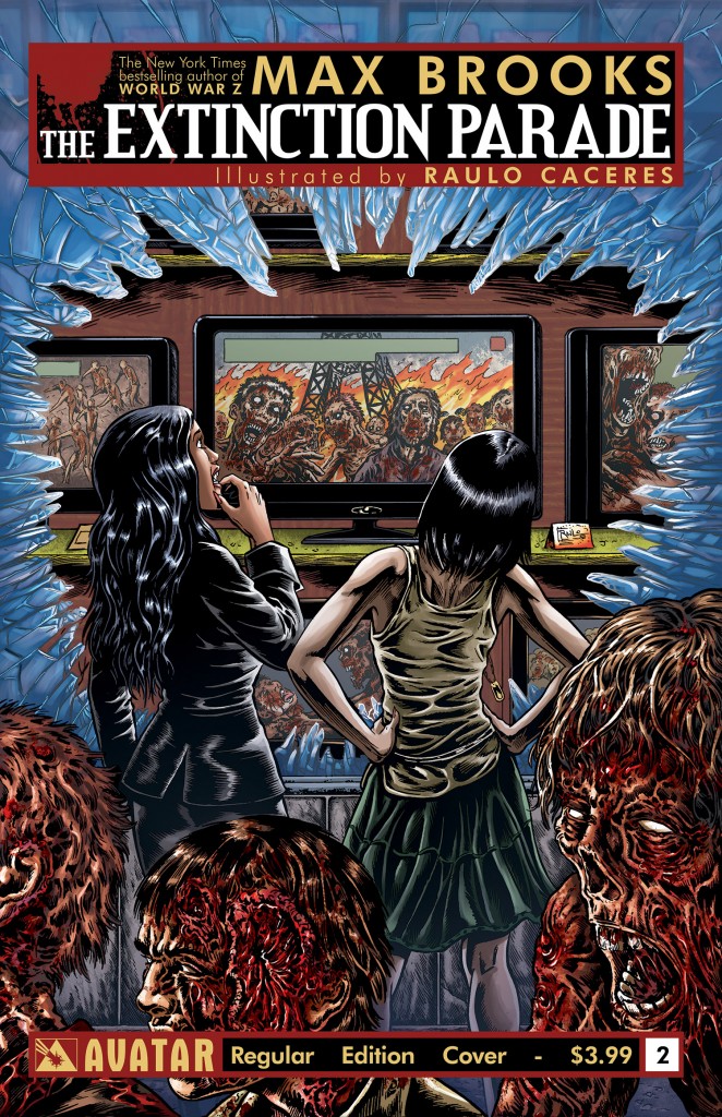 EXTINCTION PARADE #2

Writer: Max Brooks
Artist: Raulo Caceres
Publisher: Avatar
Price: $4
The second issue of Extinction Parade is here, and it’s living up to all the expectations placed on it. Just to briefly go over what kind of expectations we’re talking about: issue one introduced a world where vampires, an immortal race of intelligent but predatory bloodsuckers, witness the genesis of an epidemic of “subdead” aka zombies. We’re introduced to our “heroine,” whose name isn’t even mentioned in this issue, as she becomes the first of her immortal kind to see a threat in the plague of walking dead newly ravaging their prey. Issue two continues this theme as she narrates evolution both of the vampire/human symbiosis and the emergence of the new threat, one ignored almost entirely by her kind.
The writing is good. The issue starts off by explaining how the birth of the middle class during the 20th century was, until zombies, the only real frustration for the vampires. The way Brooks elaborates on this is actually very clever and hooks me, at least, pretty well. The exploration of how vampires survive continues by highlighting geographical advantages some vampires have in areas of the globe, then segues into detailing the zombie apocalypse with an intriguing question that hints at what is to come. We see what kind of time the early end times were for the vampires, then we witness the carnage itself, ending with one vampire elating at the newfound freedom the vampires have amidst the chaos.
So, all in all, the writing is very good. Brooks is hard to fault. But the art is fucking terrible. Oh, it doesn’t lack for detail, technical precision or expressive range. But it’s what’s chosen to be shown that is downright annoying. It’s a horror comic, so of course there’s nonstop gore. Some of the visceral violence is creative and at times (rarely) stunning; a vampire victim is graphically crushed under a tire and another is smashed into a brick wall, but it’s not until the epic zombie mayhem takes up full pages that we really see how horrible the story is; heads ripped off, legs torn clean away, etc. And that’s without even mentioning how gut-wrenching the decaying zombies themselves look.
Yet it’s all very childish and has zero impact. And it’s ruined more than once by some really dumb, trashy illustrations with zero purpose other than to shock. There’s one scene of a naked woman gagged and strapped to a dinner table as vampires appear to be feeding on her. Except she doesn’t look like she’s been fed on at all, conveniently enough. It could be intended to provoke loathing for the cruel vampires but what it really serves is to illustrate how the protagonist is somehow better than her peers, as her expression is one of mild disdain. Additionally, she insists on bringing up the plague during said “feeding” but is met with disgust from the others.
It’s a real shame that there’s so much interesting story going in a book whose visuals are utterly uninteresting. I mean, as someone who appreciates creative violence, I can honestly say that it’s not that there’s nothing transgressive here. It’s just that so much of the book is taken up by dull, monotonous outbreaks whose only color is dictated by what exotic location they take place in. For example, several pages are dedicated to the fall of St. Petersburg. There’s armed soldiers watching as a subdead horde breaks through the gates of a Russian palace and eventually overcomes them. The zombies are flavored with stereotypical Russian garb, which is supposed to lend a feel of chilling realism to the scene as they descend upon the ineffective soldiers but, like every other similar showcase in EXTINCTION PARADE, it’s more jokey than anything.
EXTINCTION PARADE, as an exercise in horror storytelling, is interesting. But the actual comiccraft is the equivalent of a hair metal guitar solo; totally insubstantial and almost entirely disconnected from the objectives of the whole work. It’s time to execute this disappointing series with a bullet to the head and a stake to the heart.
COLLIDER #2

Writer: Simon Oliver
Artist: Robbi Rodriguez
Colorist: HiFi
Publisher: DC/Vertigo
Price: $3
There’s been a lot of hype surrounding this series, in part because it’s seen as one of Vertigo Comics remaining standouts but also because it’s an unusual debut that blends a cerebral sci-fi concept with atypically lurid and wild comic art. The covers alone are impossible to ignore if you spot them while scanning the shelves of your comic shop. So let’s see if issue two manages to follow up on the thrill of the debut.
What we get, narratively, is a strong procedural thread that first chillingly hints at a physics anomaly then briefly weaves its way between a secret betrayal and the moment that the protagonist was first recruited for field work before being drawn taut by the mission of rescuing an influential businessman from the initial anomaly. There’s a lot of cool little scientific details that buzz at the corners of the tense build-up to the launch of the mission; there’s some kind of nano-tech used to control the effects of the anomaly, creating a nice little ticking time bomb to keep the reader in suspense. Within the “bubbleVerse” itself, the betrayal explodes into an incredible bit of surreal sci-fi weirdness and ends on a genuinely heart-stopping cliffhanger.
So, with such an immaculately constructed, riveting pice of narrative to support it, does the art keep pace? For the most part, it does quite well. The prologue has a wonderfully weird blast of violent color to indicate the genesis of the bubbleVerse, then jumps into some loose character interactions that do highlight how loose the artists style is, and sometimes it becomes too vague for my tastes but Rodriguez maintains a strong level of emotional expressions to highlight the dialogue. There’s a neat scientific diagram and a cool “news report” scene that both help punch up the exposition but it’s when the mission begins that the art really gets powerful: the Human Transport Collider is finally revealed, highly deserving of being the titular device as it resembles a gigantic, ominous, futuristic gun. The actual activation of the collider results in a brilliantly colorful panel of the protagonist being launched into the bubbleVerse, followed by their landing in a strangely colored alternate reality that looks more unsettling and energized than the real one.
Without giving away too much, something REALLY weird happens almost off the bat that easily out-does anything from the first issue. It’s kind of horrifying but there’s a strangely comedic strain to it that is absolutely awesome, and the artist handles it with stunning deftness. What follows is just as potently disturbing in its weirdness without disarming the plot twist it bears with it.
So yeah, COLLIDER has, with this issue, cemented itself as one of my favorite new comics and, if issue 3 is as good as this one, will take a coveted spot among my favorite sci-fi comics ever.
 TOMORROWLAND #2

Writer: Paul Jenkins
Artist: Stellar Labs
Publisher: Titan Comics
Price: $4
This latest issue of Titan Comics “European Music Festival” comic has hit shelves quite quickly after the first, which is a good thing because I was very interested in finding out just what the hell was going on in this comic. Fortunately, the latest issue does a wonderful job of explaining just that. This is not a good thing. Not for the comic.
It turns out TOMORROWLAND is The Neverending Story, except instead of magical princesses and brave warriors, you get bro DJs and wacky historical figures. Like The Neverending Story, the core conflict is a battle between the forces of creation and destruction. Unlike that movie, the story actually sees worlds of fantasy intruding into the real one, with only the two DJs aware of the battling worlds. The last issue barely hinted at this, but in issue two we get the full read and it’s… well, it’s pretty kooky. Fortunately, writer Paul Jenkins delightfully channels the voices of the big names from history who are expositing all this, particularly Oscar Wilde. We also get an intimate moment with our bad guy, who I still think is Aleistar Crowley. The climax of the book is another dance floor confrontation between the DJs and him, resulting in a rather messy defeat.
Overall, the story is weird but coherent. Unfortunately, having two DJs as the main characters means there really isn’t much to connect to with them. If the real DJs are as bland in real life as they are in the comic, I can’t see how anyone cares about them. Though I suppose if you’re a fan of bromance ala Supernatural or what have you, you might like these guys. I don’t connect and as a result, the story just seems kind of silly.
The art of the book holds up but it’s a bit more frustrating with this issue that it doesn’t fit in with the story much at all. The artist definitely seems like the type who could draw some incredible action, and can certainly handle a panel packed full of details. But this is not necessarily an action packed story. Someone with a better eye for the weird and fantastic would be wonderful on this book. But Firmansyah’s heavily manga-influenced style just doesn’t work here. Instead of looking creepy, Crowley and his horrors just seem kind of cute. None of the historical figures actual look like the real thing, just cartoonish versions thereof. This isn’t even a case of BAD art. Just, the wrong art.
So, in light of all this, we’re going to have to say goodbye to TOMORROWLAND. With a $4 pricetag, it’s impossible to continue justifying the purchase of this book, especially since I’m sure there’ll be a TPB in the future to satisfy anyone who’s REALLY into this type of thing. But I can’t imagine anyone would be.
Chris Melkus
Born and raised in the suburbs of Saint Louis, Missouri. Grew up on Ray Bradbury, Silver Surfer and Super Metroid. First introduced to horror when, instead of picking out a Super Nintendo game to rent from the local video shop, I wandered into the horror movie aisles. The cover of A Nightmare On Elm Street is forever imprinted on my brain, even though I didn't see the movie until I was much older. The first "scary" movie I ever saw was A Fire In The Sky. The abduction flashback gave me nightmares for months. I didn't develop a passion for horror films until I was old enough to drink and a friend introduced me to both craft beer and giallo films. From that point on, I was hooked. My favorite horror movies, to name a few, are DEMONS, FOUR FLIES ON GRAY VELVET, FROM BEYOND, BEYOND THE BLACK RAINBOW, etc. More at: http://about.me/cmelkus
Comic Review: REPLICA
REPLICA #1 Writer: Paul Jenkins Artist: Andy Clarke Colorist: Marcelo Maiolo Publisher: Afte
Comic Review: UNFOLLOW
UNFOLLOW #1 Writer: Rob Williams Artist: Mike Dowling Colorist: Quinton Winter Publisher: Ve