

[Comic Execution] 7/31 – ‘COLLIDER’, ‘3 GUNS’, ‘TOM STRONG AND THE PLANET OF PERIL’
Hey, fancy seeing you here! Didn’t know you’d check in so soon but, as you can see, I’ve got everything up and running. Just be careful, some of this week’s haul is a little out of the ordinary and unpredictable. So strap in, disengage and read on at your own risk.
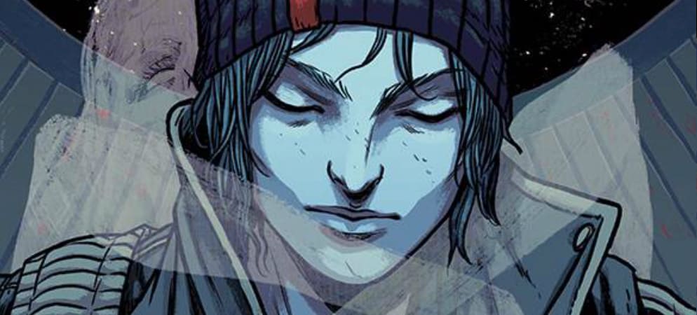
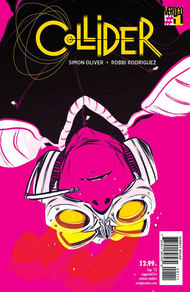 COLLIDER #1
Writer: Simon Oliver
Artist: Robbi Rodriguez
Colorist: Rico Renzi
Publisher: Vertigo Comics
Price: $3
I haven’t been paying much attention to Vertigo’s new line-up recently. I did scan a recent preview of their new launches and what I saw didn’t really excite me. Which is why COLLIDER was such a pleasant surprise. I hadn’t seen anything about a sci-fi action comic in said previews, especially not one with such a wild debut. I’m glad that there’s finally something in their current roster that appeals to me personally and I’m even more thrilled that it’s a damn good title.
COLLIDER is about, of course, physics. But it’s about physics in a world where the laws of well, physics, don’t quite work the way we expect them to. The story kicks off with a tantalizing glimpse into the past when the alternate behavior of physics are first being explored, then jump to the current timeline where we’re introduced to a pleasantly typical everyman named Adam who works for the Federal Bureau of Physics, whose role is essentially the equivalent of the fire department but for disruptive physics instead of fires. They also have a wider role as researchers into the causes behind fluctuations in said physics, which seems to put them at odds with private organizations invested in the same information. We get an intense, fast-paced introduction into how the FBP works, though things go awry and Adam nearly becomes an occupational casualty. After that, the story quickly deepens with hints at betrayal within the FBP as well as some further character development.
The way the world is handled is refined and strong in a way that credits Oliver’s depth of imagination. It feels very thoroughly realized and embedded in a setting that’s so close to our own but amusingly different in the just the right ways. It absolutely makes sense that when a weak gravity field appears at a school, all the kids unwisely decide to play in it, leading to the FBP’s arrival. It’s equally involving when we see the politics at work behind the running and funding of the FBP, especially given how topical the issue of federal agencies can be. So there’s no shortness of interesting ideas at work here and the fact that this appears to be an ongoing series is very exciting. If it reminds me of anything, it’s the underappreciated sci-fi TV show Eureka though this is considerably grittier and way more ambitious.
Vertigo has nabbed an incredible combination with this book because not only is it brilliantly written but the art is delightful. It has a loose, dynamic flow that really explodes with energy during the nail-biting action scene but also keeps the eye engaged during even relatively tedious parts like the political commentary. The panels all pack a solid rhythm that’s punctuated by occasional big pieces; we see a massive physics stabilizer rumble onto the scene and unfold, which is definitely a neat image even if the artist doesn’t lace it with the kind of intricate details you’d expect such a device to have. Yet Robbi Rodriguez deserves kudos for managing not just an exciting rendering of the world but also for churning out pages of genuinely emotional characters whose expressions punch through the pag, even when half their face is covered by a cool set of hi-tech goggles.
Alongside all of this is one of the most stimulating coloring jobs I’ve seen since Sloane Leong’s work on Ales Kot’s CHANGE. Calm, cool colors are frequently jarred by bright, liquid reds and flamboyant purples and when reality actually starts to break down, the palette goes supernova, with hot neons screaming across panels, dark blacks and purples anchoring the action while still solidly representing the real. I can’t praise the coloring enough for, like the art, being both dynamic and pleasing to look at.
If you like non-superhero comics, buy this. If you like sci-fi, buy this. If you like sci-fi comics, you NEED this book. People who don’t get into comics should definitely at least flip through it so they can get an idea of how energetic and fun this title is. It’s quite smart, has big ideas and goes the extra distance to make it all work. I’m thoroughly impressed.
3 GUNS #1 (Of 6)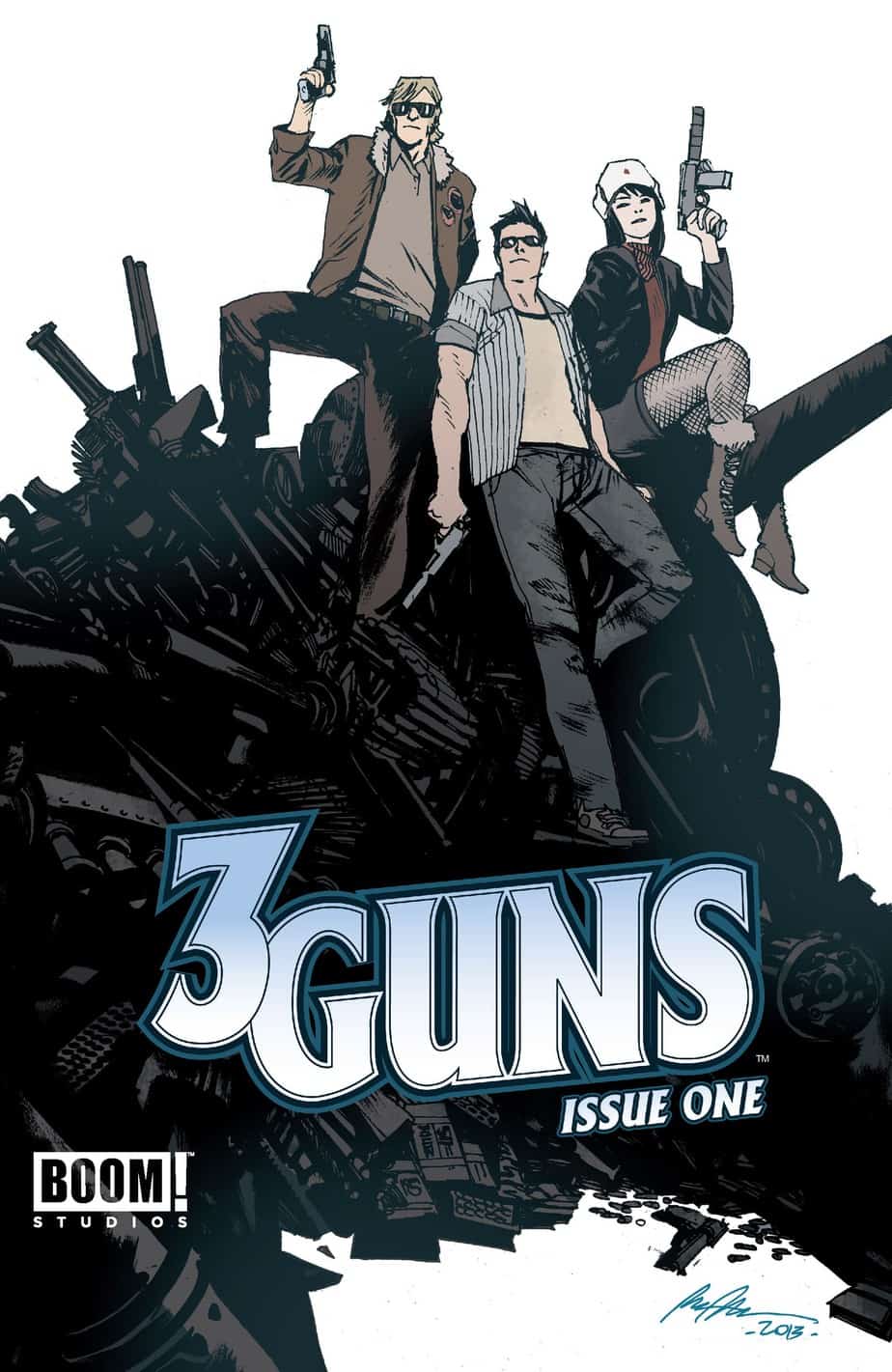
Writer: Steven Grant
Artist: Emilio Laiso
Colorist: Gabriel Cassata
Publisher: BOOM! Studios
Price: $4
Maybe you’ve heard about this new movie called ‘2 Guns’ with Marky Mark and the Man on Fire? If you haven’t, it’s a pretty stupid looking action film about two guys with guns taking on a criminal empire. That’s it. It’s a buddy cop movie except they’re crooks instead of cops. Crooks who fight other crooks, I guess. Well, here’s the surprise; it’s based off a comic book of the same name. Not one I’ve heard of but then, I hadn’t heard of RIPD when they made a movie out of it either so at least I’m consistent.
What does this movie have to do with the comic I’m reviewing? Well, in case you haven’t already guessed, 3 GUNS is the sequel to the not-quite-hit comic book 2 Guns, again being the source material for the movie. I don’t know what is retained between the movies and the comics and, frankly, I don’t care. Like the author of this comic, I’m ignoring the movie entirely and focusing on the printed product.
And what a product it is. I’ve never seen Laiso’s work before but he’s an artist I hope to see more often. Very energetic lines with a rambunctious amount of movement that really accelerates the action scenes, though with this issue, at least, there’s more exposition than anything. But Laiso handles characters just as well, his two protagonists drawn with a surprising amount of gusto, giving them as much exaggerated physical presence as the female character (the “3rd gun” if you will) who interferes with the somewhat contrived but not too distracting plot about a criminal organization posing as a religious cult who wants back the money they paid a Russian arms dealer for an armory, unaware that the very same baddie is plotting to steal back his merchandise, with our two anti-heroes stuck in between. The coloring is as solid and enthusiastic as the lines, so the presentation over all is surprisingly good for a title I’ve never heard of before.
The writing isn’t bad either but it’s a bit disappointing that Grant doesn’t really subvert or acknowledge the corniness of his premise. All of the dialogue has that same hollow drama that movies like Lethal Weapon and Bad Boys sells to their target audience of the manchild so well. None of it is painfully bad but I can honestly say there’s not one funny or quippable line in the first issue to remember and that doesn’t click for a book that should either be a paragon of or at least gently mocking the action film genre.
That said, it’s a fun book that’s quite long and packed with a lot to look at and absorb. But there’s also no real depth to it either, which makes it hard to recommend in an era where there’s a LOT of really good books to check out, some of them cheaper than this one. But if you love movies like Lethal Weapon, you basically have to get this.
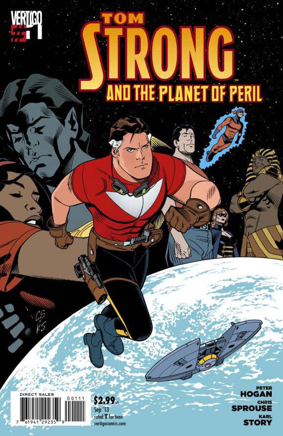 TOM STRONG AND THE PLANET OF PERIL #1
Writer: Peter Hogan
Artist: Chris Sprouse
Colorist: Jordie Bellaire
Publisher: VERTIGO Comics
Price: $3
Tom Strong is apparently an Alan Moore creation, born at the turn of the Millenium as part of DC’s Wildstorm imprint (originally an Image Comics imprint, surprisingly). That’s the extent of what I know about the origins of the series. It appears to have been crafted almost entirely from scratch by Moore, influenced mostly by classic adventure pulp. It shows in this issue that the initial intent is retro pulp superheroics but appreciating the story also requires the context that we’re jumping on board a pre-existing character with a prior series that ended a few years ago.
There’s no prelude or introduction of any kind made, dropping readers smack into the middle of a head-scratching crisis of a very strange kind. The writing is swift and well paced, with an appreciable refinement in both dialogue and pacing, breaking up the exposition with a flashback to Strong’s youth as a science hero in training. But it doesn’t make up for the very rude beginning in which nothing is recapped or any sort of information about the previous events summarized. Characters are barely introduced, if at all, before the world around them begins to fall apart. It’s hard to fault good writing when the blame lies on an editing staff that probably didn’t want to push a page count with backstory. Yet it’s already a strange world Tom Strong inhabits anyway, so not knowing what’s going on at all magnifies the sense of being out of the loop.
The artwork is excellent, perfectly suiting the pulp antics without being too retro. There’s nothing flashy but Sprouse’s characters are very real and their lines are accompanied by powerful emotion. There’s nothing big in terms of action here but there’s a lot of suspense and tension, which Sprouse manages quiet well. The most remarkable thing is that he clearly knows how to draw dynamically; every character pops and looks genuinely cool but, at the same time, there’s a big sense of realism to the world despite clearly being fantastical. The colors as well are strong, crisp, textured and really hold up a lot of the atmosphere. It’s a wonderful display of artistic prowess, if anything.
Still, though, this first issue does promise a lot as a story without delivering much explanation. It basically requires a short hop through Wikipedia and other sources to get an idea of where the plot is coming from before it pulls the rug out from under you. I’m looking forward to the second issue if only for more of Sprouse and Bellaire’s wonderful collaboration. If the story gets pulled together and starts making more sense, then we’ll REALLY have something. As it its, I can only put this down for the real pulp comic geeks, Alan Moore fans, appreciators of damn good comic illustration and, of course, those who’ve read Tom Strong before.
Chris Melkus
Born and raised in the suburbs of Saint Louis, Missouri. Grew up on Ray Bradbury, Silver Surfer and Super Metroid. First introduced to horror when, instead of picking out a Super Nintendo game to rent from the local video shop, I wandered into the horror movie aisles. The cover of A Nightmare On Elm Street is forever imprinted on my brain, even though I didn't see the movie until I was much older. The first "scary" movie I ever saw was A Fire In The Sky. The abduction flashback gave me nightmares for months. I didn't develop a passion for horror films until I was old enough to drink and a friend introduced me to both craft beer and giallo films. From that point on, I was hooked. My favorite horror movies, to name a few, are DEMONS, FOUR FLIES ON GRAY VELVET, FROM BEYOND, BEYOND THE BLACK RAINBOW, etc. More at: http://about.me/cmelkus
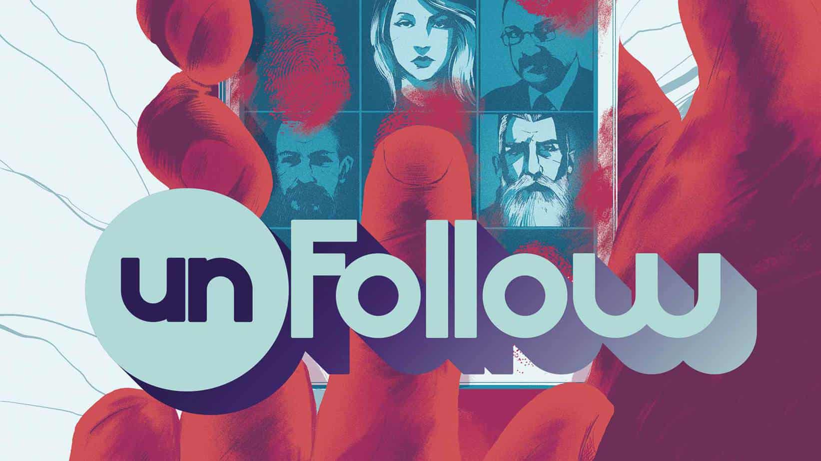
Comic Review: UNFOLLOW
UNFOLLOW #1 Writer: Rob Williams Artist: Mike Dowling Colorist: Quinton Winter Publisher: Ve
[Inked In Blood] New & Upcoming Comics For March 5th, 2015
IN SHOPS THIS WEEK: NAILBITER HACK/SLASH Writer: Joshua Williamson/Tim Seeley Artist: Mike Henderso

[Inked In Blood] New And Upcoming Comics For February 27th, 2015
IN SHOPS THIS WEEK: CURB STOMP #1 Writer: Ryan Ferrier Artist: Devaki Neogi Publisher: BOOM! S