

[Comic Execution] 3/27 – ‘BLACKOUT’, ‘MY LITTLE PHONY’, ‘STAR SLAMMERS’
You’re getting my column a little earlier today.
Reasons:
Wong Kar-wai’s ‘The Grandmaster’ on Netflix Instant
Wrapped crate of Boulevard Brewing Co.’s Grainstorm Black Rye IPA in my work’s beer freezer
Mad sales on tortilla chips, guacamole and frozen veggie pizzas
Crown Valley Brewing’s Absinthe Release Party at Sanctuaria in the Grove
The third edition of Schlafly Taproom’s local, curated, experimental music concert series, UNDERCURRENTS
‘Teaholics’ mixtape by ISSUE
 BLACKOUT #1

Writer: Frank Barbiere
Artist: Colin Lorimer
Colors: Colin Lorimer
Publisher: Dark Horse Comics
Price: $3
In case you missed it last week with my review of ‘Ghost’ #2, it’s become apparent that Dark Horse Comics is attempting to launch their own “superhero” universe ala Valiant Comics, and BLACKOUT is the latest title to join that universe. Writer Frank Barbiere is best known for his work on Image Comics’ pulp adventure comic ‘Five Ghosts’ but BLACKOUT would appear to be a wholly different beast, having a far more contemporary and sci-fi concept behind it. BLACKOUT artist Colin Lorimer is currently drawing ‘Curse’ over at BOOM! Comics but my familiarity with him comes from a great, underrated little miniseries called ‘Harvest’ he did for Image Comics a few years back. So, as with ‘Ghost’, this is a title with a high profile crew at the wheel.
Barbiere is the kind of solid, consistent writer that is the comic industry’s lifeblood; passionate, articulate and adept at bring out the best of the stories he takes on. BLACKOUT sees him diving headfirst into the near-future of big corporations and out-of-control technology. There’s an intro that seems specifically designed to disorient the reader but does it with some incredibly impressive visuals and a couple of cool ideas, like the recursive cops and the legless pilot. He also sets up a lot of pipe by giving us glimpses of several as-of-yet unknown characters who are apparently important to unraveling the meaning of this sequence. Barbiere reels us back in and plants the narrative in the real world, where we meet the pretty generic protagonist, Scott, and his… girlfriend? Wife? Are they even romantically linked? There’s a visual cue that seems to hint that they’re close to each other but it’s not a for-sure.
Fortunately, we don’t have to wait long before we start seeing bits and pieces of the “dream sequence” crop up, including a blonde female scientist who was included in the enigmatic lineup of the intro. The Man In Black that’s interviewing here is more interesting than she is, though neither of them are particularly colorful, but at least he sports a menacing ambiguity, foreshadowing his future involvement in the slowly unwinding plot. The next female character introduced is Scott’s aggressive Asian boss, Kaity. I was actually really glad that she gave Scott a thorough lashing but that’s balanced out by my aversion to the stereotype of a “bitchy” female boss. The mystery of the MIB deepens and we’re treated to the meat of the issue, which kind of an action sequence? It really serves more to illustrate what Scott’s “blackout” suit actually does, and as that goes, it might be worth the the uphill trudge here. We’re left on a cliffhanger, of course, one that introduces yet another intimidating female overlord, this time pushing around the MIB.
Barbiere might be straining just a little too hard with BLACKOUT. He deserves recognition for introducing a total of four female characters in the first issue of the story alone, which is unheard of in the superbooks world. But I’m also not sure he’s doing himself any favors here either. The character of Ms Luca, for example, is practically a nonentity, her personality almost entirely blank. Though, now that I think about it… maybe this is on purpose? I’m not dismissing the possibility that Barbiere’s pulling a fast one. But Scott’s boss, Kaity, fits just a little too cleanly into the bossy Asian woman stereotype for my tastes. That said, it’s also not just satisfying to see her dice Scott with some choice put-downs (the “base-jump” crack was ELECTRIC) but Scott definitely seems like he’d bring out that side of her… or anyone with the misfortune of having to supervise him.
I guess what I resent most is what I take is Ash, Scott’s girlfriend or… whatever. Her supportive attitude seems relatable on first impression but as a clearer picture of Scott himself is drawn throughout the first issue, I find myself actively disliking her matronly coddling of this man-child. But then, as I examine their interactions, I find myself questioning the nature of the relationship. For example, Ash appears to be subtly yet incongruently encouraging Scott’s dangerous escapades with the Blackout suit, prodding him to take action despite his reluctance, which is an unusual role for what I assume is a mere romantic partner, and she takes this even further by driving him to the scene of his next life-threatening exploration.
While I’m certainly buffering my assumptions about the female characters, I’m more disappointed by Scott himself. This guy’s supposed to be a hard-living, extreme-sports type dude who is apparently quite smart as well, given that he works in a high-tech research facility. Yet his behavior in this issue is wholly unlikable. For example, if he’s a thrill-seeker, he’s got a weird way of showing it as he moans about the danger he put himself in by putting on the Blackout suit in the first place, then seems to be undisturbed by Ash’s counterintuitive cheerleading. Shouldn’t be be a little disturbed or worried that she’s more into the Blackout suit than he is? Is he just failing to pick up on her danger fetish, if that’s what it is? And then his incredibly impotent approach to dealing with his tardiness at work is utterly despicable. I mean, sure, his life is very crazy at the moment and his arrival after the fact isn’t his fault but what kind of schlemiel reacts to very valid criticism like it’s a personal attack? Did he not even imagine that Kaity would actually be angry at him and thus approach he without some kind of emotional preparation? Even I know that when I show up late for work without an excuse to be ready for a dressing-down and I work at a grocery store for crying out loud.
But maybe I’m not supposed to like Scott. Maybe that’s the whole point of the comic. Maybe we’re seeing him at the beginning of his evolution as a hero, and we’re intended to find catharsis in both Kaity’s harsh rebukes and the awkward physical defeat he suffers later on. So then what’s really supposed to drive the reader isn’t seeing the non-heroics of Scott but the deepening mystery of just what is going on with the MIB and Scott’s crazy dream. Something tells me it’s the latter, which brings up a related problem; I can tell that, after reading this issue, I’m supposed to have read the two-part BLACKOUT story back in issue 24 of ‘Dark Horse Presents’ for a clearer understanding of what the dream meant, who all these enigmatic characters are and what they have to do with Scott and his missing lab partner Robert, around whom this all seems to revolve. Without the context of that story, the first issue of BLACKOUT is so mired in unanswered questions that it’s hard not to feel like you’re drowning by midpoint.
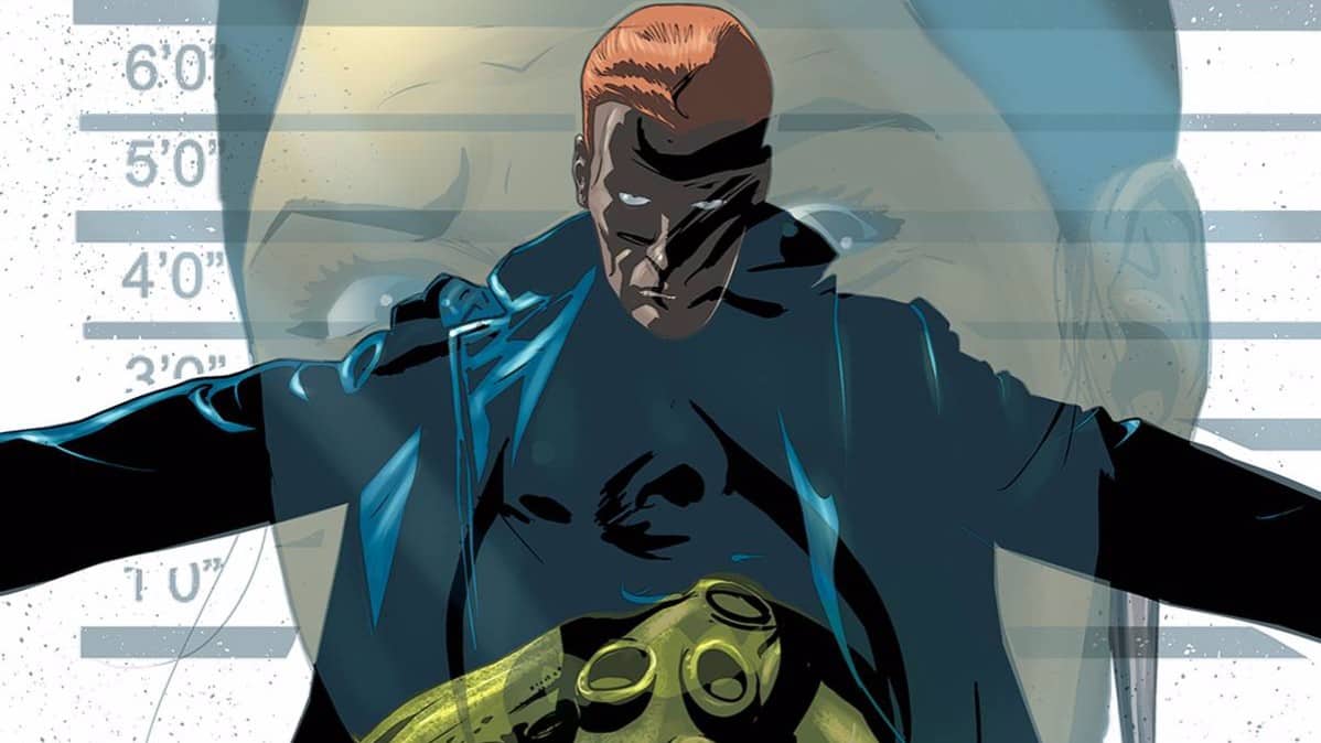
‘THE ART, YOU ASININE FART, WHAT ABOUT THE ART?!” you cravenly screech at me from beyond the confines of this tedious little blog of mine. Yes, what ABOUT Colin Lorimer’s art? Frankly, I love it, in the context of a weird sci-fi story. The very first panel is a great example of Lorimer’s visual bravery. In the foreground is Scott, clad in the remarkably cool-looking Blackout suit, popping out of a complex blast of metallic structures with dozens of iconic policemen in symmetric pursuit behind, pointing fingers and guns, some rappelling down among shards of falling glass. A perfectly slanted panel break cuts across the last fourth of the page, highlighting Scott’s masked face and the panicked expression behind it as more belligerent, uniform police loom at his back. A few pages later and there’s another stunner of a visual that I won’t spoil, suffice to say it’ll stick in my mind for at least a few days, that’s for sure. But that skips another great illustration of a metal strike flashing across a narrow panel as Scott’s face in the background snaps from the blow, shards of glass floating in imagined slo-mo away from his anguished face, which is really only expressed by his one visible eye, yet Lorimer manages to impart enough emotion with that one eye as to make the attack visceral.
But Lorimer is just as comfortable with mundane settings, as he aggressively packs Scott’s domicile with a profusion of detail in an establishing shot few artists could muster after such an explosive opening. And it’s not just his controlled blanket of attention to every little thing but the panel dynamics that he maintains even with such tedious events; a brief pair of flashback panels are set into thick black borders and cut in half by an anxiously crooked line, all of which is followed up by a panel in which the helmet of the Blackout suit serves to further break up the relatively-boring goings-on, giving the dialogue overlapping it a heavy underline of ominous. Visually, nothing really hits this level of brilliance again until the MIB character is watching a video, which Lorimer illustrates with painstaking precision, clarity and detail AND IT’S A VIDEO A CHARACTER IS WATCHING. Like, it’s crazy how surgical Lorimer is in his craftsmanship. And it goes without saying the the showdown in the lab that follows is beautiful, atmospheric AND dense; Lorimer’s ability at making guns look real is super impressive but then you see him draw a car and it’s like, WHAT. HOW.
The actual Blackout scenes where Scott is phased out of reality have a delightful weirdness to them, with unnatural lighting being used to force a sense of topsy-turvy. The panel work here, as things go south, has a pleasing rhythm to it that gets me excited for when Lorimer gets to illustrate some REAL action sequences. My only real complain with Lorimer’s work here is that his characters expressions are noticeably stiff, with some exceptions here and there. Nobody’s mouth opens except maybe for once or twice, and it’s weird because you can tell Lorimer’s good at drawing teeth so it can’t be that he’s got a deficit there. I guess it’s just a case of not having the time to really craft authentic emotional portraits and relying more of the dialogue for that. Which is a bit disappointing and, were the dialogue not so sharp, might be a major shortcoming. As it is, there’s so much richness on display that I’m certainly willing to overlook it.
But what I can’t overlook is the fact that there’s only 16 actual pages of BLACKOUT in this comic book. The last six pages are dedicated to seemingly unrelated story, titled ‘King Tiger.’ On the cover of this, the debut issue of BLACKOUT, there is little notification that you are not getting an entire BLACKOUT comic, except for a small, tacky ‘King Tiger’ logo in the lower right hand corner, blotting out a small portion of the cover art in a displeasing manner. The quality of the ‘King Tiger’ story, while certainly acceptable had it been part of a full issue, is a moot point. By taking away space from BLACKOUT in favor of ‘King Tiger,’ Dark Horse already set me against it and the fact that it is in no way proves, in its six-page span, that it holds a candle BLACKOUT, doesn’t help in the least. I seriously have no idea what Dark Horse was thinking here, though I have an actual inkling. You see, there’s an editorial column that follows ‘King Tiger’ and, in it, we are informed that the writer of ‘King Tiger’ is a Dark Horse Comics founder(!) and head editor on, coincidentally, their most profitable franchise of comics, ‘Star Wars’! I won’t bother expounding on my feelings about that particular aspect but, should you fail to surmise them outright, I will declare my cynical disdain for the unwelcome intrusion of said editor in this, what I thought was a BLACKOUT comic. I mean, I know exactly what’s going on here; Dark Horse wants to spread out this BLACKOUT story, which could easily be a three-issue run, into four books. They could not be more overt about it, and that’s pretty foul. Even worse, I can’t help but wonder if Dark Horse was maybe cynically trying to cover their asses in case the much less conventional BLACKOUT failed to suck in unfamiliarized readers of the first issue or perhaps even alienated them with its convoluted, inaccessible narrative.
I really, really don’t want to execute BLACKOUT. I went into it with low expectations and more than a gram of pessimism but, besides Barbiere’s sharp dialogue and keen expositional pacing, artist AND colorist Lorimer seriously knocked me flat on my ass in a way that hasn’t happened in a long time. If this was a full comic of BLACKOUT at the generous price of $3, it would’ve passed my first issue inspection competently. But with Dark Horse greedily diluting the series (not mention ruining a perfectly good cover), I’m hard pressed to let it slide. But I know that Barbiere has the best of intentions and I seriously would feel terrible executing a comic full of such incredible work my Lorimer so I’m giving this series one more issue. If BLACKOUT #2 sees a drop in the number of BLACKOUT pages, or I see a horrendous ad blotting out my lush view of Lorimer’s art or, and this is by big concern, I discover that Ash and Kaity really are just as obnoxiously shallow as they appear, I’m done with the series.
PS: As of the writing of this review, I’m seriously considering some kind of video essay on how awesome the visual design of the Blackout suit is. It’s a significant portion of my desire to see more of this comic.
MY LITTLE PHONY: FANDOM IS TRAGIC ONE-SHOT

Writer: Mike Moreci, Steve Seeley
Artist: Ken Haeser
Publisher: Dynamite Entertainment
Price: $4 (Digital)
Are you familiar with the term “brony”? No? GOOGLE IT.
Just Google it.
Did you Google it?
Yes?
I’M SO SORRY.
But you have to know the context of this comic for my review to make any sense. MY LITTLE PHONY is a comic that pokes fun at bronies. And by “pokes fun” I mean cuts them open and feeds them their own guts.
The comic doesn’t just make fun of bronies, though. No, writers Michael Moreci and Steve Seeley aim higher than that. They’re here to brutally mock the very idea of a ‘fandom’ of any kind. Hell, the comic’s subtitle is “Fandom Is Tragic.” You can tell almost right away that there are no innocent bystanders for them as they set the genesis of their tale at San Diego Comic Con, already a pretty subtle dig at the fact that a “comic” convention hosts things like the premier of a kid’s cartoon. Follow this with a perfect depiction of how some fandoms have zero interest in the work or history behind their associated franchises, and this isn’t an exaggeration either. There is a couple of pages of an actual ‘My Little Pony’ spoof which, while not nearly as funny as the parts of the comic set in real life, has some clever riffing on the TV show.
No, it’s the comic’s faithful rendition of the kind of subhuman crotchstains who populate these fandoms that’s the real draw. The more you read the interactions of the two main “Horse-Hes” the more apparent it is that their attitudes aren’t exclusive to the brony fandom. In fact, it almost reads like Moreci & Seeley are satirizing comic book fans, if anything. But that might just be me, as a long time comic book reader, seeing that in them. Which should be a measure of how great their writing is.
But the real-life drama gets upstaged briefly by the ‘My Little Pony’ spoof when it veers into incredibly risque territory when one of the “Horseys” reveals what looks almost exactly like a baggie of pot. But the joke lands PERFECTLY, timed so well and being so unexpected, I gasped. The humor isn’t just shock and petty mockery, though, as the irony of a brony-brawl shows. It’s quite funny to consider the frictional nature of the fandom, given that we’re talking about a show that’s supposed to promote friendship. Then there’s the interviews with an assortment of Comic Con characters re: the brony brawl, and I’m glad to see that the writers have no compulsions about taking shots at anyone in range.
Eventually, though, the story goes some place really strange, as the two crazed fans begin a game of one-up-manship that escalates past some very funny, plausible hijinx and into the realm of genuinely horrifying, though thankfully the jokes escalate in audacity and absurdity. Then things get SERIOUSLY AWESOME as the story takes a totally unexpected turn and, well, trust me when I say that this comic would be a huge hit for fans of, say, ‘From Beyond’ or anyone who likes weird, gory horror.
The art is pretty good, if just a bit sloppy. Artists Ken Haeser and Kewber Baal deserve more credit than that statement for pulling off such a diverse range of stories; the real-life drama, the on-point spoof of ‘My Little Pony’ and the over-the-top horror of the climax. The colors by Andrew Elder go a long way towards executing the drastic stylistic changes between the three “forms” of the comic, especially the atmospherics of the horror stuff and the gratingly saccharine hues of the ‘MLP’ spoof.
This is just a one shot comic but you NEED to read it if you’re at all familiar with bronies, comic book geeks, otaku, Magic players or hardcore fandoms of any kind. Even if you’re not, you’ll still enjoy it for the completely insanity of the second half of the comic, which I can’t recommend enough. This comic is going to get overlooked because it’s ostensibly about bronies, but it’s much more than that. It’s in-your-face funny but more importantly, it’s smart enough to stir some unexpected and welcome elements into the mix. It is a bit pricey at $4 but it’s not just worth the cost but buying it will push the publisher, Dynamite, into considering more of these one-shot satire books, and the comic industry definitely needs more people making fun of it.
 STAR SLAMMERS #1

Writer: Walt Simonson
Artist: Walt Simonson
Colors: Walt & Louise Simonson (Remaster: Len O’Grady)
Publisher: IDW Comics
Price: $4 (Digital)
Back in 1983, a comic book writer named Walt Simonson wrote a “graphic novel” called STAR SLAMMERS for Marvel Comics, who had employed him at that point to, most famously, write ‘The Mighty Thor.’ In fact, you know that movie about Thor? You can credit its existence to Walt Simonson. So STAR SLAMMERS was kind of a big deal, especially since it was part of Marvel’s early foray into the world of graphic novels. Now, I know Walt Simonson best for co-authoring a late ‘90s comic called ‘Weapon Zero,’ a sci-fi saga about, what else, aliens fighting intergalactic war, though most of the story took place on Earth. STAR SLAMMERS, which could definitely be cited as an influence for ‘Weapon Zero,’ takes place throughout the galaxy and follows a group of the titular badass space mercenaries. It’s an acclaimed series whose original run has never been republished in its entirety, despite efforts in the mid nineties. IDW has obtained the rights to reprint it and there’s been a bit of hype surrounding the reprint so let’s see if its as incredible as they claim.
The story starts off with the kind of thing you only ever really see in older comics; a terrestrial war fought on a far off planet. There’s a firm sense of place established and there’s more of a focus on building atmosphere than pushing a narrative. Then the Star Slammers show up. The first few pages feel like they were pulled from an old war comic, and not in a bad way; even though you know what’s going to happen, the turn of events is satisfying in its awful grandeur. As the story continues, there’s a sense at first that this could be told anywhere; it’s a basic tale at first, about power and war. But it evolves quickly, despite being told with sparse, simple dialogue and narrative. It’s revealed that the Star Slammers have a bigger concerns than the petty squabbles of the races they’re hired to fight for, which makes sense.
But Simonson starts getting into weirder territory, revealing the grander ambitions of the Star Slammers, who are attempting to harness their own minds to inadvertently create the most perfect weapon. A flashback of sorts, cleverly employed in-story by way of mind-sharing technology, reveals the origins of the Star Slammers’ patriarch, and it’s a pretty grim tale that echoes the ubiquitous genocide of natives by European imperialists, though it’s maybe a bit insensitive that the hunted are pale-skinned like their oppressors. It definitely feels like something that wouldn’t fly in today’s comics, and for good reason, as it’s more than a bit insensitive.
Simonson’s art is fantastic, naturally. There’s absolutely no question that the acclaim this series has garnered is justified. The retro-futurism on display is so charming and disarming you can’t help but grin at some of the panels packed with fashionably colorful space tech. The lettering alone puts to shame 90% of what’s on shelves nowadays, with its sharp, deadly accurate boldness, synergizing perfectly with the visuals. John Workman is the name behind the lettering and frankly I’m absolutely stunned that it wasn’t Simonson himself who did them, so astute are their placement and coordination with the artwork. The colors, which were originally Walt and his wife Louise, are enhanced subtly in this reprint, and the whole affair is just impeccable, every page filled with hues both nuanced and bold, bringing to startling life the old-school sci-fi and filling it with vitality.
But the story is still an average one, if well told, and while the artwork is absolutely incredible, IDW wants $4 for a measly 21 pages, blatantly below standards for the industry. And it’s a reprint, compounding the problem. I’m going to wait and see if the next issue steps it up on the page count. If it doesn’t, then I’m executing this series and recommending the short wait for the inevitable (and cheaper) trade paperback.
Comic Review: WEIRD DETECTIVE
Chris Melkus gets weird with Dark Horse Comics' Weird Detective #1!
[Inked In Blood] New And Upcoming Comics For July 23rd, 2015
IN SHOPS THIS WEEK: WOLF #1 Writer: Ales Kot Artist: Matt Taylor Colorist: Lee Loughridge Publish
[Inked In Blood] New And Upcoming Comics For July 16th, 2015
IN SHOPS THIS WEEK: DEATH HEAD #1 Writer: Zack Keller, Nick Keller Artist: Joanna Estep Publisher