

[Comic Execution] 1/24 – ‘DEAD BODY ROAD’, ‘UMBRAL’, ‘THE MIDAS FLESH’
I’m dedicating the beginning of this column to issue three of Larime Taylor’s ‘A Voice In The Dark’, which I failed to review last week. Thanks to how long the respective issues are, I was under the impression that the newest issue was number four. That means that I haven’t actually completed my evaluation of the series. This actually works out better because what I’m going to do instead is give my review of the issue a separate article, including a video of me talking about why more people should be reading it. But since that’s coming a few days from now, I’ll say this; if anyone was in doubt as to whether the series genuinely qualifies as horror, the beginning of this new arc should clear that up unquestionably. Keep your eyes peeled for my article about the series.
 UMBRAL #3

Writer: Antony Johnston
Artist: Christopher Mitten
Colors: Jordan Boyd
Publisher: Image Comics
Price: $3
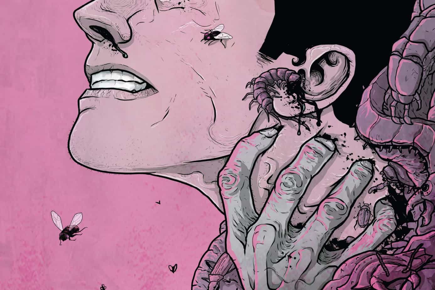
For just a second, I want to talk about the cover art for UMBRAL #3. Frankly, it’s brilliant. But it’s brilliant in an unusual way. While it could certainly be argued that this is not necessarily the way it should be, the fact is that cover art needs to effectively A) grab the attention of the viewer B) convey the theme of the contents. Looking at that first priority, artist Christopher Mitten and painter Jordan Boyd chose an unorthodox approach by presenting the entirety of the artwork in varying shades of purple and pink. That’s bold, not just because it’s radical but because it’s risky; saturating a cover in one hue, especially one as subtle as purple, can actually make it seem featureless, the sameness rendering it uninteresting, even when myriad shades are present.
What’s most important then is what is being presented. In this case, it’s a massive stone face, both emotionless and intimidating, lined with craggy seams and black shades beneath glowing white eyes. What especially impressive is that Mitten’s lines manage to convey a sense of its monolithic scale without a reference for size. But there’s also Boyd’s dreamlike painting, using what I would describe as “psychedelic” dashes of bright pinks to convey power and mystic energy glowing and flashing from the eyes. The image, as a whole, manages to grasp the elusive combination of surreal grandeur. Anyone who hasn’t read the series will see it and immediately wonder what that face is and why it looks so alien but those who ARE reading the series will be even MORE piqued, since nothing like it has even been HINTED at in the previous two issues.
Does the story back up such an enigmatic cover? Johnston definitely has been taking his time with unraveling the mysteries posed by the first issue while still more questions surfaced as the second came to a close. The flashback beginning #3’s story is surprisingly mundane, given the cliffhanger it followed, as refugees who appeared briefly prior now arrive at their destination, mirroring the grim conclusion of the last issue. Clearly, we know something’s amiss but the rogues who cautiously welcome them don’t see past the lies, even as we return to Rascal’s investigation of their remains. Keeping the story fluctuating between the past and present really helps key up the suspense and is handled gracefully as both narratives end with the reveal of the Mistwalker. I can’t even talk about how awesome the Mistwalker is but let me just say that the name, as cool as it is, doesn’t do justice to what Johnston and Mitten have summoned.
They follow this up with more carnage, furthering the menace of the Umbral and revealing just how Rascal’s friends were slain. Yet there are more mysteries abound, one presently recurring one re; old Dalone’s real identity cropping up to remind us that for everything we think we know, there’s another veil to lift. That’s what I love about Johnston’s writing; he keeps the plot moving and gives up just enough information, like a fisher teasing the line to lure a catch. Some trouble goes down and Rascal’s paranoia gets to her, reminding us that she’s still basically a criminal trapped in a situation she’s barely got a grasp of.
Things only go downhill from there as she obsessively pursues her initial objective, triggering a series of events that make Mistwalker an even cooler… thing. It’s a shame Dalone pulls a “heroic sacrifice” but something tells me it’s not as noble as all that and after Rascal quickly recovers she takes action, one we don’t really know the full effect of before an abrupt cut to elsewhere.Not satisfied with concluding on one cliffhanger, Johnston unwraps yet another nasty revelation that harkens back to the first issue. It’s suitably foreboding and splashes more twistiness into the plot.
Christopher Mitten, Jordan Boyd and Thomas Mauer masterfully blend beautiful, surreal imagery with grounded, energetic storytelling, keeping panels tight where better served then opening up the throttle with big, thrilling scenes lush with detail and those intoxicating colors that ebb as the story narrows to focus on drama. Mauer’s delicate but thoughtful details in the lettering is something you have to pay attention to in order to notice but it contributes effectively to the weird aesthetic. I want to go on about how great the art is but this is a case where saying too much would spoil how wonderful it is. But let me make a gentle suggestion; if it’s not too late, go to your local comic shop, pick up a copy, and flip through haphazardly. Don’t look too closely but glance through it just long enough to SEE the Mistwalker. THEN try to put that comic back on the shelf. If you can do that, this UMBRAL just isn’t for you.
But those of you this comic IS for (and that should be a LOT), we collectively need to thank Image for ensuring that this title is generously endowed with 24 uninterrupted pages of greatness plus an informative and charming letters page and only two ads between that and the back of the book. For a measly $3. That’s less than a Magic: The Gathering booster. It’s a full dollar less than your average Marvel/DC comic, and has more bang for your buck than BOTH the other comics I reviewed this week.
DEAD BODY ROAD #2

Writer: Justin Jordan
Artist: Matteo Scalera
Colors: Moreno Dinisio
Publisher: Image Comics
Price: $3
Now that DEAD BODY ROAD writer Justin Jordan has left behind the series I knew him for (‘Shadowman’), this is the only book of his I’m reading. ‘The Legend of Luther Strode’ has wrapped up and, besides DEAD BODY ROAD, he’s writing nothing but Big Two titles and ones I have zero interest in, sadly.
I’m not really sure DEAD BODY ROAD is a book for me. The writing is still just as action-movie intense as the first time around but this time it revolves around, at least at the start, a woman named Rachel. Her immediate introduction hints pretty strongly that she’s pregnant, possibly with the child of a dead man. I’m already rolling my eyes at the ironic tragedy of it; now there’s men coming who will probably torture her and of course that’s even more horrible because baby. Nasty guys show up, she reveals that she’s (surprise) a hardass and nearly escapes but, of course, has to be rescued in the nick of time by the protagonist. Like clockwork, they take out the bad guys, confront each other, reconcile (sort of) and are on their way. Sure, a good action movie doesn’t bother with exposition but this one is just plain dry.
Rachel is a genuinely confusing character. She’s in the bathroom at the start, having a bit of an episode. Then she plays for sympathy when confronted until the bad guys push her too far and she gets a bit menacing. But later, she’s got a gun in her hand and tears in her eyes when she asks about the fate of her beau Jimmy. I don’t know how much time elapses between that scene and the next but at that point she’s openly talking about how much she regrets meeting Jimmy and mocking the protagonist’s dumb revenge spree. She careens from sociopathic to tears to light-hearted at hairpin speeds. I genuinely don’t like her. Between that and the protagonist’s absurdly cliche motives (ones that Jordan himself nods at), I’m having a hard time even caring about these characters. And then I realize I’m not supposed to, I’m just along for the ride? Except that’s not why I read comics. If I wanted that, I’d watch an action movie.
The art is still the best part of this book but this issue is taken up mostly by talking, with only 7 pages of action. There’s some violence and one pretty awesome headshot and Matteo still imbues every panel with energetic lines but there’s also a rushed feel to some of the panels; compare page 10 to page 14 and notice the clear care taken with the latter absent in the former. But Moreno Dinisio’s colors are still taut and concrete, every page ripe with texture and familiar shades of the real world but just worn enough to feel slightly unpleasant. His work with close-ups transforms Scalera’s exaggerated lines into sculptures and he’s at least partially to blame for the impact of the bite-sized portion of violence in this issue. I also took notice of Pat Brosseau’s popcorn blasts of compressed sound FX, spiking the action with delightfully visceral crunches and blasts.
But despite this work, this is the first Image title I’ve felt like the publisher has failed the title. Only 20 pages of comic in a 30 page book. Is this because Scalera is also working, at the same time, on the higher-profile ‘Black Science’? Probably. Does that excuse Image putting this out and packing ten pages of fluff into the back of the issue? No. They should be giving Scalera space and putting this on the backburner instead of rushing it out. Opting for a full-sized issue of quality work would be more in line with Image’s MO of being the foil to the Big Two. And, can we PLEASE knock it off with the advertisements for the loathsome ‘King of Nerds’ TV show? It’s repulsive. Get a different sponsor, Image.
 THE MIDAS FLESH #2

Writer: Ryan North
Artist: Shelli Paroline
Colors: Braden Lamb
Publisher: BOOM! Box
Price: $4
I’m kind of surprised by how little press this series has been getting, at least that I’ve noticed. It’s written by the “Internet-famous” webcomic guy Ryan North, now also known for his successful ‘Adventure Time’ comic series. You’d think that, given how successful both of those ventures have been, that a creator-owned sci-fi book from him would be more talked about. But this is only the second issue so I guess the buzz is still building. But this is also the launch title of a new publisher (well, technically an imprint) and that seems like it would amplify expectations. Or maybe I’m just not paying close enough attention to the comic-book blogosphere. Yeah, it’s probably that second one.
There’s something irresistible about North’s writing that conflicts with his at-times frustrating inability to shut off the Internet-shaped “voice” he writes in. Or maybe it’s not an inability but simply that he doesn’t need to and, given that this title seems pretty clearly aimed at the demographic that already reads his webcomic and Adventure Time series. There are some moments where the dialogue feels more grounded and not quite so clever, usually when things get serious. But most the issue, from page one on, has the three main characters tossing quirky quips back and forth in a manner that would probably get on my nerves after too long. Which it kind of is, at this point.
Fortunately, North also knows how to craft a compelling plot. As the intrepid crew of science ship Prospect analyzes the results of the mysterious ‘weapon’ that turned an entire planet into solid gold, we’re treated to a pretty amusing scientific study of how the Midas Touch would’ve worked had it occurred in the real world (well, as real as one with talking dinosaurs). And just as the intrigue of their examination wears off, the dinosaur character has a dream/flashback, revealing that the human-led, militant, space-faring Federation killed someone close to him in the act of attacking a planet. There’s no real context provided for this tragic scenario but it serves well the purpose of adding another layer of mystery to the world of THE MIDAS FLESH without interrupting too disgracefully. But then, as with the previous issue, we’re treated to some snooze-inducing explaining that thankfully only takes up two pages before the expected “other shoe” drops, one that’d been dangling precarious since the first issue.
Except we get another two pages of scientific explaining. I get that this is supposed to be sci-fi but North has to make a choice; if he wants to write a snappy sci-fi comic, he’s going to have to give his readers some credit and not dedicate four pages of boring visuals (with the exception of a soldier being Midas’d) to stuff we wouldn’t have missed if it was skipped entirely. Or he could actually write the sci-fi novel that this story wants to be and, frankly, would be better as. Either way, I’m barely paying attention to these pages, much less the uninteresting panels of art dedicated to such tedious exposition. When North does return to, you know, actually moving the plot along, it’s quite the relief, especially as he introduces new characters, then adds a layer of moral ambiguity to the crew’s efforts.
The whole thing ends with the big reveal, which I won’t spoil here, except to say that it was not what I expected. I’m very curious as to how North is going to reconcile what he’s revealed here with the world he’s set his story in, but it looks like there’s going to be some genuine space combat before then. Maybe. Regardless, as with the previous issue, North leaves this issue on a gracenote.
Artists Shelli Paroline and Braden Lamb manage to wring a bit of excitement out an art style that still doesn’t quite gel with the epic sci-fi storyline. Yet I can’t quite elucidate why. The main characters have features that should make them feel more real but visually, they look cartoonish; the dinosaur character certainly LOOKS scientifically accurate yet has a Saturday morning cartoon feel. Even the grim invasion sequence features laser toting powered armor that, for all its riffing on Robotech and Tiger & Bunny, looks more like a kids toy than a weapon of war. Overall, both the lines and the colors lack a certain grittiness that I’d hope for with a science fiction yarn of this cleverness.
Alas, the one thing that would’ve redeemed a book I struggle to justify at $4 has been changed since the last 27-page debut issue. See, in the last issue, it seemed like BOOM! Box was a publisher set on raising the bar for comic books by presenting grander, more imaginative stories with shorter runs of longer issues but THE MIDAS FLESH #2 is only 22 pages. Let’s compare this to the third issue of Image’s UMBRAL, a generous 24 pages for only $3. THE MIDAS FLESH was already a mixed bag, between North’s excessively quirky script and art that doesn’t suit the tale but for a publisher to cut 5 pages off the book on the sophomore outing is not a move I’m going to condone. I’m executing THE MIDAS FLESH.
‘REGRESSION’ Comic Review
REGRESSION #1 Writer: Cullen Bunn Artist: Danny Luckert Colorist: Marie Enger Publisher: Image Comi
‘UNDERWINTER’ Comic Review
UNDERWINTER #1 Writer & Artist: Ray Fawkes Publisher: Image Comics Price: $4 CLICK HERE FOR PREV
Comic Review: THE GODDAMNED
THE GODDAMNED #1 Writer: Jason Aaron Artist: rm Guéra Colorist: Giulia Brusco Publisher: Im