

[Comic Execution] 12/27 – ‘PRETTY DEADLY’, ‘UMBRAL’, ‘BLOODHOUND’
Well, the Christmas season is officially over. We’ve beaten the final boss. OR HAVE WE??!! Uh-oh, it looks like the boss monster has a THIRD form; NEW YEARS EVE! Hurling whirling bottles of spewing champagne and assaulting us with waves of noise blasting from its myriad multitudes of drunk revelers, we’re going to need every health potion and revive spell we have in our inventory to survive this battle. But what will be left of our world when the smoke clears? Will 2014 welcome us with good cheer and perfect teeth or will we survey only the appalling wreckage of a dying wasteland as we grieve those we lost in the fray.
Yeah, I’m thinking the 31st will be a good night for a kung fu movie at home by myself. Well, by myself in the middle of the stupid party my roommate will have and probably invite me to and all my friends will be at.
What I’m trying to say is; what are you doing, Jet Li, this New Year’s eve?
 PRETTY DEADLY #3
Writer: Kelly Sue DeConnick
Artist: Emma Rios
Colors: Jordie Bellaire
Publisher: Image Comics
Price: $3
Not sure what to make of the mixed reactions people are having to PRETTY DEADLY. I think it’s an incredible book that deserves to be as popular as ‘Nowhere Men’ or ‘Revival’. What is it about the book that’s so divisive? I can’t possibly imagine anything being turned off by the artwork, which is at least as good as the standard superhero fare. Maybe the writing is too complex? I complained a bit in my first review in regards to what felt like a sloppy script but by the end of the second issue, I felt like it had less to do with the tightness of the writing and more to do with the fast pace of the story, which is something I actually love about PRETTY DEADLY, because too many books stretch out their content for the sake of milking a popular title.
But I think there’s more to it than the writing. I posed a hypothetical question to myself; what if the character of Ginny was male? And that’s when it occurred to me that such a book does exist; ‘East Of West’. It’s a bit different, certainly, since PRETTY DEADLY is a fantasy western while ‘East of West’ has a sci-fi meets western aesthetic that throws in supernatural elements as well. But there’s a lot of similarities. But even if PRETTY DEADLY could be accused of “ripping off” ‘East of West’ it’s not like there isn’t room for two such titles in the world of comics, though I’d point out that there’s a totally different theme being explored between the two of them.
Regardless of the merit of PRETTY DEADLY in the context of current comic book trends, what of the quality of the latest issue? Has it held up? Well, on the writing end of things, I’d say it’s met expectations set by the second volume. We get our prerequisite prologue featuring more skeletal rabbit antics, which this time around seem to be acting as a humorous foil to the main storyline, though there’s still a sense that there’s some kind of symbolism at play here. We’re returned to the character of Johnny, who set the plot in motion in issue one, as he finds himself confronting a talking crow. The crow does fit into the rather overdone cliche of smartass birds but it’s a cliche that has never really rubbed me the wrong way so I’m overlooking it, especially since it’s a well written cliche.
There’s more exposition with Ginny and her new “friend”, the slight vagueness of it not quite so irritating since we can speculate a bit more accurately now as to what they’re talking about, though fortunately DeConnick’s knack with dialogue keeps it lively. What really makes the scene work is the slow but exciting evolution of characters’ relationship, especially when the scene comes to a close in an unexpected way. The focus moves to Fox and the vulture girl, where a confrontation between the two (despite an impending flood) results in a flashback that FINALLY fills in most of the details we needed to get a real grasp on what’s been happening. This is the turning point in the narrative and it’s told masterfully, both echoing classic Greek tragedies but twisting them as well. There’s more than a few genuinely cool moments, with lines like “You are only blind to that which you do not deserve to see” hitting like a gut punch. The final page sees Fox and Sissy in danger from the flood they knew was coming. The symbolism is big but not immediately obvious, thankfully.
And this is all conveyed with some of the most impressive artwork I’ve ever seen. Can I just stop for a moment here and, regardless of how awe-inspiring the visuals are, thank Emma Rios (And Image) for drawing a naked man without childishly hiding what makes him a man. So many comics try to be edgy with their nudity but fail. Here, Emma and DeConnick say; this is a naked man. Enjoy it. Or don’t. And he’s not idealized, either, which is even more thrilling. So much courage here, artistically. There’s a scorpion in the later panels, drawn with as much expertise and detail as the people themselves.
I’ll spare you the continued praise because I could go on for a while. PRETTY DEADLY and TRILLIUM will be the two best comics to grace the pages of Comic Execution, so if you’re not collecting this series by now, you can’t be helped.
UMBRAL #2
Writer: Antony Johnston
Artist: Christopher Mitten
Colors: John Rauch
Publisher: Image Comics
Price: $3
UMBRAL doesn’t seem to be getting much attention, which is interesting for an Image title bearing the loudly-declared label of “dark fantasy.” As I said in my first review, this was actually a bit putting-off for me but I would’ve that at least some Image fans would pick it up on. But as I read some of the reviews of UMBRAL #1, I picked up on what was generally being lost on readers who did try it on; it’s a horror comic set in a fantasy world, and that’s not a combination anyone’s used to. Take, for example, the sudden and brutal death of a major protagonist in the first issue; most readers had a hard time even accepting that, much less the unrestrained weirdness that followed. I didn’t find it as rough since, frankly, I welcomed the unexpected subversion of expected genre tropes.
This issue doesn’t quite backpedal but it does yet again carve a path into unexpected territories. Again, Johnston’s dialogue is, from the start, charmingly anachronistic, giving the fantasy setting a pleasant tongue-in-cheek tone that gets dialed up a bit with the arrival of enigmatic yet ornery old Dalone, who provides both a needed foil to heroine Rascal’s perpetual cheekiness and a well-written exposition provider. Johnston keeps the plot moving fast by cutting to the malevolant machinations of the antagonists, known as as Umbrals. A moment of conflict between Rascal and Dalone highlights an important facet of UMBRAL’s world; magic users are basically monsters, to the extent that Rascal would endanger herself to avoid one. The action thankfully slows down long enough for Dalone to get some much needed backstory but only for a moment. The next chase sequence ends with a grim scene, yet again highlighting how occasionally dark this book can be. Yet this issue seemed more like an action-comedy than a horror fantasy. Am I complaining? Not really. Probably because the first issue had some of thise as well but also because it’s so well written.
It also doesn’t hurt that said thrill ride is GORGEOUS on page. The gloomy grandeur of the setting is just as tantalizing this time around, though there’s not quite as much visual weirdness. Still, Mitten needs to be illustrating sourcebooks for ‘13th Age’ or something because never have I seen such cool looking fantasy background art and he really knows how to set a mood, even as his POVs bounce from one dynamic angle to another, despite the disappointingly tedious panel layouts. But it’s not really just his work that’s magical here; colorist John Rauch brings a huge sweep of powerful spectrums to bear, crafting surreal atmospheres on each page. Normally, I’d complain about an artist saturating such refined lines in repetitive purples and blues but there’s something very hypnotic and immersive to his nuanced hues, lending more of a dreamlike ambience to the affair, rather than the expected result of boring minimalism.
With the second issue of UMBRAL, we’re given more answers to the mystery of the Umbrals, even as the protagonists are pursued across the gritty, beautiful city. With the introduction of Dalone, we get a character we can sink our teeth into who also helps ground Rascal, letting both breathe as characters, despite the breathless excitement filling the pages. And with a continued 3$ price point, I’m recommending this to anyone who likes fun, weird, spirited comics in the vein of Sandman or even Studio Ghibli’s stuff. It’s really good and even though it has a minor identity crisis, it’s too fun to let that get in the way.
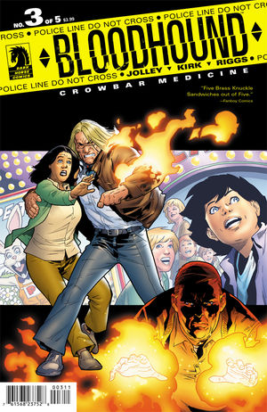 BLOODHOUND: CROWBAR MEDICINE #3
Writer: Dan Jolley
Artist: Leonard Kirk & Robin Riggs
Colors: Moose Baumann
Publisher: Dark Horse Comics
Price: $4
I’m going to keep this review short because I don’t have much to say about BLOODHOUND #3 and very little of it is good.
The writing, by this point, has dropped just low enough on the effort scale that I’m genuinely bored with it. It fulfills all the generic cliches of gritty anti-superhero comics, including a hardass camo-sporting general who just doesn’t get along with the lone-wolf protagonist. There’s a few pages of reiteration of the story so far with very little new to add, information-wise, which is pretty irritating since the last issue left off with quite the moment of intrigue. There’s more of the faux-political commentary that’s dotted this series from the start, but I’m not reading comic books for thinly-veiled yet insubstantial sociopolitical metaphors. There is a much more substantial riff on the surreal horror of suburban warfare as the doughy schoolteacher from the last issue takes the first steps towards mastering his new fire-throwing powers and his cheerleading wife congratulates him. It’s a pretty sickening moment, so good on Jolley for showing us how dangerous their mindset is but that’s followed by some really tedious and blunt character development where the protagonist displays his surprisingly (though not by now) progressive parenting skills.
Jolley builds suspense pretty well, even if we already know something tragic is about to strike when fireball-wielding suburbanite spies a petty conflict in the parking lot where the protagonists family is at. Naturally, the idiot ignites a chain of explosions that kills the protagonists would-be step-daughter. Of course. Because the main character has to have someone important to him die before the plot resolves. Now, I understand that the titular Bloodhound, Kevin, isn’t supposed to be a “good” character but for a book that seems to go out of its way to make him look like an increasingly human person, this is just a ridiculous twisting of the knife. It’s not even tragic, it’s just maudlin, especially the way the whole thing goes down, him running towards the explosion, somehow surviving the blast and being conscious enough to bleat out some pathetic expletives.
I’m executing this comic right here. The art’s fine. In fact, it’s probably the only thing good about this series. I feel sorry that artists as dedicated and talented as Kirk, Riggs and Baumann got lashed to such a soul-sucking display of mediocrity. No writer has any excuse for this kind of ham-fisted nonsense unless they’re seeking a very dull and predictable audience who are excited by such a mundane narrative. But at $4, there are far better comics out there than this worth that kind of money. Take it elsewhere. Wait ‘till this comes out as a TPB, then some poor sucker who bought it new sells it at bargain basement price, if you MUST finish the series. If I had known how dim the convoluted plot would end up, I would never have let it get this far.
[Comic Execution] 1/24 – ‘DEAD BODY ROAD’, ‘UMBRAL’, ‘THE MIDAS FLESH’
I’m dedicating the beginning of this column to issue three of Larime Taylor’s ‘A V
[Comic Execution] 12/27 – ‘PRETTY DEADLY’, ‘UMBRAL’, ‘BLOODHOUND’
Well, the Christmas season is officially over. We’ve beaten the final boss. OR HAVE WE??!! Uh-
[Comic Execution] 11/29 – ‘S.H.O.O.T. FIRST’, ‘PRETTY DEADLY’, ‘RAT QUEENS’
IT’S BLACK FRIDAY! In the spirit of crass commercialism, I’m offering to you, in addition to my