

[Comic Execution] 11/8 – ‘BALLISTIC’, ‘GRINDHOUSE’, ‘HINTERKIND’
When I first devised the idea of Comic Execution, I wanted to do more than just the standard “this is good, this is bad” capsule reviews that are so prevalent nowadays. I wanted the column to be entertaining first and foremost, and I wanted it to hold mainstream comics to a higher standard than what I saw online. Going with a theme of “who will survive” seemed natural for a column on a horror themed website but I didn’t realize how WELL it would work. Well, for my own purposes, at least. Today, though, marks the first step down a dark corridor. Full of blood and pain is this corridor. You see, I’m executing a publisher. You’ll have to read two reviews first, though. Or you could scroll down the page to my HINTERKIND review and skip the first two but SURELY you wouldn’t be so cruel…
 BALLISTIC #3

Writer: Adam Egypt Mortimer
Artist: Darick Robertson
Publisher: Black Mask Studios
Price: $3.50
I’m a little bit in love with Black Mask Studios. They’re an independent publisher who’s publishing stuff that others won’t; Occupy Comics is an anthology series that’s politically incendiary and untouchable by any company that’s afraid of pissing of their conservative fans. But then there’s Liberator, a comic about animal rights activists on the wrong side of the law. Regardless of how I feel about it, I think it’s amazing that Black Mask is willing to take that on. But that’s not all! They’re also home to two of my favorite comics; BALLISTIC and ‘12 Reasons To Die’ (not reviewed here because it’s partially written by a Twitter friend), both of which are super intense, ultra weird stories that just doesn’t fit in anywhere else. But I’m always wary of publishers turning into monsters (I’m looking at you, Vertigo) so I’m keeping a level head when it comes to BALLISTIC.
There’s no downtime in BALLISTIC, it seems. This issue picks up the cliffhanger last issue left us on and it doesn’t slow down a notch as the story careens from an inevitable reunion to an epic catastrophe to an intense showdown that ends in devastation. The protagonist is on the run yet again, one step forward and two steps back, trying to at least slow the spiral-out-of-control he and Repo City finds itself in. The second half of the comic dials it down a notch but makes up for it with revelations abound, finally clearing up MOST of the mysteries that’ve been dangled in front of the readers like so many mind-altering carrots. Adam the writer gets big ol’ heaps of credit for presenting the exposition in organic, unfolding fashion that succeeds at immersing us even further in the intense world of BALLISTIC. There’s also multiple moments of black comedy, especially when the protagonist has to get a new hand and ends up with something far removed from what he needs. Somehow Adam has retained the insane overload of weird intensity that made the first issue such an explosive debut.
I have so much sympathy for Darick Robertson. He’s drawing one of the most strange, visually bizarre books I’ve ever seen and he’s set the bar so high for himself I can’t help but pity his monthly attempts to up the ante. But somehow he keeps everything held together, solidly delivering thrills and spills galore. The second and third pages host a massive panel that’s just awesome, followed by some really great panel-dynamics filling in the city-wide carnage. Telescopic eyeballs. I don’t even know what to say. The bad guy that shows up in this issue is a bit plain looking and I think that the three page shoot-out gets a bit tiring. Thankfully it ends in what might be the most shocking moment in the series, expertly conveyed in a convincing full-page explosion. We’re treated to another awesome 4th-wall-breaking celebrity gangster magazine layout and then somebody literally dissolves and exploding rabbits and severed heads hijacking nervous systems… yeah, I’m pretty much done raving about the perfect art. Besides the drawn-out and cheesy gunplay, I am absolutely taken with what Robertson shows us here, with impeccable accuracy. The colors and the lettering continues to be top-notch.
BALLISTIC wins everything. I’ve raved about this comic in the past and I could rave about it again but JUST GO BUY IT AND READ IT.
GRINDHOUSE: BEE VIXENS FROM MARS #2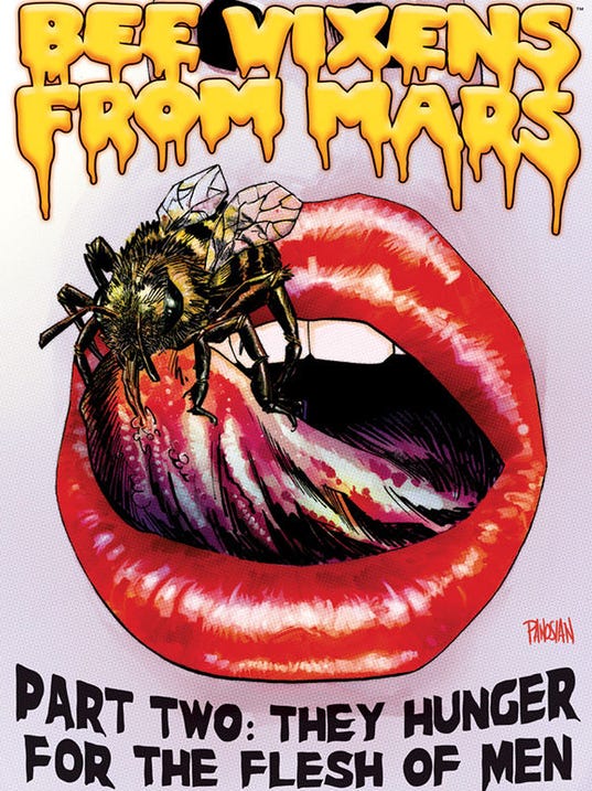

Writer: Alex De Campi
Artist: Chris Peterson
Colors: Nolan Woodard
Publisher: Dark Horse Comics
Price: $4
So maybe I shouldn’t have reviewed this book. I mean, I HAD to but I should’ve known this just wasn’t going to end well; calling a comic “Grindhouse” raises expectations the likes of which no person should have to deal with, at least in my case. I mean, did you notice that the very website this is posted on has an event called “Late Nite Grind House?” I attend it regularly. So, yeah, I’m really into “grindhouse.” This comic? It’s not “grindhouse.”
The writing is the biggest problem. The story is about alien bees from space that are also “vixens” and use human bodies to reproduce. Immediately, we get that this is supposed to be funny stuff. And for a while, it’s pretty funny stuff; the evil bee vixens get some choice bits and the heroine has more snark than she knows what to do with. There’s small details that reward closer examination and you can definitely tell that the writer and artist had a lot of fun. But halfway through the book it loses steam and the book descends into cheap parody; De Campi pretty much rips off ‘Hot Fuzz’ at one point and the ending is quite anticlimactic. It seems pretty obvious to me that De Campi had written one comic book of story and was probably asked to stretch it to two issues.
The art is, thankfully, more than capable of making up for the inconsistent writing. Fortunately, there’s way less in-your-face T&A in this volume, substituted by a substantial gore upgrade, which is handled PERFECTLY. I say that in capitals because rarely do I see gore in comics done right, but Chris Peterson has one scene midway through that is real jolt in terms of visceral nastiness. But there’s also those small details I mentioned earlier; the way he draws the alien bee larvae is genuinely amusing just to look at and I’d love to give a nod to the “om nom nom” bit. The queen bee, while being a bit generic looking, is pretty spectacularly rendered, mainly due to how concrete she seems in every one of her panels. Peterson isn’t interested in cheating the reader and I love that. Nolan Woodard does a spectacular job of bringing the blood and guts to crimson-saturated life but he also infuses explosions and sunsets with feverish energy.
But my real problem with GRINDHOUSE doesn’t really have much to do with the writing or the art. The problem is in the name. I don’t think this is a “Grindhouse” comic at all; it’s a horror movie parody. If the limits of your experiences with grindhouse is the Tarantino/Rodriguez film of the same name, or ‘Zombi’ or ‘Texas Chainsaw Massacre’ then you’re seeing a narrow portion of what grindhouse really was. The wider spectrum of the genre included films like ‘Maniac’, ‘Thriller’, ‘Nekromantik, ‘Four Flies On Gray Velvet’, etc which were certainly violent but were relegated to grindhouse theatres because they were too controversial or weird to show anywhere else, not because they were exploitative (though they certainly were that too). But there’s nothing about this comic that’s controversial or weird at all. De Campi has taken a very standard, rote story and tried to pass it off as grindhouse, and fails utterly to do so to anyone actually versed in the film genre. Either she actually doesn’t know enough about grindhouse to justify using this title or she does and didn’t want to actually do a comic that would be controversial or weird and just slapped “Grindhouse” on the cover to draw attention.
And given the interview she had with Kieron Gillen on a podcast, I’m willing to bet it’s the latter. Which is unforgivable. This is a fine comic for horror movie fans and if it was billed as a horror movie parody, I’d simply be criticizing it for being a bit boring. But cynically exploiting the buzz of “Grindhouse” is criminal (I’m looking at you, Tarantino/Rodriguez) and I won’t tolerate it.
EDIT (11/8): I received a response to my criticism of De Campi’s writing on Twitter(!) and here’s what she had to say: “Certainly grindhouse covers a huge range of films/subgenres; I’m sorry my first story wasn’t […] the darker, 4 Flies / giallo story you were hoping for. Giallo is actually a subgenre I’m hoping to tackle in a future story.” This is a very promising response as it would seem she’s openly acknowledging that BEE VIXENS FROM MARS wasn’t as dark or subversive as I’d expected from a “grindhouse” comic, and her promise to eventually emulate “4 Flies / giallo” is certainly precisely what I’d love to see most. The next issue launches a new arc and I’ll be anxiously awaiting a story that not only emulates the campy, absurd aspects of grindhouse but its subversive, shocking originality as well.
 HINTERKIND #2

Writer: Ian Edginton
Artist: Francesco Trifogli
Colors: Chris Peter
Publisher: Vertigo Comics
Price: $3
VERTIGO. I WANT TO STRANGLE YOU. BUT FIRST I’M GOING TO REVIEW THIS COMIC YOU’VE RUINED.
Edginton, the writer of HINTERKIND, has crafted a viscerally thrilling page-turner of a story with the second issue of his series. Headstrong heroine Prosper barely survives a run-in with some kind of fantastical creature introduced in the last page of the first issue and he sells it to us with perfect pacing and dialogue that skirts corny but never quite manages it. The character interaction that follows should seem like tedium comparatively but his lively dialogue between two affable yet colorful characters maintains momentum long enough for a new character to arrive. There’s an interlude that at first seems to dilute the suspense but turns into a pretty thrilling confrontation in itself, packed with tidbits about the true nature of the mythical creatures. In the meantime, our protagonists are glibly betrayed by the new arrival, only to find a larger problem on their hands. It’s really cool that Edginton immediately introduces us to a human in cahoots with the predatory monsters, blurring the line between factions. And then he blurs it even further by, with the last two pages, revealing another human observing the whole story from a VERY interesting vantage point. Needless to say, there’s a LOT of cool stuff packed into this issue and Edginton never lets it get weighed down by clumsy exposition or pointless dialogue. The writing here is on par with Brian K Vaughan’s writing on SAGA, though the story is a bit confused down by a silly premise taken seriously.
Francesco Trifogli’s art really helps sell that premise despite the corniness of it, mainly by humanizing the monsters; the bridge troll looks more like something from tribal mythology than the ones from Grimms fairytales and responds with amusing emotional honesty to the heroine’s ambush at the start. When the two are clinging to a precipice, Trifogli uses a series of dynamic perspectives to keep the scale large and as a result, when the conflict is resolved, there’s a genuine sense of relief. The revealing conversation between the protagonists is boosted sharply by very strong facial expressions even as we get eyefuls of lush, overgrown backgrounds. Unfortunately, the interlude sees Trifogli cheating a bit and setting it on a beach where the background is less dynamic but even then, we see books littering the area and birds swooping past. Truly, Trifogli packs his pages with action like no other artist. The shadows of a campfire give him a chance to play with atmosphere to great effect, utilizing an overhead POV to heighten the drama of a sudden reveal. The monsters he introduces are just a bit generic but there’s a generous amount of work put into making their personalities stand out. The final panel’s reveal is perfectly illustrated with grim foreboding and atmospheric contrast. Much of the aforementioned lushness and atmosphere is due to Chris Peter’s incredibly agile coloring job, balancing bright surreal hues with immersive earthy tones.
But it’s all for naught; advertisements are sometimes one page of comic apart, there’s a two-page spread right where it SHOULDN’T be (advertising ‘Man of Steel’ no less!) and the longest block of comic you get is four pages at the very beginning. As I read the book I began to feel an awful lot like I was reading it on a really awful pirate site where pop-ups kept obscuring my enjoyment of the work but no matter how many times I clicked, it kept coming back. The most offensive part is the two ads for the same spectacularly shitty looking MMO I keep seeing in Vertigo & DC books, and they’re ads that look EXACTLY THE SAME. There’s exactly 20 pages of comic in a 30-page book. At $3, that’s ten cents a page. A full dollar of that was spent on disruptive advertising of the most tedious kind.
And this has happened before: Vertigo did it with ‘FBP’ as well. And when they did it last time, I said I was cutting them off if they did it again. And they did. So I’m cutting them off. I won’t stand for it. Vertigo titles will no longer be reviewed in my column, I won’t talk about them and I definitely won’t be buying them. This includes my much beloved ‘Trillium’ as well.
This means war.
‘DANIEL ISN’T REAL’, But This Teaser Trailer Is
The team that brought my favorite film of 2018, Mandy, is back with Adam Egypt Mortimer’s Da
Comic Review: WEIRD DETECTIVE
Chris Melkus gets weird with Dark Horse Comics' Weird Detective #1!
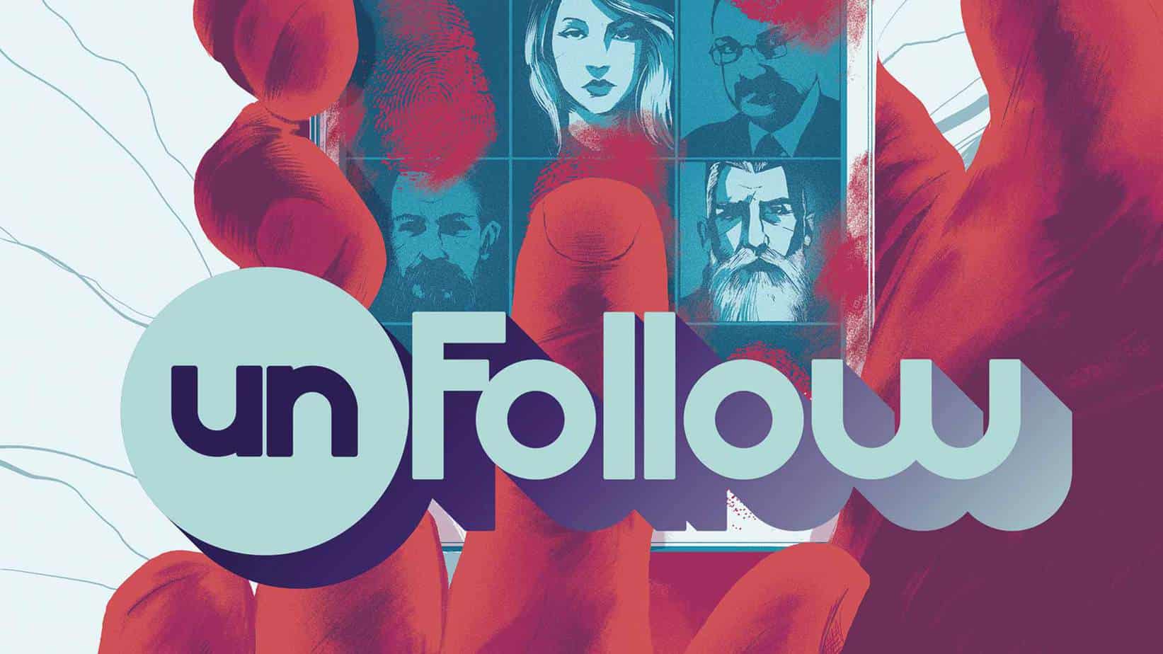
Comic Review: UNFOLLOW
UNFOLLOW #1 Writer: Rob Williams Artist: Mike Dowling Colorist: Quinton Winter Publisher: Ve
Hans Marozzi
An impressive share, I just with all this onto a colleague who has been doing little analysis on this. And the man in reality bought me breakfast since I found it for him.. smile. So let me reword that: Thnx for the treat! But yeah Thnkx for spending enough time to debate this, I feel strongly regarding it and really like reading on this topic. If you can, as you become expertise, could you mind updating your blog post with more details? It is highly ideal for me. Huge thumb up in this article!