

[Comic Execution] 11/29 – ‘S.H.O.O.T. FIRST’, ‘PRETTY DEADLY’, ‘RAT QUEENS’
IT’S BLACK FRIDAY! In the spirit of crass commercialism, I’m offering to you, in addition to my standard three reviews, a fourth review! That’s right, you get a whole extra review, for FREE!
That is a horrible face you are making.
 S.H.O.O.T. FIRST #2

Writer: Justin Aclin
Artist: Nicolas Daniel Selma
Colors: Marlac
Publisher: Dark Horse Comics
Price: $4
I wish I didn’t feel quite as cynical as I do about the premise of this book, because I’m worried my cynicism might be skewing how I feel about it as a whole. But I’m also not sure I should be second guessing my instincts; if the comic did something genuinely assuage those feelings, I like to think I’d respond appropriately.
The story of S.H.O.O.T. FIRST is a bit tedious, in this, the second issue. The big twist reveal at the end of the last issue gets a bit more exploration in the first few pages but there’s no answers, just some more mystery and a bit of character development. As with the previous issue, the S.H.O.O.T. FIRST team gets sent to a location of topical import to battle more supernatural entities, this time with their new ex-Muslim friend assisting. The running theme, so far, seems to be to take real-life scenarios and reimagine them as they would occur in the world of the comic, which is interesting but a bit shallow, since we never go beyond the surface level of what’s going on in said scenarios. The writer, Aclin, upsets the reader’s expectations with a clever riff introducing the baddie of the week but the novelty wears off quick, thanks to the cheesy action scenes. There’s an odd bit of political flavor as Aclin wraps up the “main boss” battle but it’s just a sidenote, his focus moving to the new recruit’s crisis of not-faith, which seems to be cured with a naughty bit and we see a bit of drama unfolding, with what looks like betrayal in the wings. It’s weird how all this writing is mostly humorless, which would make more sense of the theme of atheism as a battle being taken more seriously. It’s not though.
And none of this is helped much by the art, really. The demon we encounter early on the story is one that’s supposed to be frightening, but Selma’s version of the beast feels more like it was ripped out of an RPG than a horror film. The setting for the fight in this issue is, again, rendered with such a lack of detail (most BG consist of dust clouds and blue sky) that it’s entirely up to the character art to drive the visuals, even if this is excused by the sparseness of said location. Sadly, though, there’s nothing particularly exciting about multiple panels portraying the S.H.O.O.T. team pointing their guns off panel in awkward poses. There’s some cool stuff on display as two characters get into the heart of this week’s monster but it’s not really impressive. The whole thing wraps up with more of the different characters discussing stuff so there’s nothing there to comment on, art-wise.
The best I can say about the newest issue of S.H.O.O.T. FIRST is that it’s on par with the first issue. But it also establishes an unfortunate formula, in which the genuinely engaging storylines are slowly developed in the background while the majority of the pages themselves are dedicated to action scenes with no energy or relevance to the plot as a whole. If you wanted your series to be about a team of faithless warriors battling supernatural entities, you’d want to make those parts the big draw, right? Because the topic of atheism isn’t really given anything other than lip service here so that can’t be a factor. I’m bored with S.H.O.O.T. FIRST and that’s pretty disappointing, given that I’d love to see more comics featuring openly atheist characters. But I won’t condone the lack of energy or commitment here. I just don’t have enough faith that the third issue will be an improvement, so consider this a eulogy.
PRETTY DEADLY #2

Writer: Kelly Sue DeConnick
Artist: Emma Ríos
Colors: Jordie Bellaire
Publisher: Image
Price: $3.50
It’s time for me to make a full disclosure. Wait, no, not THAT kind of disclosure, geez! Let me explain. You see, when I got done reading PRETTY DEADLY #2, I was looking at the back of the book and saw that my tweets about the first issue were printed there. I won’t lie and say that I’m not hugely grateful that DeConnick and Image Comics were cool enough to publish my thoughts to their audience. But I’m also a bit at odds, since I’m still reviewing this series and I don’t want their act of kindness to mar the illusion of objectivity in my review. So, let me clear the air; just because this issue features my tweet in it doesn’t mean I’m in any way biased about how good or bad it is. I hope.
Opening again on the surreal pair of characters from the intro of the first issue, their roles as symbols seeming to be blurred into a something more concrete, though they’re really still just there to be our narrators so far, but I love that Deconnick has a second layer of story that’s just as weird and interesting as the tale of Ginny, which kicks off by reintroducing the roguish Johnny as he recovers from an earlier encounter, elaborating every so slightly on what precisely happened, but not by much, focusing more on his bizarre relationship with his enigmatic lover who is, again, more than meets the eye, though we don’t get any good grip on that either. Elsewhere, we finally get to see the confrontation we’ve been waiting for since halfway through the first issue as Big Alice tracks her quarry to the homestead of kind Sarah. but not without a page introducing two new characters, even more bizarre than those we’ve already encountered.
The antagonist, Big Alice, definitely comes across as being far more menacing this issue as she essentially lets the abuse of a child stand for the sake of luring Ginny into her trap. Yet Ginny’s entrance is considerably more horrifying. Again, Deconnick seems to have thing for traumatising kids, and I’m fully on board. The ensuing battle is AWESOME. It’s bloody, badass and there’s some genuinely messed up stuff going on as Big Alice reveals her true colors. The way it ends is both devastating and poignant, a credit to Kelly Sue’s excellent dialogue. This issue is a home run for Deconnick, giving us more to chew on than the debut while still retaining the atmosphere and mystery that defines PRETTY DEADLY.
The art of Emma Rios is just as impossibly dreamlike as ever, but we’re also seeing how versatile her work is, from nude bodies to scorching infernos to brutal violence. Some of the credit for the intensity of the fight scenes is due to the dynamic panel layouts but really, it’s the artist’s bold display of blow-by-blow back and forth that’s exciting. The struggle retains suspense precisely because of the detailed rendering of each fighter’s nuances, short bursts highlighting each shift in the conflict. It ends with a truly hallucinatory visual that recalls ‘Paprika’ more than a bit, reinforcing the dreaminess of it all. Rios doesn’t falter in her mission to make PRETTY DEADLY as weird, powerful and unique. And once again, Jordie Bellaire’s coloring builds a world of gorgeous moodiness, saturating the pages with delicate pinks, suffocating yellows, fiery reds, synchronizing perfectly with the surreal aesthetic.
I didn’t know what was going on in issue one of this series but I felt like, unlike some books, Deconnick wasn’t playing a waiting game with her audience. This issue outright explodes with the big revelations and confrontations that I’d suspected were on their way, confirming my speculation that Image had another hit on their hands. Unless issue three completely derails that momentum, I can’t see this being one of my new favorites, and at Image’s reasonable cover price, there’s no reason you shouldn’t be reading it at this point.
 LETTER 44 #2

Writer: Charles Soule
Artist: Alberto Jimenez Albuquerque
Colors: Guy Major
Publisher: Oni Press
Price: $4
So it looks like the first issue of LETTER 44 is free to read online. I don’t know how long that’s going to last but I’m not really surprised, given that the first issue was a $1. I’m not sure what LETTER 44’s publisher, Oni Press, is up to but it’s an intriguing game they’re playing. It definitely feels like a response to Image’s “Firsts”, printings of a popular series’ debut for a $1. So there’s really no excuse at all not to at least read the first volume, assuming it’s still available when you read this.
Does the narrative of the second issue retain the forward momentum established by said debut? Well, that’s sort of tough to answer. See, the first issue focused mostly on events occurring at home; a new president and his discovery via the titular letter regarding a potential invasion from space as well as the mission to investigate the nature of said threat. This issue starts off similarly, with a really brilliant explanation from a foreboding scientist about why the US government chose to investigate the alien presence rather than ignore it. Soule’s writing stands out during this part, his character’s eerily rational approach taking on real world implications. Soule’s done his homework. The politics come into play again but never pass beyond harmless texture before the spotlight moves to space drama. Soule isn’t quite as deft with the interaction between astronauts, much of their actions coming across predictably. Soule bounces us back to Earth and we get to see more of the President’s complex struggle with the repercussions of what’s going into this space voyage, even as we’re shown some subterfuge from outside elements. It’s great that Soule can weave such a tapestry of plot without losing the attention of his readers. But again, back in space, our attention is given briefly to matters of an alien nature before the bomb is dropped and we discover why Soule has given a somewhat boring crew of astronauts so much development.
Soule’s writing is pretty damn good here. He maintains a careful balance of the two parallel storylines, fleshing out both equally and detailing them with interesting features that will definitely pay off later. The one scene of action is a bit corny but serves its purpose and gets out of the way so hopefully this doesn’t reflect on what will conspire in further conflicts. Dialogue’s sharp and Soule really does invest his world with a sense of surprising realism.
Alberto Alburquerque’s art is another story. There’s something I really can’t place about the way he draws characters that feels awkward. He has a frustrating mix of semi-realism and cartoonish facial structures that works well enough but contrasts with the hard sci-fi of the world. But the more I read the series, the more comfortable I get with it, as it suits the blend of real world politics and futuristic science fiction. That said, it’s clear Alburquerque’s specialty is dynamic action and he’s not being given much of a chance to deal any of that out. This is a character driven series drawn by an artist who’s maybe not as suited for such, but he’s making it work, and that’s actually more commendable than it is a weakness. I’m looking forward big time to seeing what he does when the story really opens up and hits the accelerator, but he’s performing well in the meantime. Guy Major lends a robust palette of spot-on hues, doing as much work (if not more) than the artist in contributing to the realism of the visuals, every panel a precise application.
The second issue of LETTER 44 is quite good and just manages to justify Oni’s $4 pricetag, especially as they wisely eschew any advertisements. Honestly though, unless the next issue really grabs me with a more intense experience, I can’t condone such an expensive yet slow-moving comic, one that feels more like a well-written sci-fi novel than anything else. And shame on Oni for using such a misleading cover. You set yourselves up for failure with that.
 RAT QUEENS #3
Writer: Kurtis Wiebe
Artist: Roc Upchurch
Publisher: Image
Price: $3.50
So the writer of RAT QUEENS, Kurtis Wiebe, is a legit tabletop gamer. I’m following him on Twitter and I’ve got to say, he’s an interesting character. Most comic book authors are just that; comic book guys. Kurtis has a lot more going on and it’s really refreshing to know that normal dudes get to write these things, no offense to the professionals out there. I thought it was really incredible that he hosted an online video chat with him, artist Roc Upchurch and their editor Laura Tavishati, much less than he’s going to continue doing this with the rest of the issues. Truly, comics are a cool thing.
Wiebe’s writing for this issue is interesting. Starting it off by exploring two very different romantic relationships was off-putting at first, since the first two releases were more about action than this one. We get to see how the Rat Queens work though, and it’s a blast to see things loosen up a bit. A pretty intense confrontation mid-book provides some much needed violence to break up the tedium and Wiebe simultaneously gives us an intriguing glimpse into the backstory of one of the Rat Queens. Keeping the energy high, there’s a pretty funny bit involving the rogue, Betty, and a surprising revelation at the end of it all. So Wiebe did worry a bit at the start but then delivers the goods. No complaints here.
Upchurch, the artist, still isn’t really doing a lot heavy lifting in this issue. Lots of character development at the start means he’s cruising by on his talent for detailed character dynamics but fortunately the second part has a rich establishing shot and the whole scene itself feels much more solid thanks to a sense of place. Upchurch gets to work a bit with some dynamic play between the Rat Queens, as well as more colorful background details throughout. There’s a really great scene of sword fighting during the aforementioned confrontation, which Upchurch really sells despite its brevity. You can almost hear the shattering blade. A bit of stealthiness establishes some suspense near the last few pages, again enriched by more nuance in the backgrounds, especially the candlelit penultimate page.
I had hoped this series would find its footing and I think it has, especially the artwork, which feels significantly upgraded. Wiebe gives his characters some more color but then wisely amps up the overall energy level and Upchurch embraces that. I’m giving this series the dubious title of my favorite RPG-related comic of all time. Go get it ASAP, because you don’t want to be a critical failure, even if you don’t know what that means.
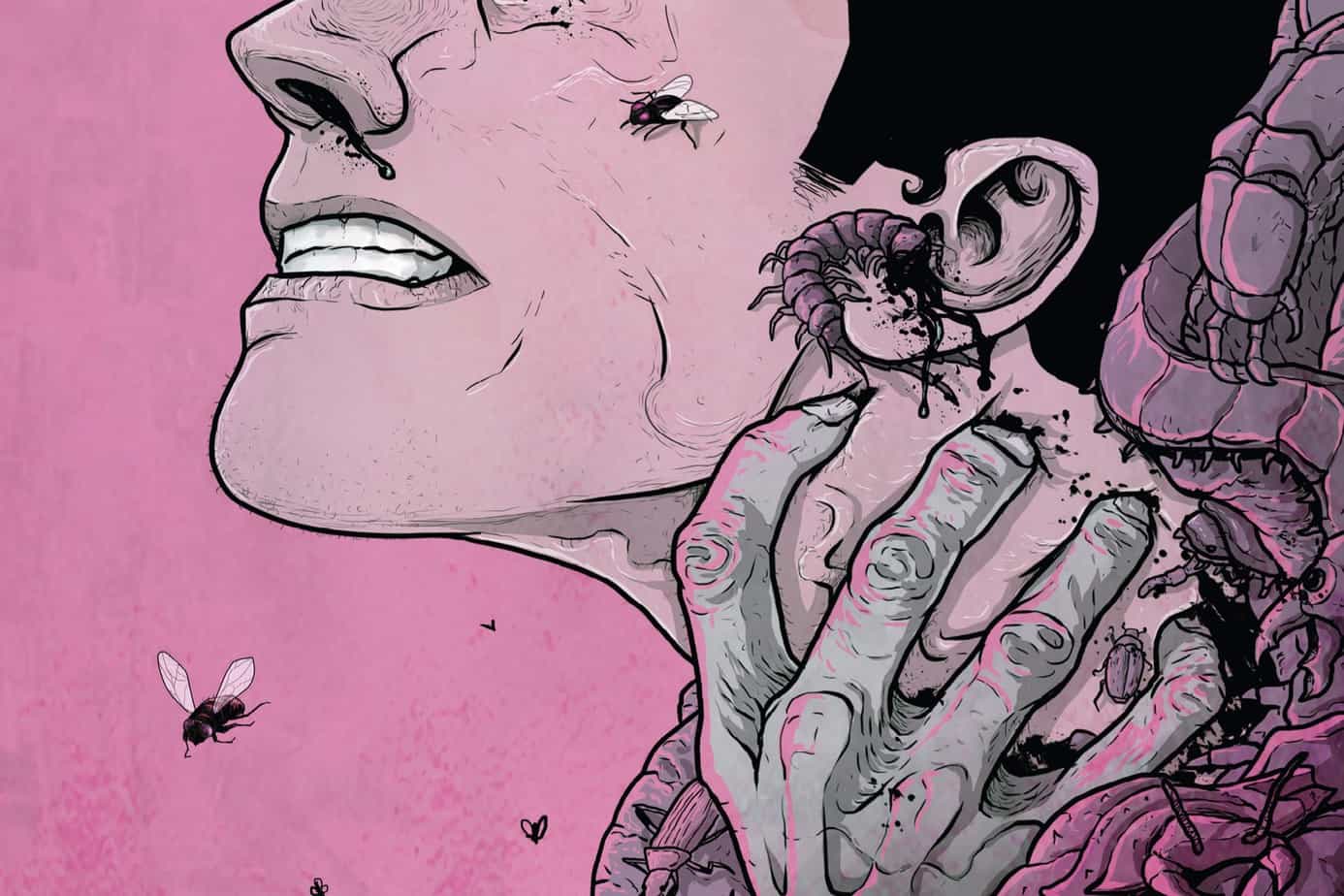
‘REGRESSION’ Comic Review
REGRESSION #1 Writer: Cullen Bunn Artist: Danny Luckert Colorist: Marie Enger Publisher: Image Comi
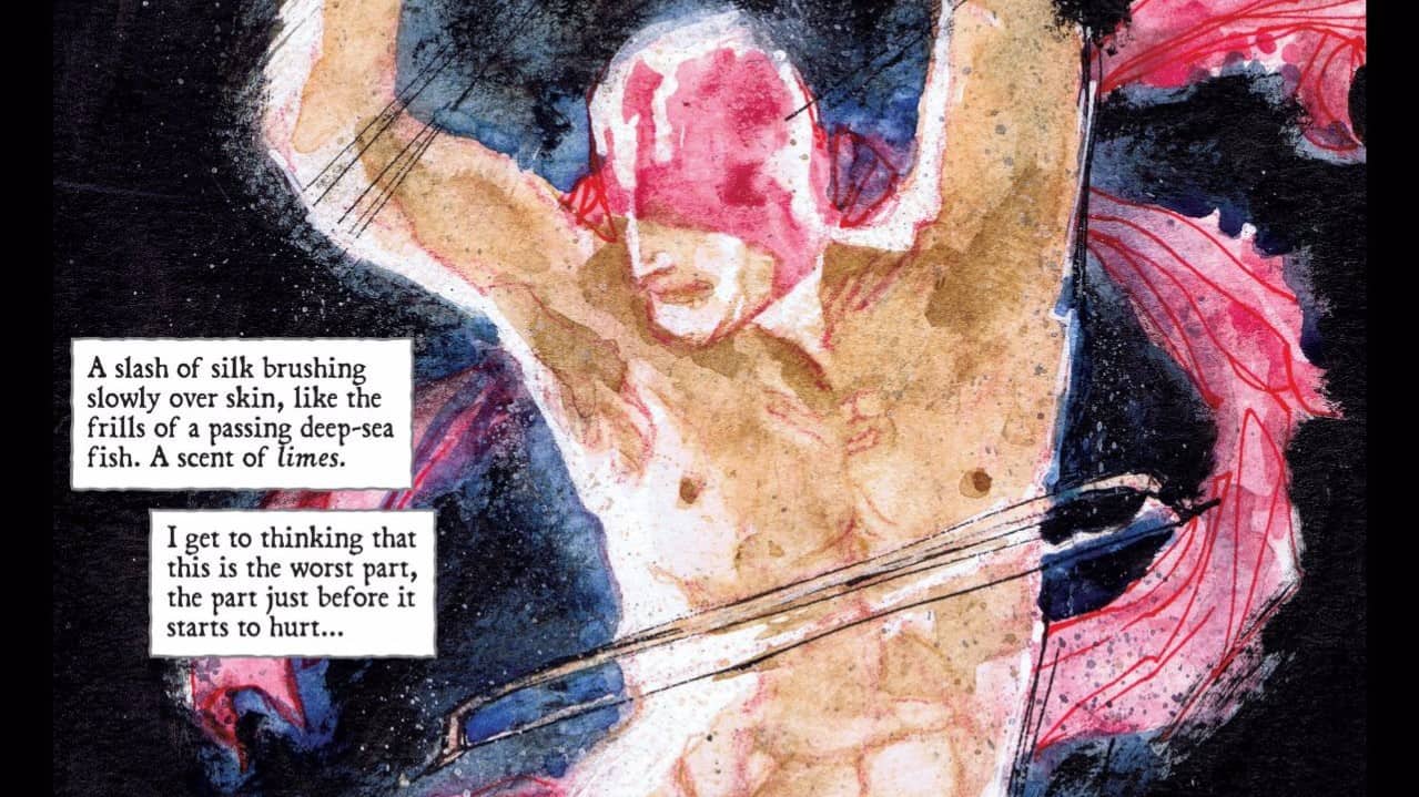
‘UNDERWINTER’ Comic Review
UNDERWINTER #1 Writer & Artist: Ray Fawkes Publisher: Image Comics Price: $4 CLICK HERE FOR PREV
Comic Review: WEIRD DETECTIVE
Chris Melkus gets weird with Dark Horse Comics' Weird Detective #1!