
[Comic Execution] 10/31 – DOUBLE-SIZED HALLOWEEN EDITION!
Well, I did it again; I made you wait two weeks before getting you a column. Last time this happened, you threatened me with a machete (or was it a straight razor? You think I would remember these things) but I promised it would never happen again. I only have myself to blame. I’ve failed you. I deserve to die. Just, do me a favor, all right? One last dying wish? Just, look… I don’t mean to embarrass you but… couldn’t you at least give me an upgrade? What I’m saying is that I just don’t think that wimpy little kitchen knife is how you REALLY want to do this. If you’d just use your imagination, I’m sure we’d both get a much more satisfying result out of my grisly demise, know what I’m saying?
I know you’ve already got plenty of ideas but, just, let me throw some suggestions out there, maybe we can brainstorm this thing together and really do it right. Now, if you’re anything like me, I’m sure you’re going straight for the big guns- well, not GUNS per say but you know what I mean- but I think we need to reconsider the nuclear option. Which would be the chainsaw, of course. It’s noisy, messy and doesn’t leave survivors but the problem is that it uses precious fossil fuels AND pollutes the environment.
No, I think if you really want to murder with a clean conscience AND make an impression, there’s nothing better than pushing your victim off a building. You can really milk the suspense; when they’re teetering on the precipice, you can linger a bit and savor their desperate hope that maybe, just maybe, you’ve considered a reprieve. THAT’S when you give ’em a good shove. Make sure they’re facing you though so you can see their expression the whole way down. Heck, if you want to get the maximum amount of enjoyment from the experience, get a pair of binoculars and pick a really tall building. You’re guaranteed to see AT LEAST three of grief before the splat. But there’s the kicker; you don’t want a building that’s too tall because the impact is just too far away for the sound to be satisfying. It can be tough to tough to estimate what the proper height is but ironically, pumpkins make the perfect test subjects! And I know exactly where we can get some…
 PRETTY DEADLY #1

Writer: Kelly Sue DeConnick
Artist: Emma Rios
Colors: Jordie Bellaire
Publisher: Image Comics
Price: $3.50
To say that this book is highly anticipated would be an understatement. It’s a debut that’s been advertised pretty heavily by Image in most of their books for a long stretch of months, nearly a year. It’s the work of critical darling AND fan favorite Kelly Sue Deconnick whose recent run on Captain Marvel has been cited as a turning point in the depiction of female superheroes in comics by female creators. Like that book, PRETTY DEADLY revolves around a female protagonist so it has also drawn attention, politically. I’ll admit I was pretty excited as well; Deconnick really is an excellent writer and artist Emma Rios is no slouch either. Does it deliver? I… I’m not sure, actually
The writing is pretty out there. It starts off with a conversation between unseen characters that have nonsense names like Bunny and Butterfly. It’s a damned vague conversation that floats across an equally surreal scene of a young girl with a gun blowing away what appears to be a harmless creature. Deconnick pretty much right away makes clear that there’s nothing cute about this story and that she’s not here to coddle the reader with a straightforward tale. Frankly, I find it refreshing, even if my first read through was a headscratcher. Things don’t get much more sensical, as we’re introduced to a girl dressed like a vulture and her blind friend, a tall, powerful man. There’s very little dialogue through most of this and it’s so pleasing to be reading something relaxed enough to let silence do the talking.
They proceed to tell a group of townsfolk the story of Death and his tragic love, Beauty. Usually, when characters hand-feed me the exposition, I get resentful but it’s done in such a novel way I didn’t feel quite so patronized. The story we’re told is a distillation that both disguises hidden truths and succinctly summarizes what we need to know. (As an aside, we’re now reading a story within in story within the comic) The “Death falls in love” trope is kind of trite at this point and it’s kind of amusing to consider the idea that Death’s offspring would be anything other than a death-dealer. That said, I absolutely love that, if you’re paying attention, you’ll notice Vulture girl is giving a younger girl in the audience a traumatic life experience! GOOD JOB.
The original storyline gets a bit more muddled as an an enigmatic man interferes with the Vulture girl and something happens between them. I’m still not positive what and that might be on purpose but I think it’s just a narrative blemish honestly. The Vulture girl and blind man are ambushed later but ironically there’s more comedic relief here than anything. Deconnick’s characters are surprisingly fun and her economic dialogue seems to hinder not at all. Yet another scene change back to the town establishes a nice punchy rhythm and there’s some equal-opportunity nudity accompanied by violence as Big Alice arrives with a bang. Despite dealing with yet another “quirky” character, Big Alice is just too much cool to complain about but I hope this cast doesn’t grow too much in the next issue.
Back in the desert, Vulture girl and blind man discover something and have to hit the road in a hurry to the next setting; a nameless farmstead in the middle of nowhere where we meet more people. I’m not sure how I feel about this whole bit; it’s a nice bit of character development but it also doesn’t seem to lead anywhere as our protagonists hurry on rather quickly. I’m guessing that it’s setting up a more meaningful confrontation in the next issue. The very last page teases the imminent arrival of the main character, though we don’t know exactly where she’s going to appear or why. It does lose a bit of effectiveness as we don’t know why we’re anticipating her.
But the frustration of all these unanswered questions and vague portents are disarmed by the superb artwork. Rios summons feathery textures that delight and were probably painful to create but she makes it seem easy. There are two scenes of kids in tears and they’re palpably emotional. The dust-saturated, arid town is so gritty you could swear you just heard strains of a Ennio Morricone score in the distance. Despite a plethora of characters, they’re all boldly imaginative and thrilling riffs on classical archetypes; the blind old wise man is a foul-mouthed sharpshooter, the animalistic trickster wears a vulture cloak, the charismatic rogue is a ginger, etc. I can practically hear theme songs for each of them. For such a dreamlike story, the panels themselves are kinetic, often zooming in on details then pulling back for big, widescreen moments. It shouldn’t work but as surreal as the saga is, it’s still rooted in Western film aesthetics and this accentuates that properly. Jordie Bellaire’s colors lend a very distinctive and unusual mood to the whole work, saturating deep into every panel with textured, mottled hues of soft pinks, dry yellows and gorgeous cool blues. Jordie definitely establishes a haunting, ethereal feel that’s absolutely appropriate for a tale being told.
Overall, I’m quite taken with PRETTY DEADLY. It’s close to perfection. And at Image’s reasonable three and a half dollar price tag, you can’t afford to pass it up, not with the complete lack of ads and the nice bit of back matter from the writer detailing the book’s origins.
RAT QUEENS #2

Writer: Kurtis Wiebe
Artist: Roc Upchurch
Publisher: Image Comics
Price: $3.50
It’s time for me to come out with this, on the second issue of RAT QUEENS, with the truth: I’m a Dungeonmaster. And not just some weekend warrior type; I’ve been running various tabletop games for almost a decade, including long runs of both Pathfinder and D&D. So I’m not approaching this book from an entirely impartial standpoint. But it might also not be the standpoint you’re thinking of; I don’t actually like most of the trappings of traditional sword and sorcery RPGs. It serves the purpose of being empowering and being a game that doesn’t require/encourage creative dungeomastering but as someone who craves fresh worlds to explore, I get bored with the same old Tolkien-esque repeats.
So naturally, I love the strong satirical tone RAT QUEENS takes with the source material. On the first page we get the kind of bickering you should see a lot more often in adventuring parties split between magic users and fighters though Wiebe immediately chooses sides, clearly favoring the old school “spellcasters are squishy” tradition. There’s a few pages of combat dotted with cute quips at the expense of the monster before it goes down, subsequently riffing on the MMO cliche of getting spell components from defeated creatures. There’s a wonderfully gruesome post-battle evaluation which jumps quickly to another battle elsewhere that also ends quite gruesomely as well. Conclusions are drawn and the group returns to town but not before there’s some more bickering, this time between two magic users, of course. Their evening getting drunk at the tavern is cute but pretty boring honestly, a waste of two pages, though the return of the Four Daves is a moment to celebrate. Their drunken rampage is considerably more amusing but seems as pointless as the tavern scene but the next part cleverly reveals the true purpose of their confrontation that night; one of the party members has disguised themselves and is off to visit the Mayor. It doesn’t end well and it’s probably the funniest segment of the story. There’s another weird moment before that of two characters enjoying a bit of domestic calm, quite out of place. Overall, the writing isn’t quite as taut as the previous issue and that’s a disappointment. Particularly, there’s three dead zones that don’t move the story along or contribute much to character development, if that’s something that we’re looking for from this series (I’m not).
The art is just the same as it was the last issue; solid, fun but not as quality as I’d like. The action sequences are handled capably and there’s a lot to be said for Upchurch’s dexterity with characters. But Upchurch tries to economize his workload by doing one panel introducing the blandly generic background for each locale then skipping background art entirely, opting for gray blurs or gradient silhouettes. There also isn’t as much cool magic going on in this issue so there’s no chance for that to distract from how boring a full page of bickering characters can look.
I hope the next issue of Rat Queens ups the ante visually because there just isn’t much going on here besides two neat action scenes. I’d also like to see the story tightened up a bit, with less focus on filling in the meaningless details of the characters day-to-day life and more on keeping the momentum going. If issue three doesn’t fix these problems, I’ll have to give it the boot, much as I’m loathe to. Fortunately, I’m optimistic; I think this is just a case of the sophomore slumps and that issue 3 will be a return to form.
 THE ROCKETEER & THE SPIRIT #2

Writer: Mark Waid
Artist: Loston Wallace & Bob Wiacek
Colors: Hi Fi Designs
Publisher: DC/IDW Comics
Price: $4
Well, welcome back to the land of the living, THE ROCKETEER & THE SPIRIT. It’s been a while since we last met. Have things changed? You bet they have; the book as a new penciller! What happened to the legendary Paul Smith doing the job? NOBODY KNOWS. Editorial is keeping their mouth shut with a mere “unable to continue” for response’s sake. Who’s taking bets on DC’s publisher-wide editorial asshattery being to blame? *raises hand* Has this also hurt the writing efforts of prolific the Mark Waid? Let’s find out!
We pick up where we left off, discovering that Rocketeer’s girl Betty has taken a liking to The Spirit, sparking a childish bit of jealousy as The Spirit’s friend Inspector Dolan also takes a rather imprudent amount of interest in Better herself. It’s a credit to Waid’s writing that the dialogue is funny enough to justify the silliness of it all, though I guess I should also acknowledge that this is supposed to be an homage to classic pulp so that’s another reason it’s tolerable here. Fortunately, Waid’s still funny and proves it a page later when The Rocketeer and The Spirit are, ironically, stuck in traffic together. Sadly, his villains aren’t very villainous at all, more campy than anything, though I suspect this is on purpose. Still, it’s hard to invest in the comic suspense when the antagonists are such rubes.
The Rocketeer and Dolan’s daughter flirt a bit while The Spirit and Dolan stumble upon a horrifying (really, actually) detail about the corpse Betty found. Betty, meanwhile, is hanging at the hanger (LOL) when she and Cliff’s friend Peevy make similarly frightening discovery. The hanger becomes the target of a pair of machine-gun toting biplanes, and our protagonists leap into action. Waid continues his thrilling pace, lightening up the death-defying battle with well-written quips galore. There’s a twist ending that sets up the next issue quite nicely. All in all, Waid crafts a high-pulp adventure that might rely on well-worn tropes but then, anyone expecting otherwise has forgotten that what kind of book they picked up. This isn’t Alan Moore, kids.
The new artist, Loston Wallace, can’t hold a candle to the pure visual pleasure of Paul Smith but his own style suits the book remarkably well. He’s considerably more of a cartoonist than Smith and as a result, the art takes on a much flatter, sillier tone, which really isn’t a bad thing. He proves to be equally adept at backgrounds and action, some genuinely thrilling moments keeping the book from getting tediously bogged down in static character interactions. As much as as I lament Smith’s exist, Wallace is the perfect substitute, though it helps that inker Wiacek gives his lines a lot of boldness and muscle, as well as being supported by the returning colorist Jordie Bellaire who adapts to Wallace’s style perfectly, flattening his colors but tossing in a lot of really sharp hues that pop off the page with energy. It took a long time for this art team to gel but I can honestly say it’s worth it; usually when a book changes artists mid-run, it’s a blow. Not here.
Overall, I can definitely still recommend this series to those of you who grabbed the first as well as people looking for a really fun pulpy adventure series. Unless there’s another major staff jumble in issue three, I’m likely to make this my favorite new pulp series in a long while, which is quite amazing considering the expectations in place.
 S.H.O.O.T. FIRST #1
Writer: Justin Aclin
Artist: Nicolas Daniel Selma
Colors: Marlac
Publisher: Dark Horse Comics
Price: $4
The tagline for this comic is about as silly as one can come by without trying; “ANGELS VS ATHEISTS” it boldly announces! Is that actually accurate? How does that even work? Does the comic really want to talk about faith (or the lack of) or just use it to sell copies? I’m going to review this comic and maybe I’ll have answers to your questions. But I wouldn’t hold your breath.
Let me give you a quick rundown of the premise: using their disbelief to power their weaponry, a group of un-believers defend the world against supernatural manifestations that prey on humans. With that laid out, let’s get the actual narrative; it kicks off with an introduction to S.H.O.OT. Field Leader Mrs. Brookstone and her pre-adolescent son, who’s getting into the existential crisis phase of his life a bit early, thus setting up the theme of the series; how do you deal with fighting something you don’t believe in? I don’t have much experience with kids at Ray’s age but I assume questioning mortality is not something they’re supposed to do so at first this felt like the writer was trying way too hard. More on that later.
Brookstone and her team go to Afghanistan where what appears to be a bombing in progress is actually an incursion of fiery monsters devouring humans. One of the faithful present (spoiler: he’s NOT) witnesses/assists the S.H.O.O.T. team and is brought on board. He essentially becomes the readers, asking questions and getting answers about the nature of the conflict between O.A.’s (Outside Actors) and the team. The dialogue has the unfortunate burden of expositing all this but handles it well. There’s enough quality wisecracking throughout to offset that but it doesn’t even come close to compensating for the stilted action movie inanity crapped out of character’s mouths during the battles. I hope the next book puts a cork in the mid-action banter because otherwise the writing is good, as is the pacing. There’s a plot twist at the end of the book that’s appropriately tantalizing and gives Mrs Brookstone an interesting character quirk. Overall, I liked the writing and if Aclin can reign in his need to fill the panels with word bubbles constantly, I’ll have nothing to complain about.
But the art, I’m afraid, might not be up to snuff. It’s not that anything’s BAD. In fact, the overall quality of the art never dips below professional grade. But there’s also a sense that Selma isn’t really trying. The characters all look pleasing but there aren’t any really fun designs and the backgrounds are so rote as to be nonexistent. I do get that he’s got quite the balancing act on his hands; he’s drawing high tech weaponry, “quirky” protagonists AND freaky monsters but he seems to excel at NONE of these. There’s a few moments where he finds inspiration (he draws some pretty badass angels) and the final panel is eerie but overall I can find nothing to commend. The colors by Marlac are equally solid and, in fact, there might actually be MORE going on there; the work by newcomer Marlac is at times quite bold, with ripe warmth and fun glowing effects scattered about. It’s unfortunate that half the book takes place in a sterile bunker but the last panel he really stretches his wings, pun intended.
I’m giving S.H.O.O.T. one more chance. It might be because, as someone who contemplates the meaning of faith far too often, I can relate to the subject matter. But I’m also cognizant of the book’s disarmed tone; by presenting the subject in the context of a Ghostbusters-style action romp, it’s considerably less grave than how it feels in reality, and it seems less interested in exploring said topics than in making a weird world out of them (though setting their first bit in Afghanistan seemed a bit grim). Let’s just hope it’s a bit more compelling than it seems at first, because a $4 book this is not.
LETTER 44 #1
Writer: Charles Soule
Artist: Alberto Jimenez Albuquerque
Artist: Guy Major
Publisher: Oni Press
Price: $1
I feel pretty bad regarding Charles Soule, writer of LETTER 44. Specifically, I prejudged the guy because he seemed to have swooped in as DC’s editorial mandate sent bigger names running. He took over at the end of Scott Snyder’s incredible Swamp Thing run and immediately introduced new characters, which rubbed me the wrong way. It didn’t help that he was also writing the abominable Red Lantern and was shortly announced for Superman/Wonder Woman. I had him pegged as a mercenary clean-up man with the bare minimum of talent. He has some weirder stuff under his belt prior to DC scooping him up but LETTER 44 is the first of his own work I’ve read after dropping his Swamp Thing.
Soule is no slouch, it turns out. LETTER 44 starts off ambitious, asking some interesting questions about the meaning of humanity in relation to space. But that’s a tease quickly ripped away as we’re introduced to a new POTUS, an Obama-ish figure that feels less like a real character and more like an amalgam of John Kerry and the current Leader Of The Free World. There’s a weird bit of narrative tomfoolery as he drops the ball on his inauguration and we jump back several hours to the source. Why not just go chronologically? I guess Soule wanted to really impress upon us how much of an impact Letter 44 had on him because we read the letter then are dropped right back into the inauguration. It’s not distracting but it does come off as trying harder than needed.
On his first day, he investigates the merit of Letter 44 and Soule stretches his muscles with some political drama that’s heavy-handed and continues to flatten what little dimensions the POTUS might have. The following introduction to the members of the spacecraft addressed by Letter 44 is sharp and to the point, keeping their characterizations brief but filling them out in rough but satisfying portraits, though cliche raises its ugly head just a few too many times. Fortunately, the last page unveils the biggest hook of them all. All in all, the writing of Letter 44 is a somewhat schizophrenic mix-up of political intrigue and sci-fi, but as of right now they’re at odds, rather than mingling as they should be.
The art manages to cushion some of that dissonance by being incredibly proficient. The machine known as Alburquerque churns out page after page of immersive backgrounds, packed panels and rich textures. His characters are unique enough though his faces are a bit stiff, with the extent of emotional range being eyes opened wider. It wouldn’t be such an issue if the story didn’t have quite so many close-ups that are intended to heighten dramatic tension but fail to do so. But really, when you see the grand illustrations of both the ships, it’s hard to complain about. If he’s not relied on to push emotional impact too much, I can’t see having a problem with the art from here on, especially as Guy Major’s colors really help immersing the reader with soft yet realistic hues that accent the realism of it all.
What’s really great about this book is the price; a mere buck to get a very interesting first issue. Dark Horse is making a smart move by banking on the cheap premiere bringing in readers and hopefully they’ll all be open-minded enough to appreciate the questions the story asks about presidential politics. If not, the sci-fi angle should rope in the rest. It’s a good book you can’t afford to miss but the next issue better not be $4 because unless it gets better, I can’t condone that much with what’s here.
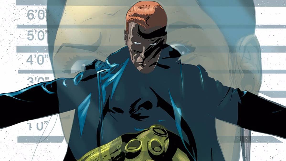
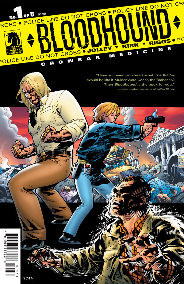 BLOODHOUND: CROWBAR MEDICINE #1
Writer: Dan Jolley
Artist: Leonard Kirk & Robin Riggs
Colors: Moose Baumann
Publisher: Dark Horse Comics
Price: $4
The protagonist of BLOODHOUND: CROWBAR MEDICINE has some history behind him; he’s a former Atlanta cop who specialized in tracking down and dealing with “metahumans” but eventually ended up in prison for manslaughter but not for long; he’s now employed by the FBI for his specialized skill set. His first story was published quite some time ago so naturally the new series tries to introduce people to his world delicately. But the back of the front page says “#11 in a series” so it’s kind of implied you’ll be missing out on some of what’s going on.
Which is kind of true. The first page gives us our hook; a superpowered and panicked guy flees a bank, leaving a trail of destruction behind him. Writer Dan Jolley doesn’t pull his punches; this dude has godlike power. But it’s just a hint of what’s to come later; for now, the focus lands squarely on Travis “Bloodhound” Clevenger and his “family” who are having a hard time coming together. Jolley does a fair job of invoking the awkwardness of bringing a new father figure into the fold, even if the teenage daughter is written with little care. It also doesn’t help that we’re not given context on how they came together to begin with. A page returns us to the fleeing metahuman from page one as he’s pursued by the police just long enough to build a bit more suspense before rubberbanding back to the domestic scene where Travis’ supervisor is having it out with a friend/acquaintance over the merits of gun ownership in a world of the superpowered. I kind of feel like Jolley’s deploying straw man tactics here by making the gun rights advocate behave like a jackass but I can’t pretend I’ve never met such a person. As pattern dictates, we return to the high-speed pursuit but it ends abruptly with a horrific scene.
Bloodhound is called in and he ALMOST manages to talk down the not-so-bad guy but things go awry in the most annoyingly cliche manner possible and he has to get violent. But the next scene is where the story gets REALLY interesting: while in the hospital, Bloodhound and his manager witness a broadcast of a scientist offering superpowers at a price to the public at large. It’s a nice twist that ratchets up the excitement level for the next volume though I’m going to have to point out that Suicide Risk had almost the exact same setup. Regardless, the writing overall is brisk, sturdy, well-paced and Bloodhound is absolutely a likable guy, even if the rest of the cast come off more as caricatures than anything else. It’s also not a very imaginative story; badass normal guy takes on people with superpowers. That being said, the first Bloodhound series occurred before this was really a big thing in comics so make of that what you will.
The art is definitely the real star of the show. From page one, the triple threat of penciler Leonard Kirk, inker Robin Riggs and colorist Moose Baumann absolutely scorches the pages with strong images, easily careening from suburban landscapes to exploding storefronts to guys running for their lives in a matter of five panels, all done with detail and finesse. The characters are all really expressive and stand out from each other quite well, especially Bloodhound himself, whose looks are a study in real life contrasts; beefy dude with all kinds of scars sporting long locks and preppy clothes. The backgrounds rarely disappoint and the action scenes are huge. There’s one panel in particular that’s incredibly graphic in all the right ways and Dark Horse is commended for letting it slide. Robin’s lines are just about as refined and animated as you could hope for, energizing the pencils and really fleshing out all the visuals fully. Baumann nails the colors with a sense of restraint and tact that lets the lines do all the talking but totally succeeds at bringing realism and depth to the pages, whether it be the huge open spaces of the final confrontation or the intimate close-ups of the same. The art of BLOODHOUND: CROWBAR MEDICINE is some of the best I’ve seen in a long time.
So overall, this book has me locked in. It’s a bit pricey at $4 but Dark Horse spares us completely any interrupting advertisements (unlike S.H.O.O.T. FIRST) and it truly grabs you, as a result. Plus, the story (one that’s pretty tame at first) really takes a thrilling twist and the end and I can’t wait to see how the art team handles what that will evolve into. That said, if the art does take a blow in quality but the price point sticks, I’ll have to reconsider.
‘REGRESSION’ Comic Review
REGRESSION #1 Writer: Cullen Bunn Artist: Danny Luckert Colorist: Marie Enger Publisher: Image Comi
‘UNDERWINTER’ Comic Review
UNDERWINTER #1 Writer & Artist: Ray Fawkes Publisher: Image Comics Price: $4 CLICK HERE FOR PREV
Comic Review: WEIRD DETECTIVE
Chris Melkus gets weird with Dark Horse Comics' Weird Detective #1!
ka
Respect to website author, some fantastic entropy.